

Case Study
Branding the developer experience
How I moved Chase’s developer platforms from corporate stock imagery to an illustrative, award-recognized brand — proved it with research, and moved the firm toward a more illustrative visual language.
I led the brand strategy, the research, and the team. I also know a brand never stops evolving — so I built this one to change without a rebuild. The driver, not the executioner.
Role · Brand & developer-experience strategy · Chase / J.P. Morgan
At a glance
Role
Head of Design — Merchant Services & the API Portals, leading the firm-wide Developer Ecosystem. I drove brand strategy, research, and the team — not the pixel execution.
Scope
The developer platforms — one application, multiple storefronts (Chase Developer and J.P. Morgan Developer), the model later extended as developer.payments.jpmorgan.com. The Merchant Services Developer Center was a separate project.
Team
Hired & grew the team — enterprise / design lead, 2 UX designers, a researcher, a content strategist, and tech writers.
Skills
Brand strategy · Design systems & tokens · Accessibility & inclusive IA · Research & A/B testing · Content strategy (docs) · Team building & coaching · Stakeholder workshops · Illustration direction
Where it started · Merchant Services
A ten-year-old Developer Center — and a brief that was really bigger.
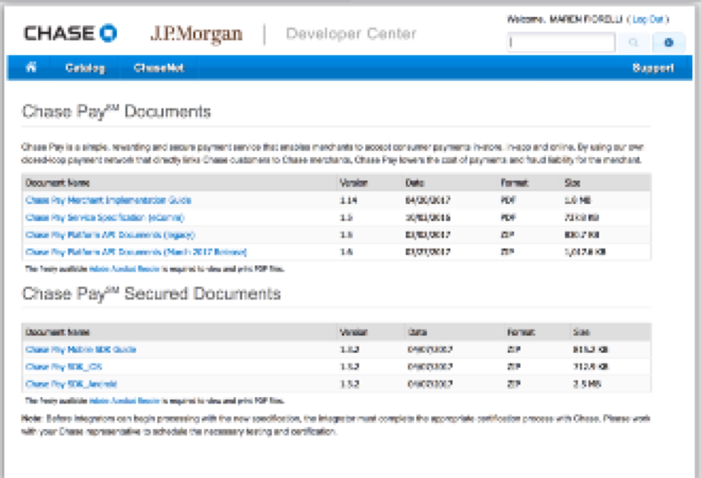
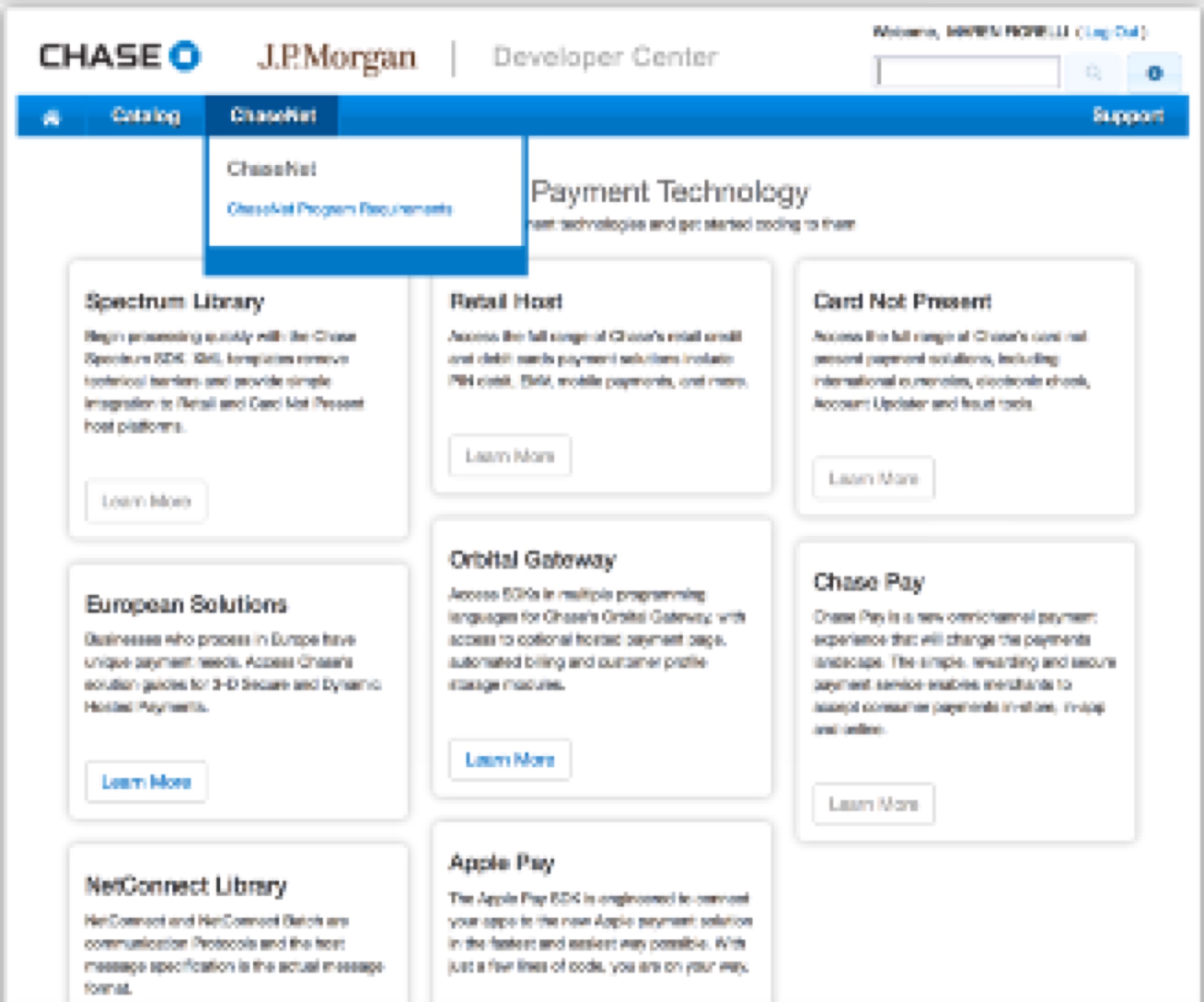
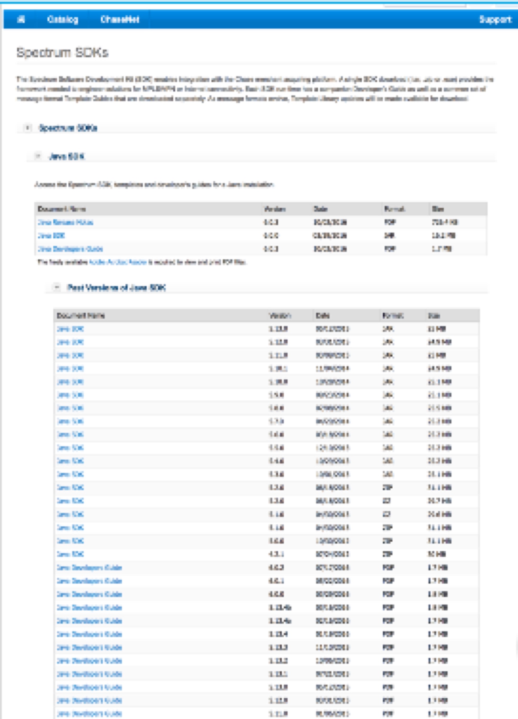
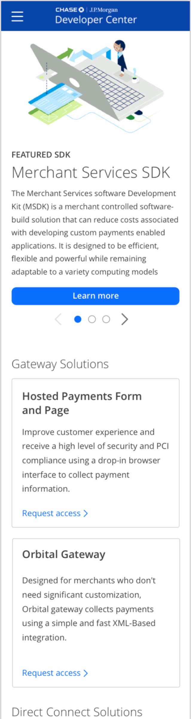
Dev Center came to me while I was Head of Design for Merchant Services. It was a ten-year-old Developer Center — so dated it looked like an early, engineer-built website. They wanted to modernize the stack, but the legacy technology couldn’t be deprecated: too many third-party applications were already built on top of it. What they wanted was a rebrand, a fix for their docs (all PDFs — the source of the harshest criticism), and a hope of one day building APIs for the portal.
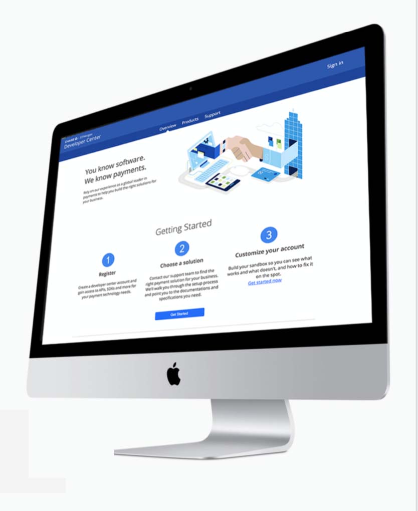
Merchant Services Developer Center Legacy Website
Our UX audit recommended far more than a rebrand: it needed a workflow and IA overhaul. With that pitch, I won a team to support the redesign. (Talk about a 1990s design.)
Asked for
A rebrand
The audit found
A stale, hard-to-navigate 10-year-old system
We pitched & won
A full UX + workflow overhaul — funded
From UX to DX
Stock imagery, for developers? Start by identifying the user and their preferences.
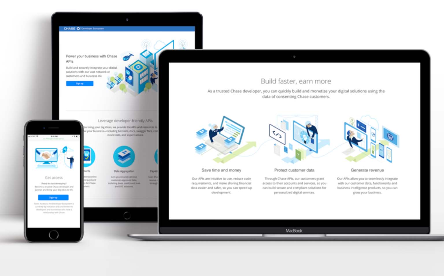
Chase had an internal marketing and production-design agency that supplied our visuals — largely stock imagery. We proposed a feel built around the UX instead, and started calling it DX: developer experience. It’s UX work — but the industry uses DX for this specific user, the developer, who is still a customer even when the work is mistaken for pure enterprise.
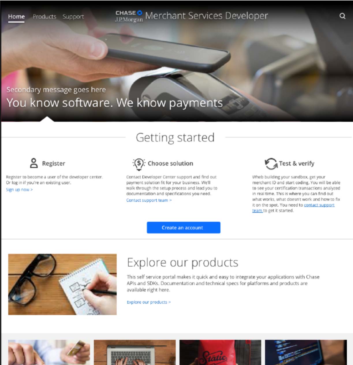 First proposed feel
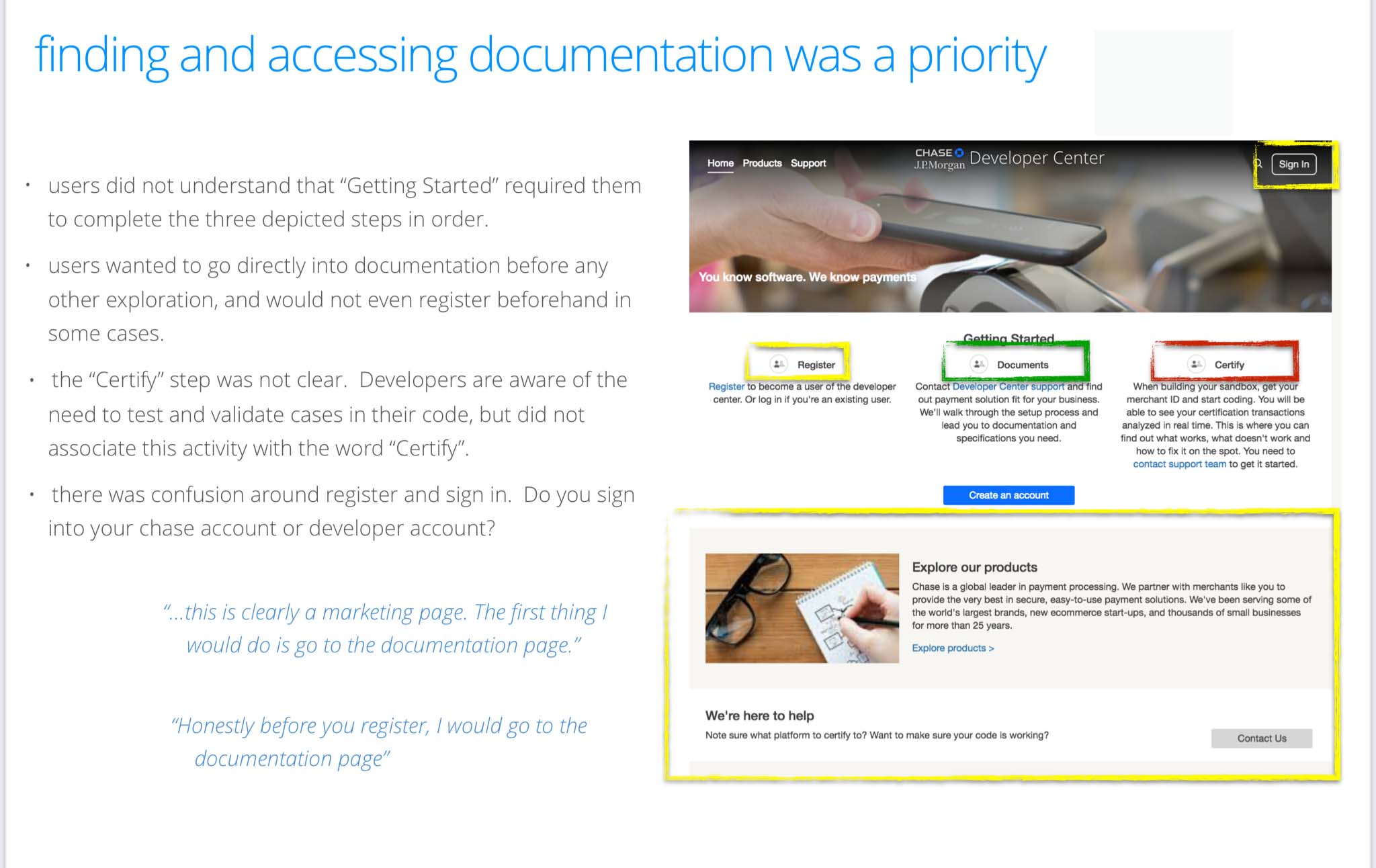 Generative research
Research · what makes great DX
“No marketing fluff. Just get me to the docs and code.”
Our first generative testing asked what best-in-class DX looks like. The feedback was blunt: no marketing fluff, just get me to the docs and code — and “Stock images, really?” Two best-in-class names came up again and again: a Google-esque feel, and Stripe most of all. We knew this couldn’t be generic — that’s the direction we’d pursue.
Exploration · finding the feel
A loaned creative director, and a whimsical bet.
I took the research to my Chase business director, who loaned me his creative director. She showed a few illustration feels as exploration, and my team and PO chose the whimsical feel we believed would delight developers — a placeholder for a feel we could, and did, actually deliver. To produce the real replacement illustrations, we hired a vendor.
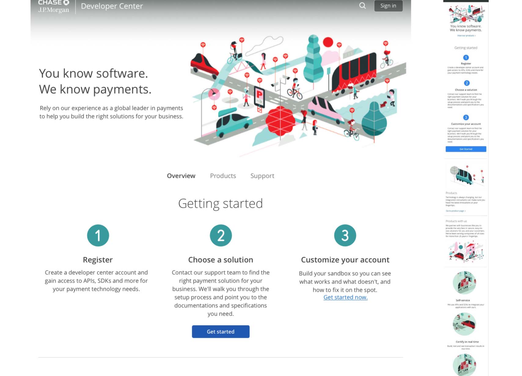 Placeholder feel · exploration
Delivery · the Dev Center redesign
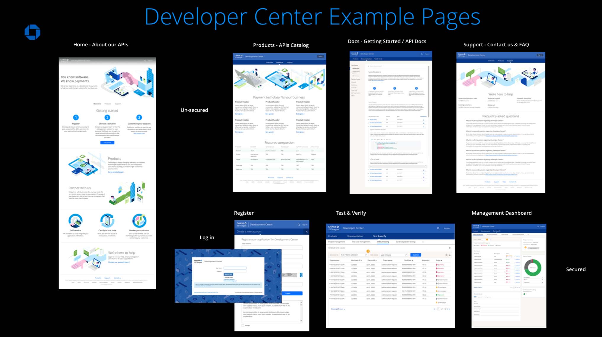
Sketches to actuals — web, mobile, and the MVP journey.
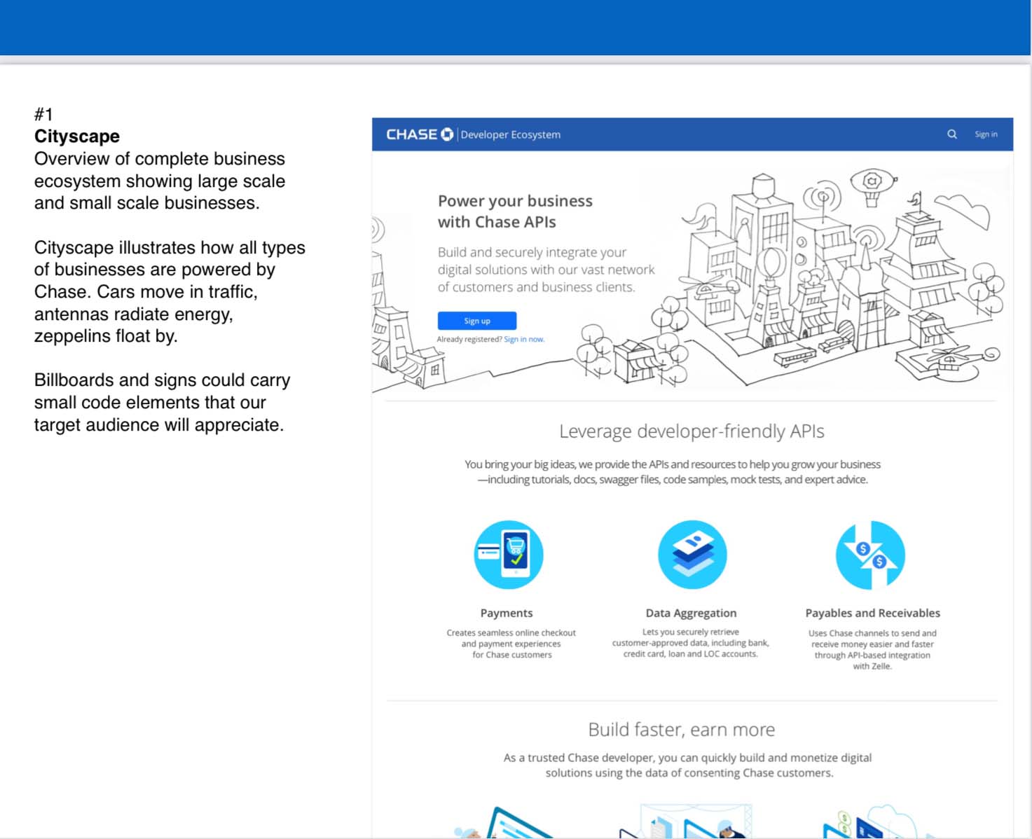
We directed the vendor’s illustration sketches for approval before actuals — and handed the full mocks to developers for build, assets marked placeholder, so engineering could proceed in parallel while the real illustrations were produced. The redesign shipped across web and mobile, off a single MVP user journey.
Final design deliveries with the new brand
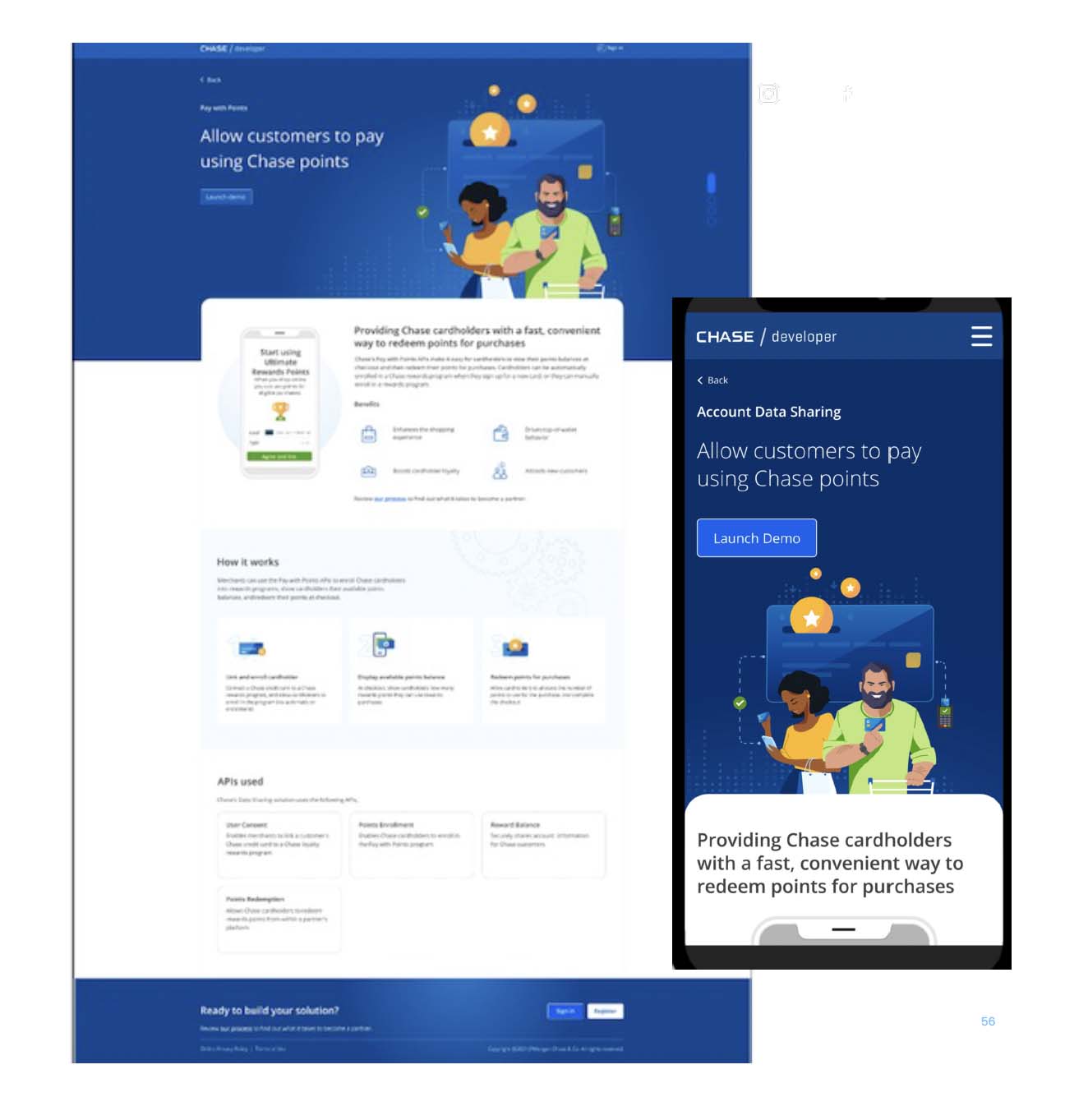
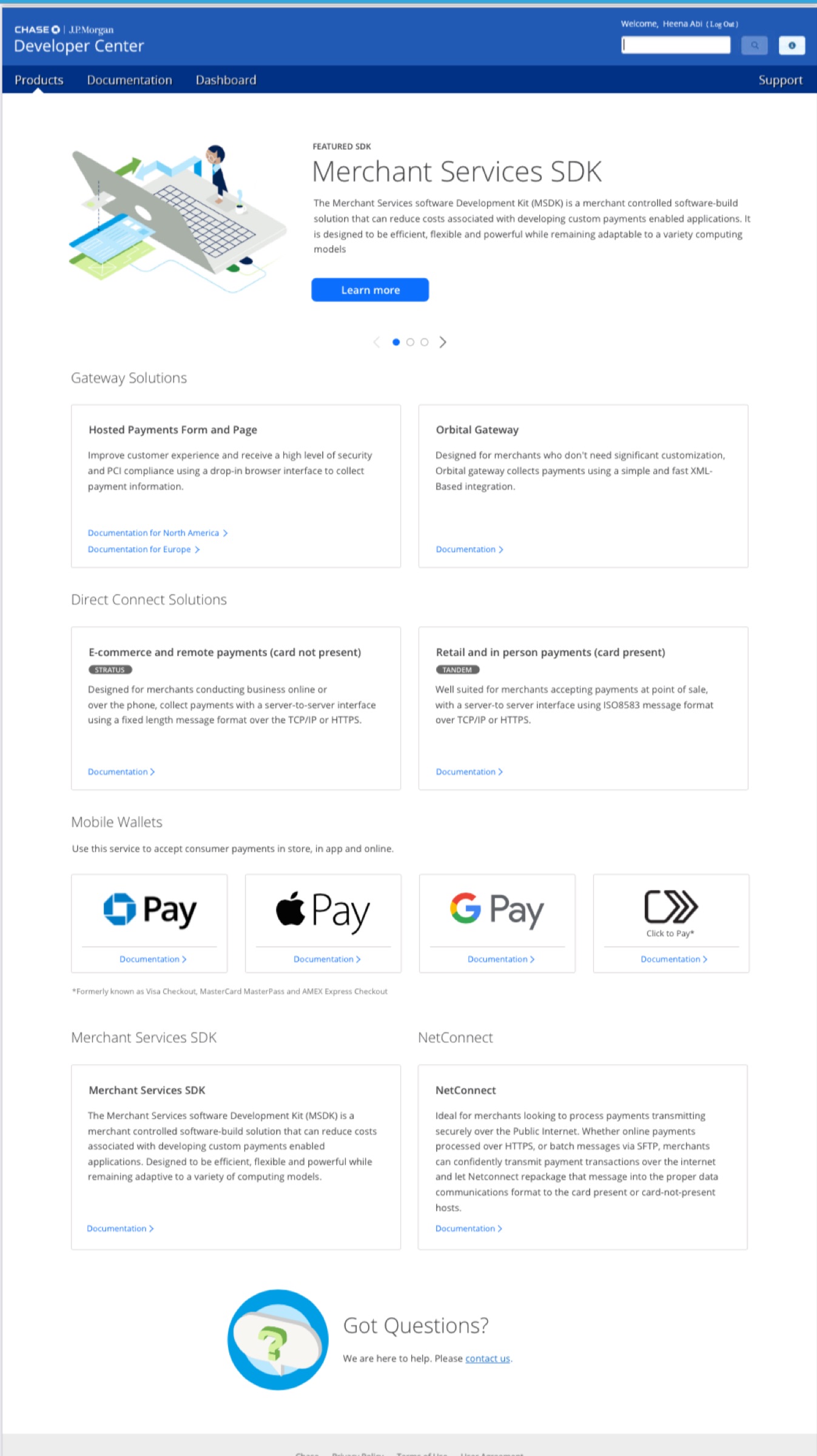
The vendor sketches captured the rationale for the feel. Beside them, the final deliverables with the new brand — the full user journey, and the product page in web and mobile.
The mandate · Developer Ecosystem
One API store for the whole firm — sponsored by Jamie Dimon.
From that delivery, the Head of CCB came to me: there was a desire to build one API store for the entire organization — would I take it on. Initially called Developer Ecosystem, it carried Jamie Dimon’s sponsorship: many lines of business building APIs as services for partnerships, and APIs built across the company for efficiencies — so one application to discover everything already available.
JPMorgan’s initial initiative was a private, internal list of APIs — click one to see its Swagger API doc — with a basic Swagger-with-description publisher in the back end. What was missing was the experience: the journey to open this up to external partners with entitlements. That’s why Chase came in as a partner, with Jamie Dimon’s sponsored push — so each line of business didn’t reinvent the wheel.
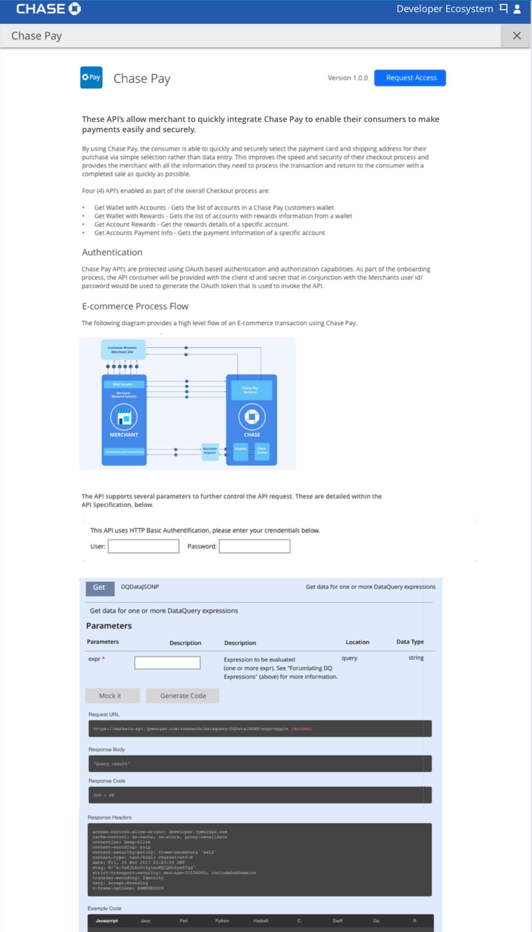 MVP · doc publisher + API list
The unlock · one app, flexible brand
One application, multiple storefronts — skinnable by brand.
One unified brand was the obvious ask. What actually shipped was smarter — one system, skinned per brand.
The compromise that unlocked it
We explored what one unified brand might be, but JPMorgan, Merchant Services, and Chase were all hesitant — JPMorgan especially: a strong brand, different users, and partner businesses that weren’t at first accepting of our explorations. Their point was fair, though: different users mean different communication and tone. Merchant Services — just delivered, and without APIs yet — wouldn’t be a stakeholder in defining this unification.
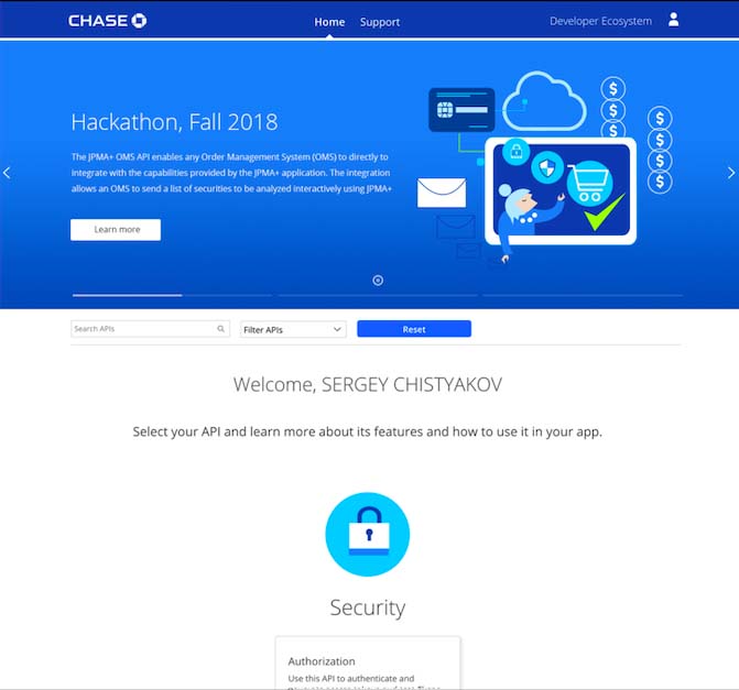
That freed me to propose another model: one application, multiple storefronts — skinned per brand, each with its own pre-sign-in front door — built to scale to more (as the later J.P. Morgan Payments storefront shows). At first it was just me and one other designer: an MVP deliverable plus the future-vision strategy. Once we aligned politically, we shipped a white-label version to get APIs to entitled partners — until we built the front-door marketing and onboarding, which comes next.
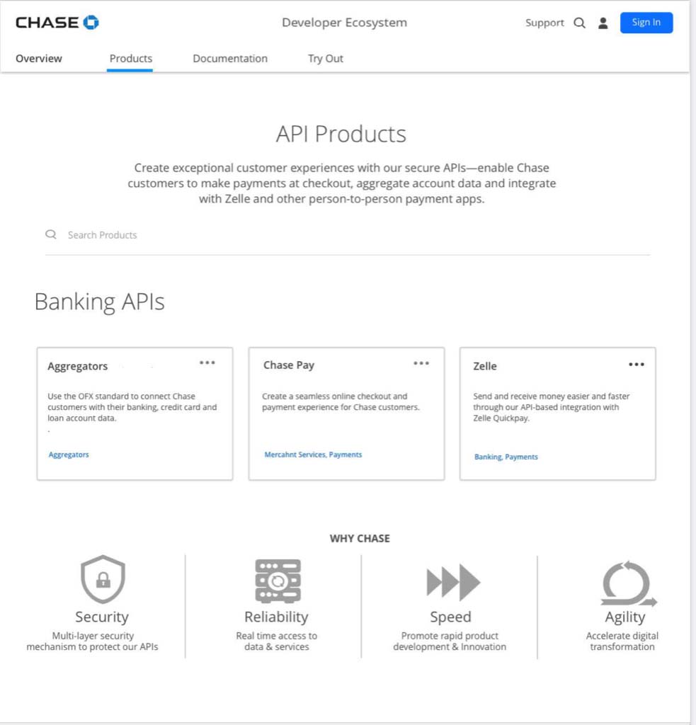
Explorations
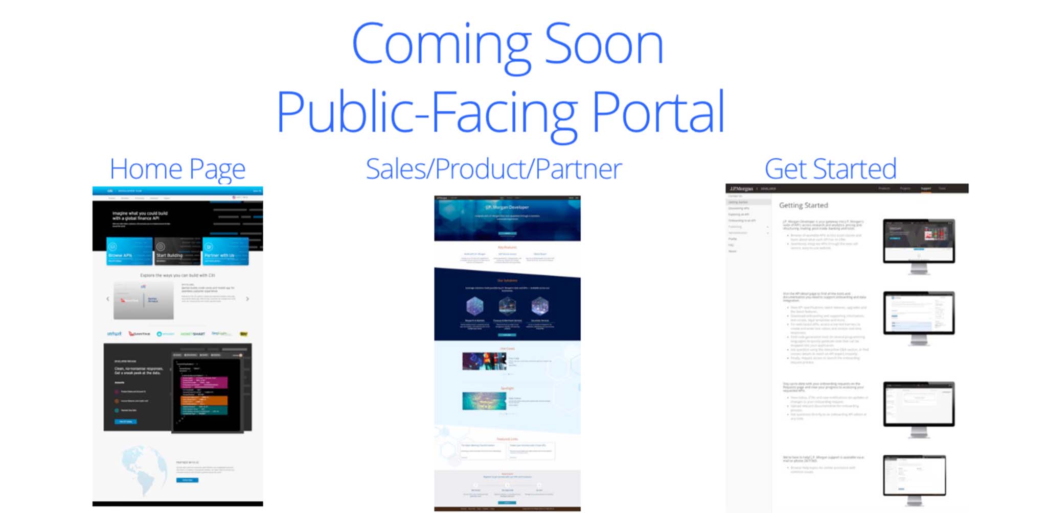
Scaling · the team
A one-designer MVP, scaled into a platform.
As it grew into a multi-year initiative, I built a team to match — and shaped the brand around what the content actually needed.
Built for dense content
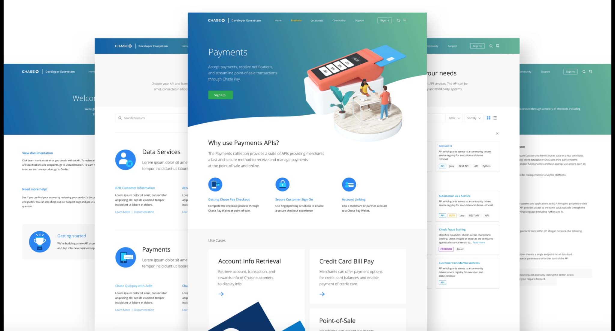
What we learned shaped the brief: as much as this had backend publisher needs for API consumption, it was heavy on marketing material for API products, docs, and getting-started guides — dense content that needed visual cues. I’d already learned I wanted a minimalist yet illustrative, Google-esque feel — so I had my Creative Director design in the same feel as Dev Center, hoping Merchant Services could integrate later without a redesign.
She designed the illustrations, the marketing, and mobile — and we pitched why we were proposing this direction.
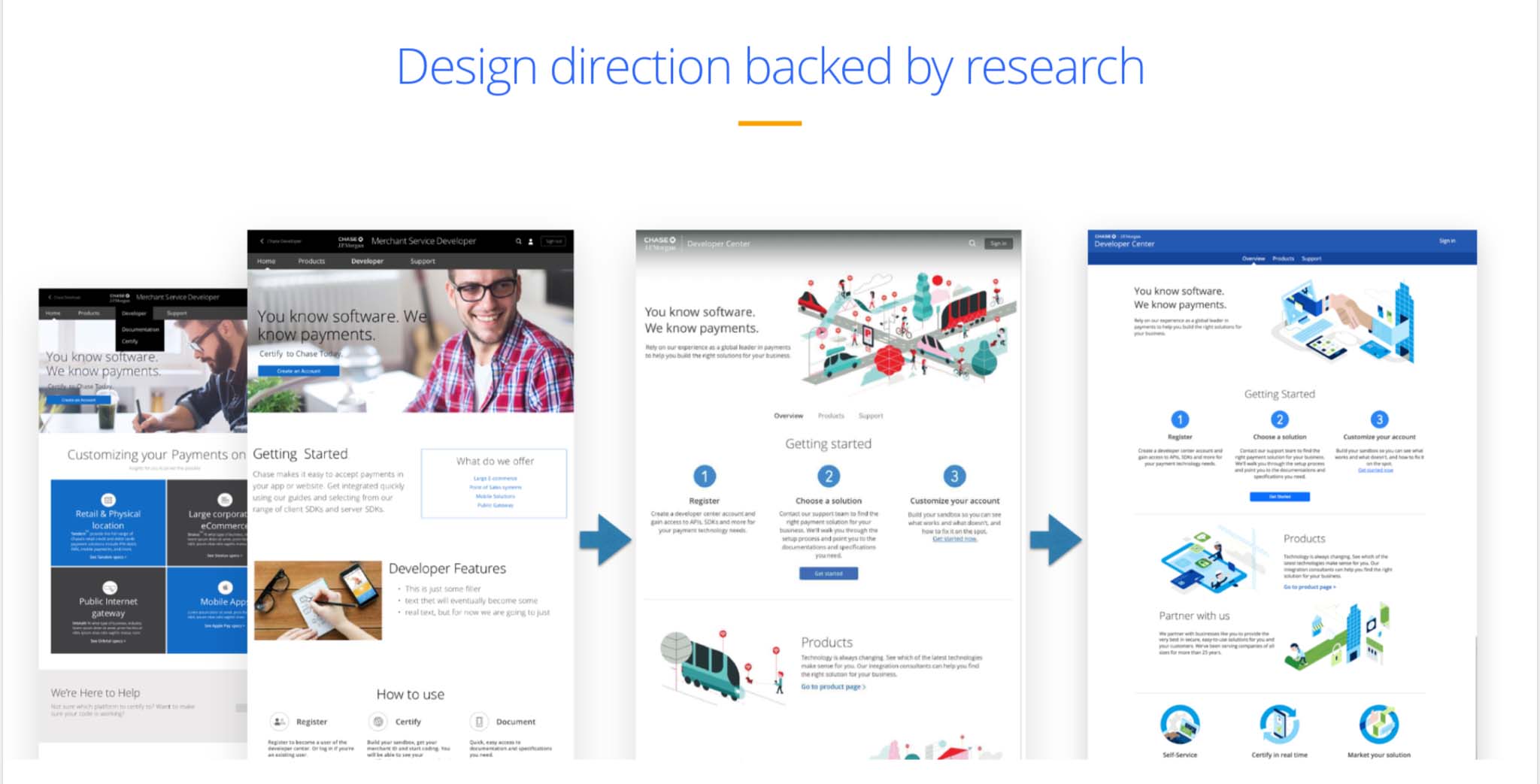
Visual language proposal
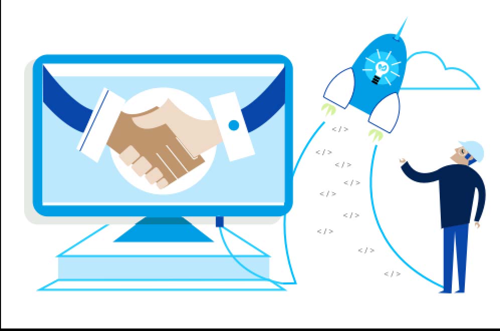

The team I hired and grew: a design lead (enterprise designer), 2 UX designers (one a creative director I’d grow into UX, one a complex-systems thinker), a researcher I split with the Dev Center work, a content strategist, and a tech writer.
One application · two storefronts
Two brands, two URLs, one system underneath.
Two brands, two front doors
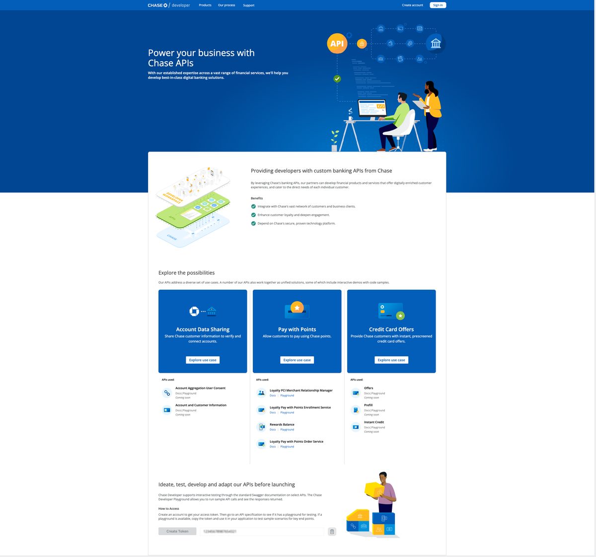
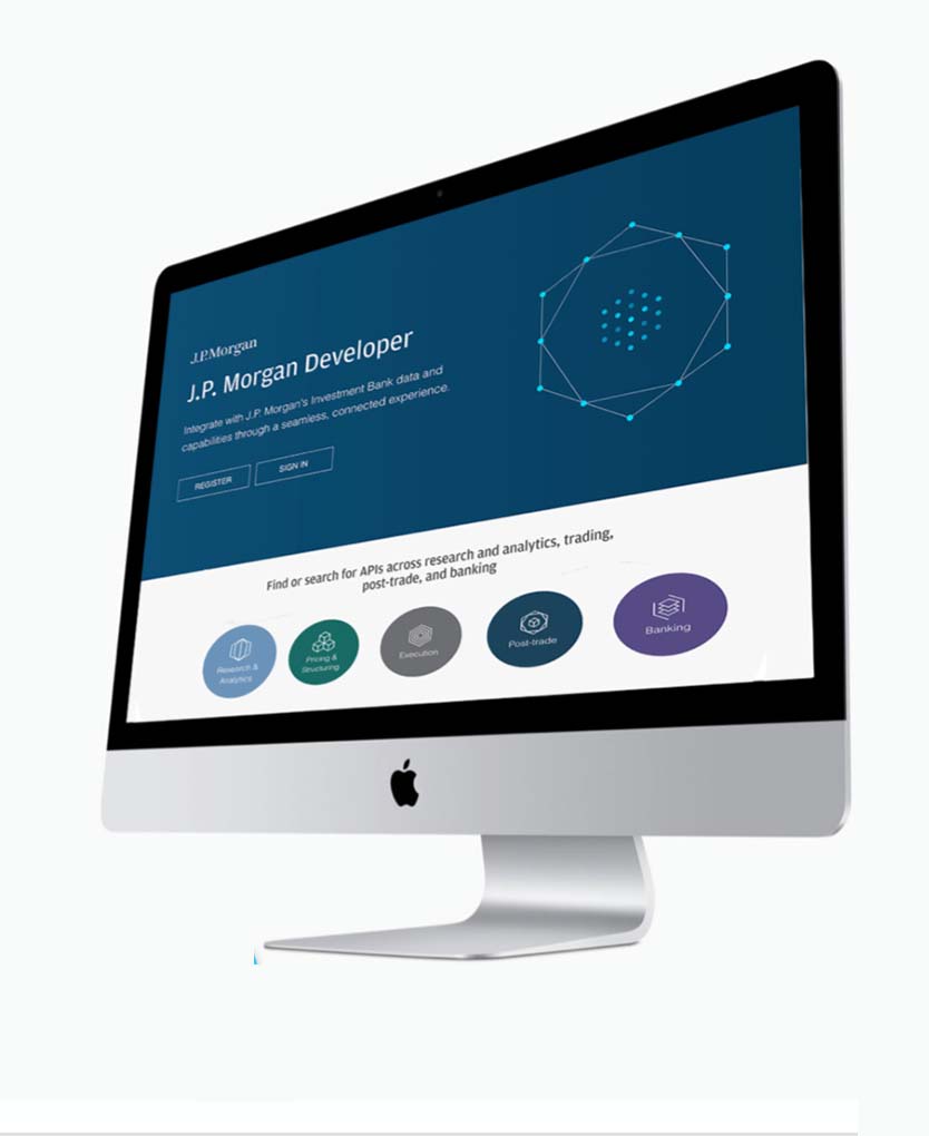
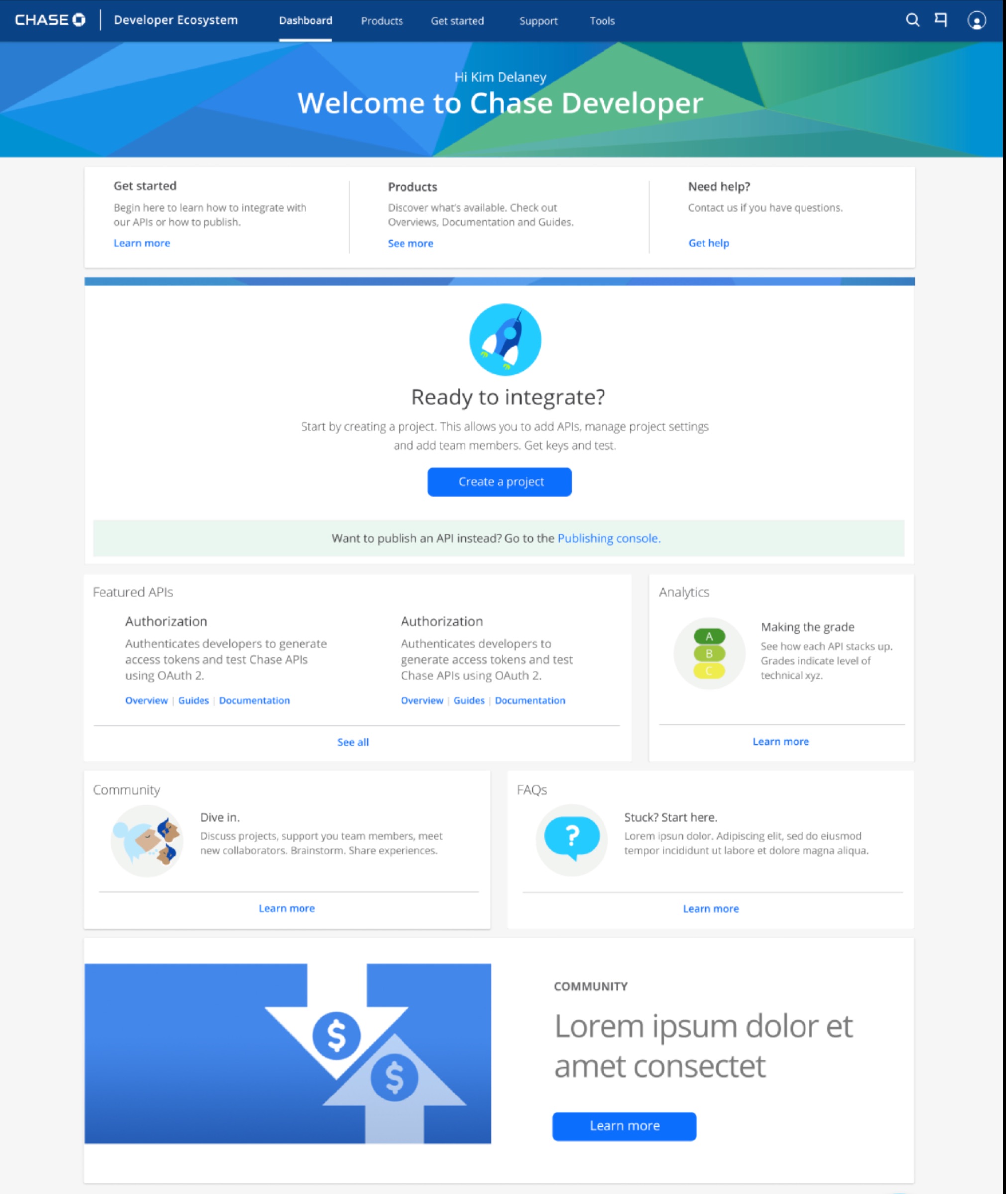
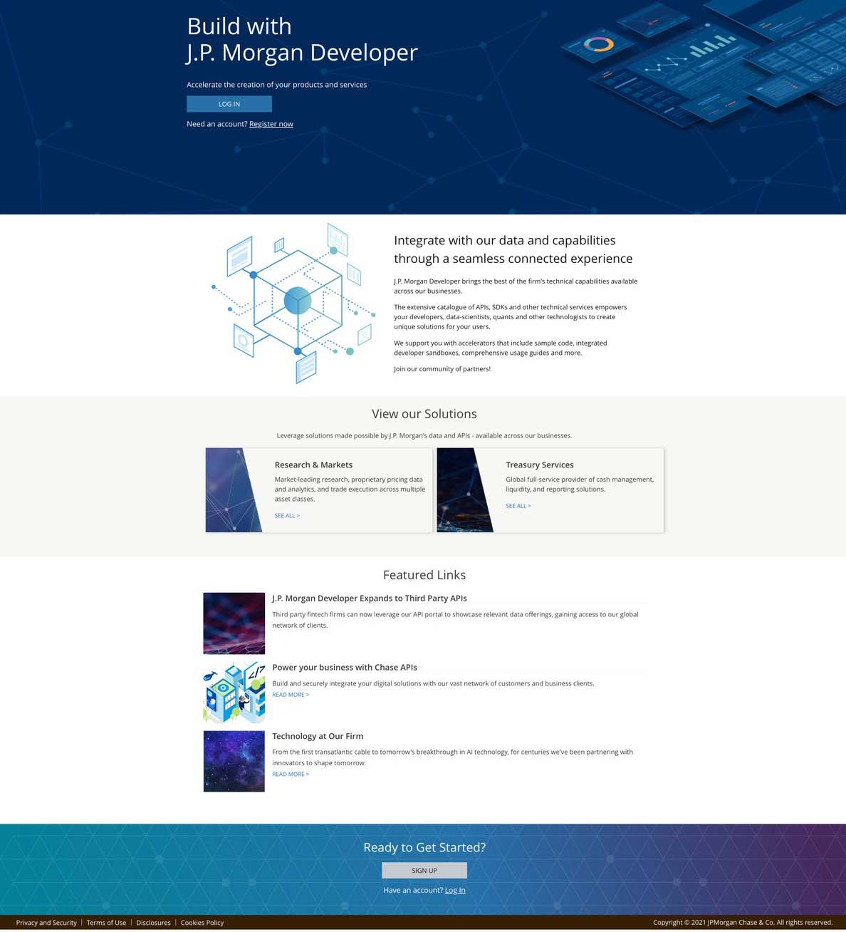
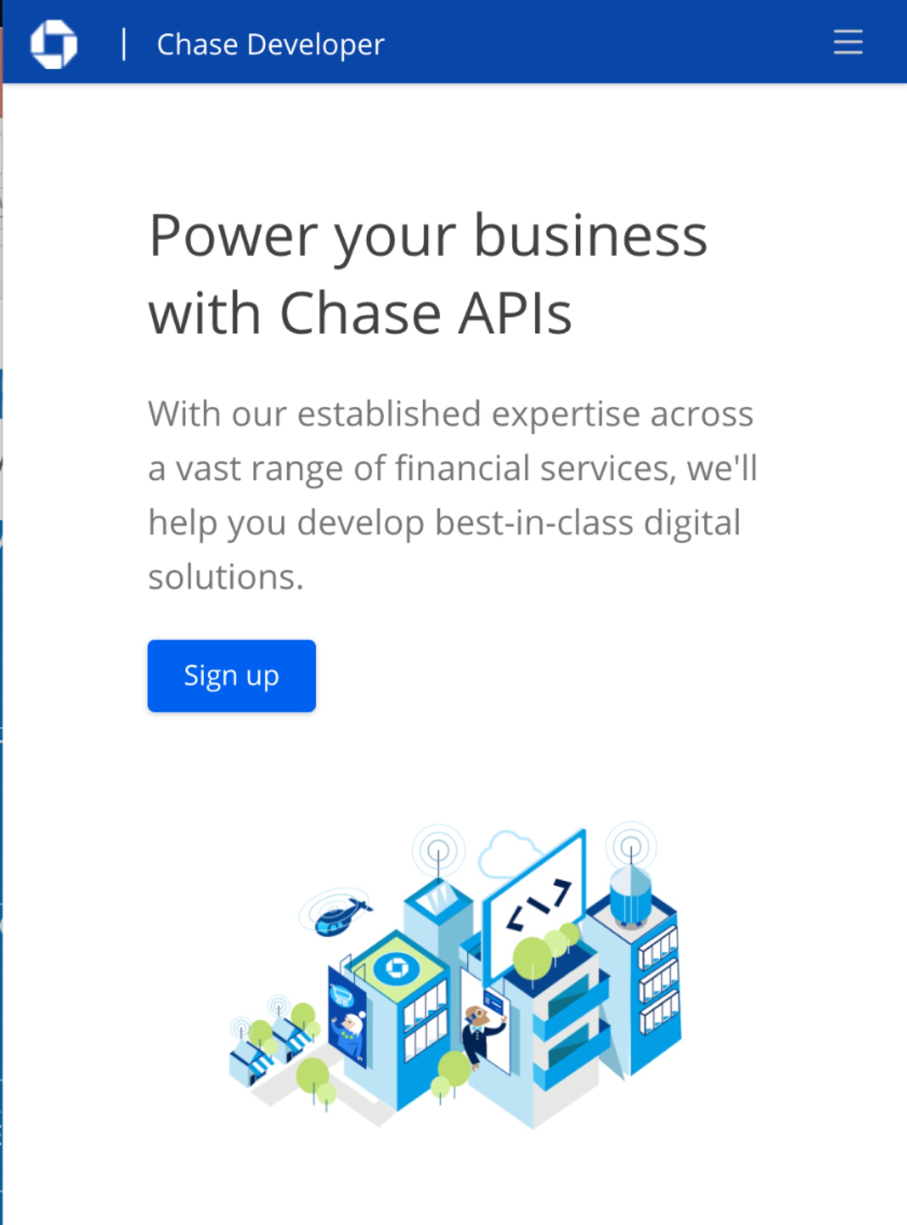
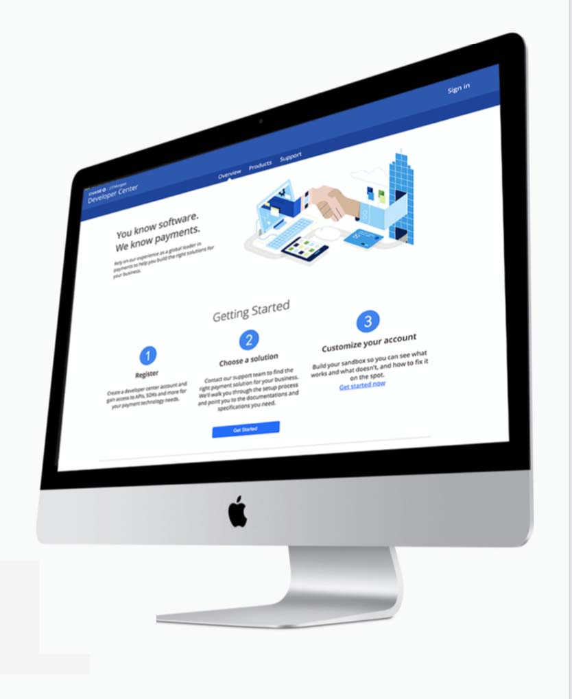
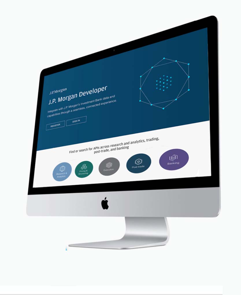
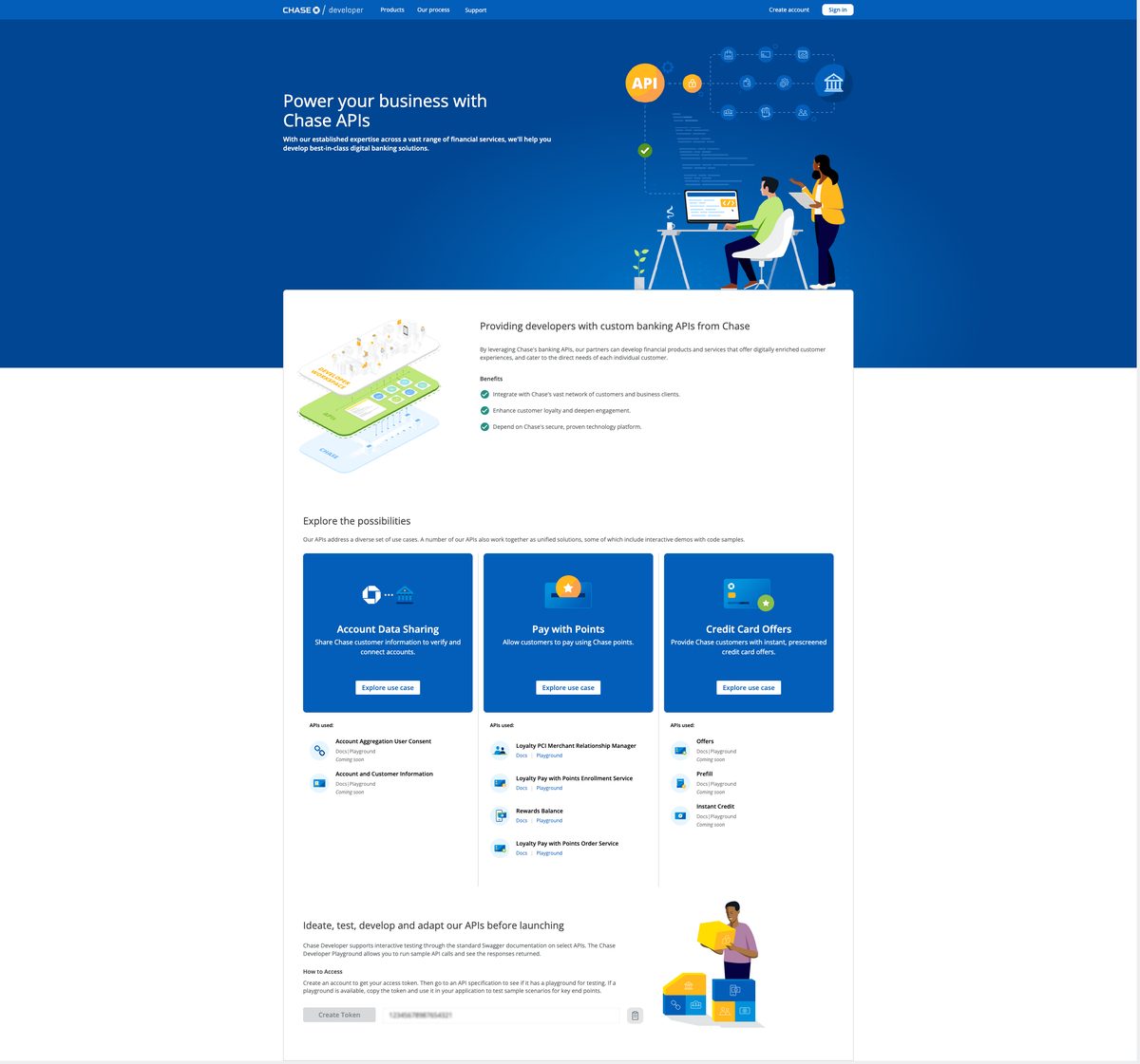
This is where the two identities diverged in public. Chase Developer kept the illustrative, developer-first feel; J.P. Morgan Developer leaned more corporate and enterprise for its partner-business audience — different users, different tone.
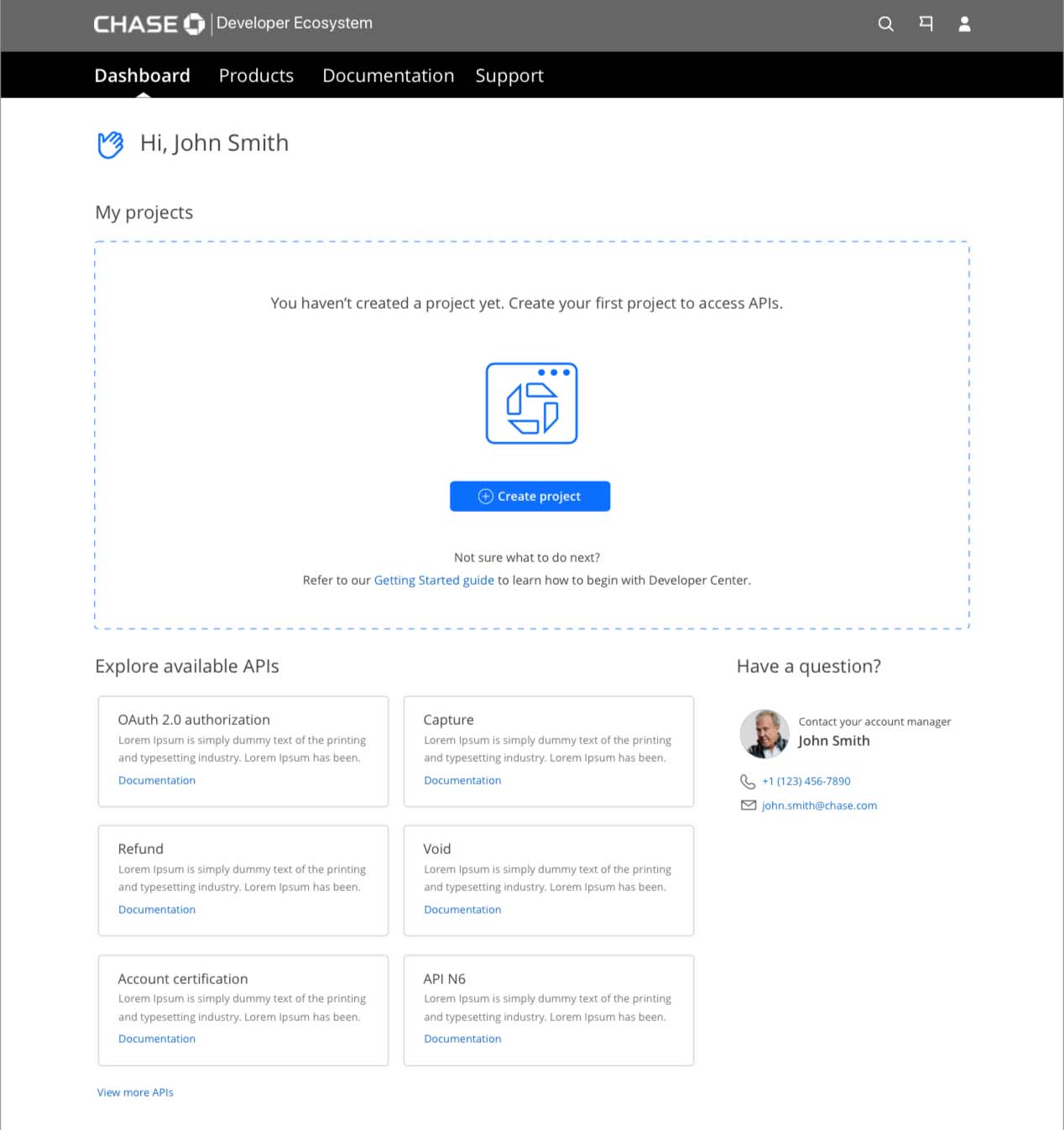
Behind both front doors sat the same application — the post-sign-in ‘create a project’ dashboard, skinned per brand. Same components, same system; only the brand layer changed.
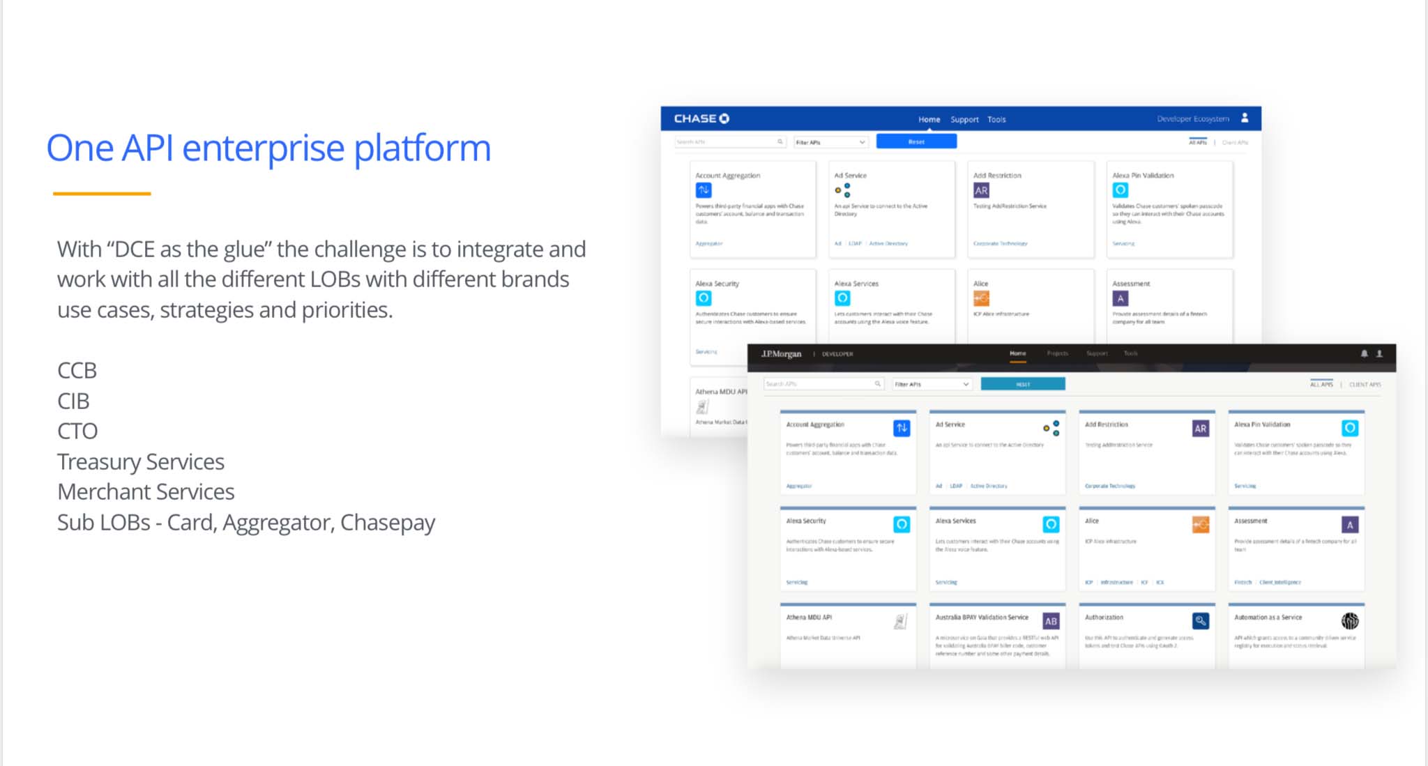
Final storefront designs — two brands
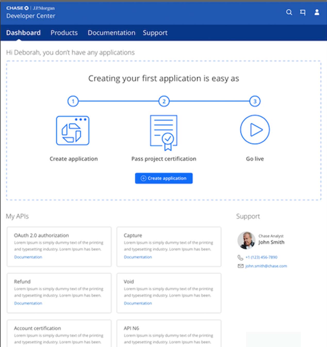
One application
So: one application, skinned per brand — the post-sign-in “create a project” landing rendered for each storefront. The internal library kept growing, carrying private and partner APIs on one application — and the model was built to add more storefronts over time.
The Branding DX proposal & process · password-protected
What else you’d review in the deep dive
With two storefronts live, the work turned to winning a public GA and closing the last gap between the experience and the brand. That proposal — and the design process that carried it — continues in the deep dive, along with how the same playbook extended beyond Chase. Here’s what’s inside; the launch and the result are below. View deep dive →
- Toward GA · the spectrum pitch — “Not a bank feel,” so I brought the whole brand spectrum.
- GA · going public — the real partner journey, and docs written to fit each reader.
- Chasing the final feel — the 3D exploration, and why I chose not to use it.
- The system scales · new storefronts — how the one-app model kept adding brands.
The GA proposal & the design process
The spectrum pitch that moved leadership off “not a bank feel,” the partner-journey work for going public, the craft exploration behind the final look, and how the system scaled to new storefronts.
Beyond Chase · Amazon
The same brand playbook applied at Amazon scale — shown abstracted, since parts are under NDA or not yet public.
The win · public interactive docs
The illustrative feel that won — and docs finally public.
Then the payoff: the feel I’d fought for shipped, the docs finally went public, and the work earned its recognition.
The feel that won
Finally I hired my visual designer, and with the release of VIP interactive docs — now public (something we’d argued and pushed for all along; making docs public was a legal and security fight it took me and my next Sr. Product lead to win), the illustrative Chase Developer feel shipped. You can still view it today at developer.chase.com.
JPMorgan evolved too, and Merchant Services eventually joined — with its own front door at developer.payments.jpmorgan.com.
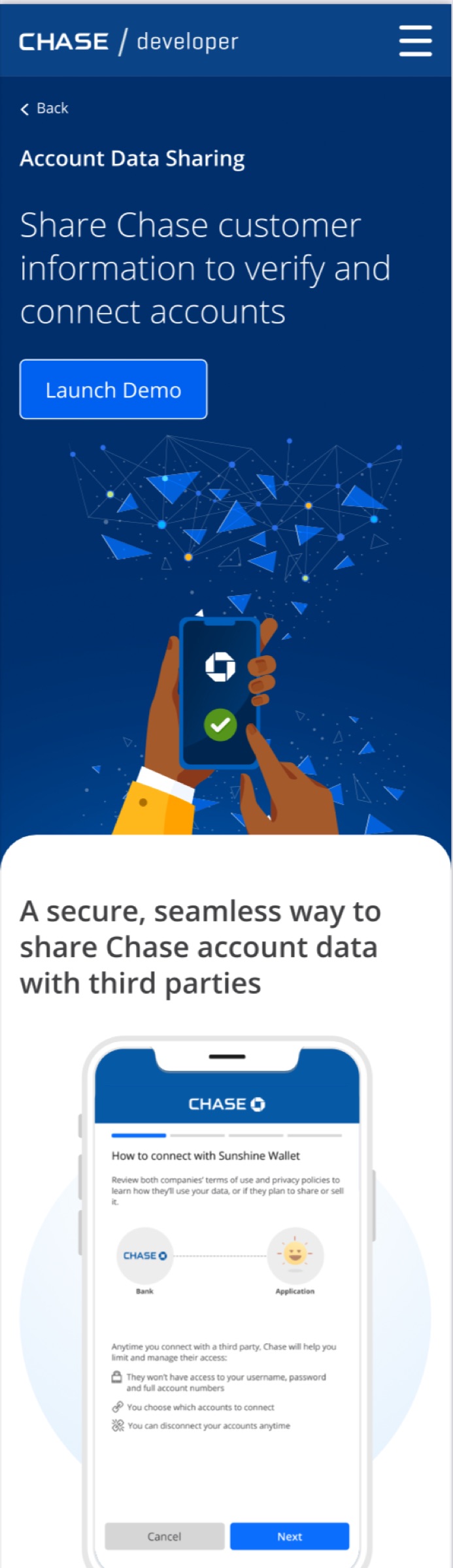
The recognition
DevPortal
Awards
Special call-outs — Best Visual Design & Best Accessible DevPortal
The illustrative feel I fought for shipped, the docs went public, and it’s live today at developer.chase.com. 2022 DevPortal Awards, via Pronovix.
The results · the firm moved
Three years of “not our brand” — then the firm adopted it.
2022 DevPortal Awards
Special call-outs — Best Visual Design + Best Accessible DevPortal
Docs made public
Won the legal + security fight to open the documentation
Still live
developer.chase.com, J.P. Morgan & MS — years on
Firm-wide adoption
My Creative Director promoted to Head of Brand; Chase adopted the visual-cue, illustrative direction
The results: the award’s visual special call-out, and the VIP interactive docs you’ll soon be able to see in Connected Banking. And the telling one: after three years of pushback that illustrations “weren’t our brand,” they promoted my Creative Director to Head of Brand for Chase.
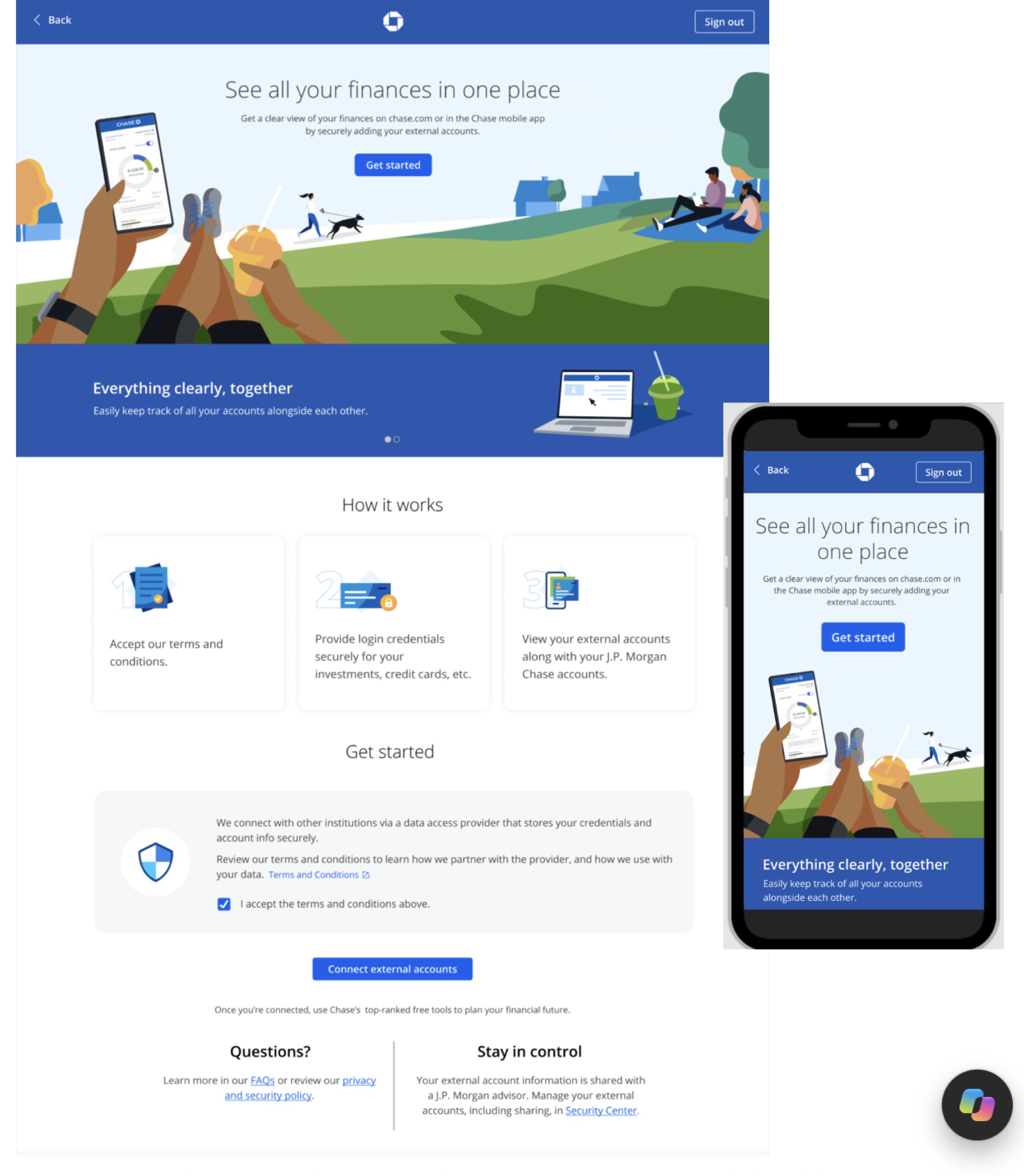
And the direction they landed on was the one I’d been pushing — and getting pushback on across Security, COVID, and this dev work: stronger education with visual cues. You can see it in my aggregation work now across Chase.com, Chase Mobile, and Chase Business. The whole org moved that way.
That’s the thesis proven in production: because it was built on tokens and a system, the brand could evolve without a rebuild.
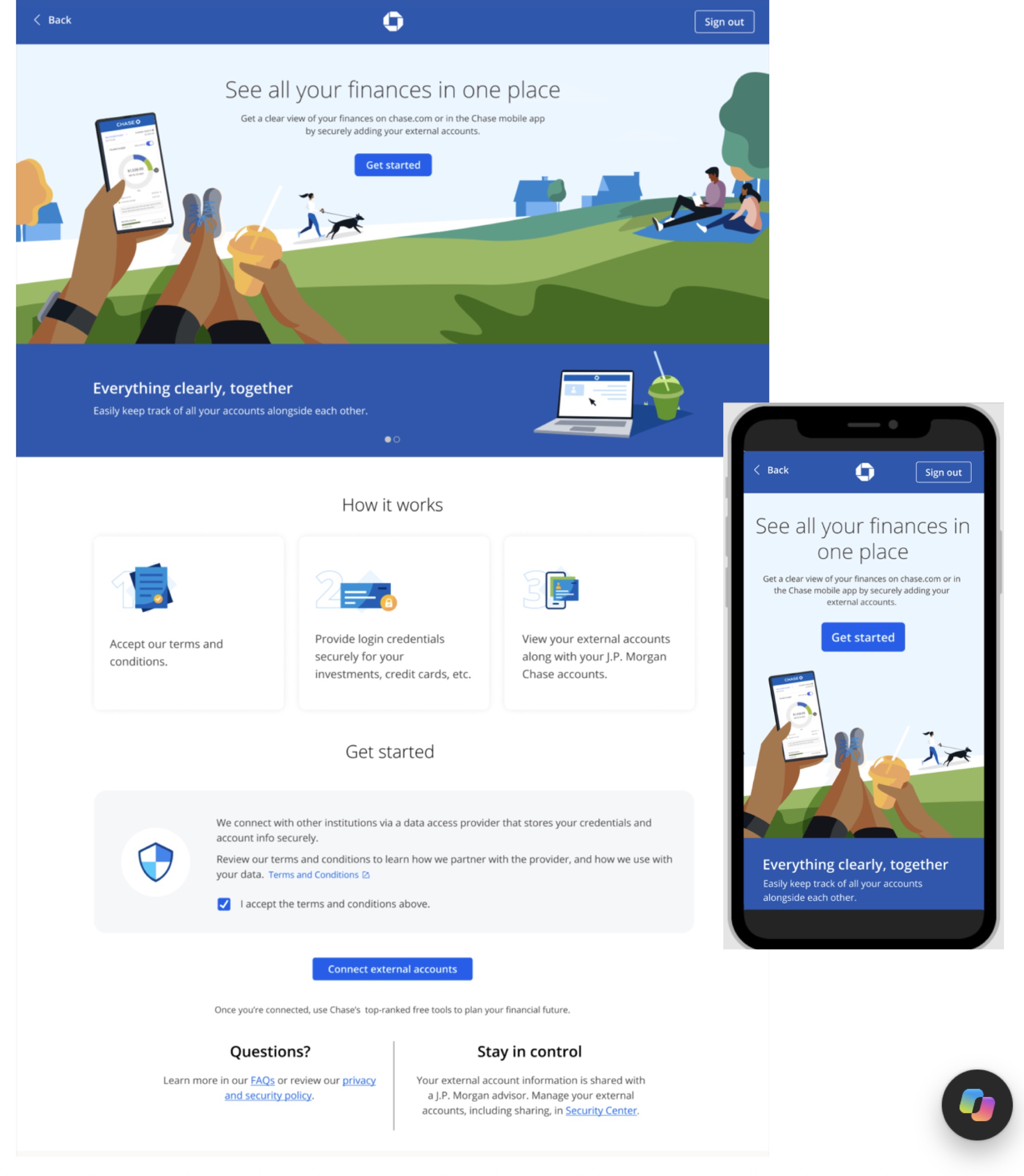 Aggregation · Chase.com / Mobile / Business
API Portals
One application, two brands — the shared developer & API platform this brand work was built on.
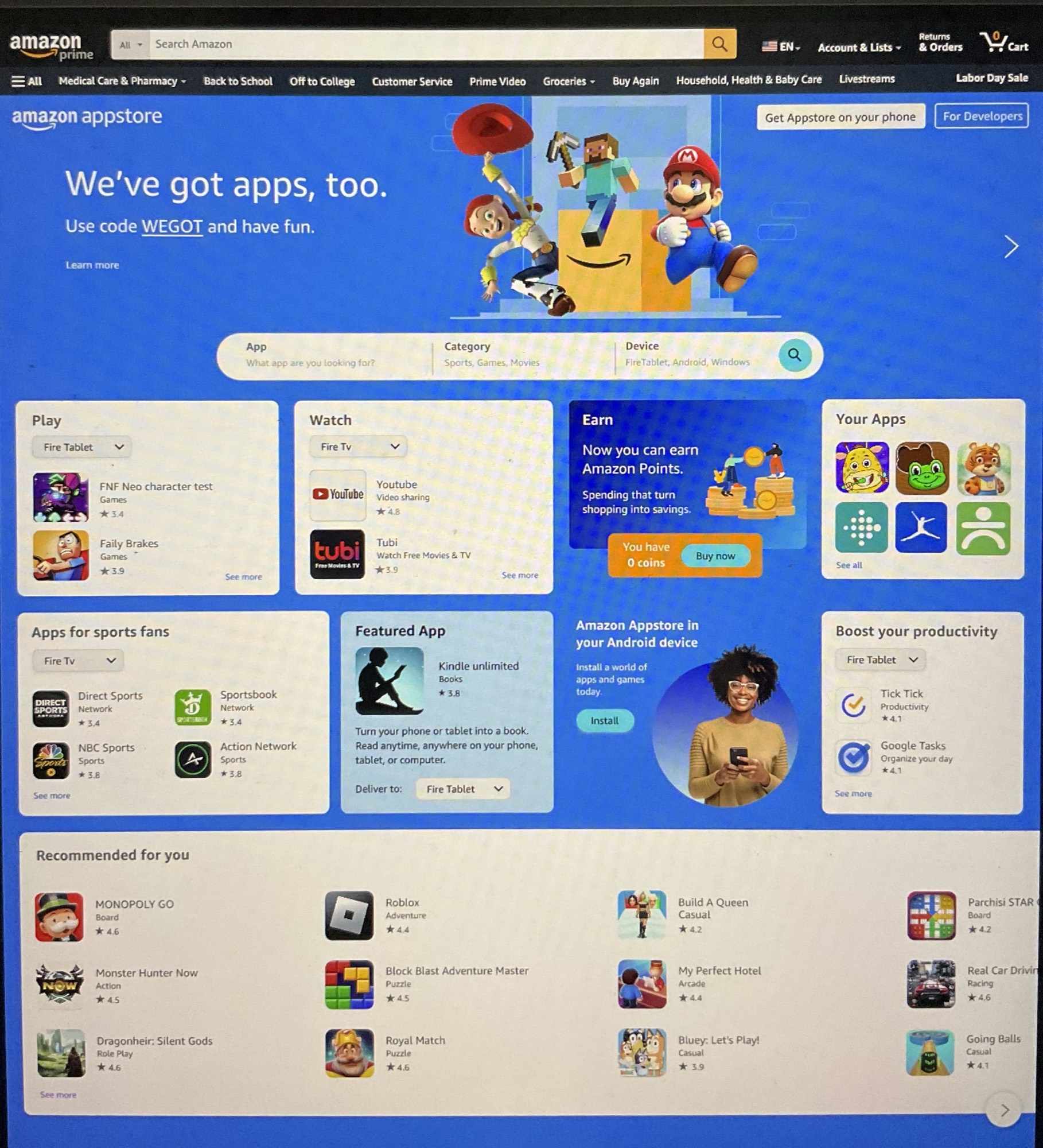
Amazon Appstore
The consumer store across Alexa devices — where the co-creation branding workshop played out.
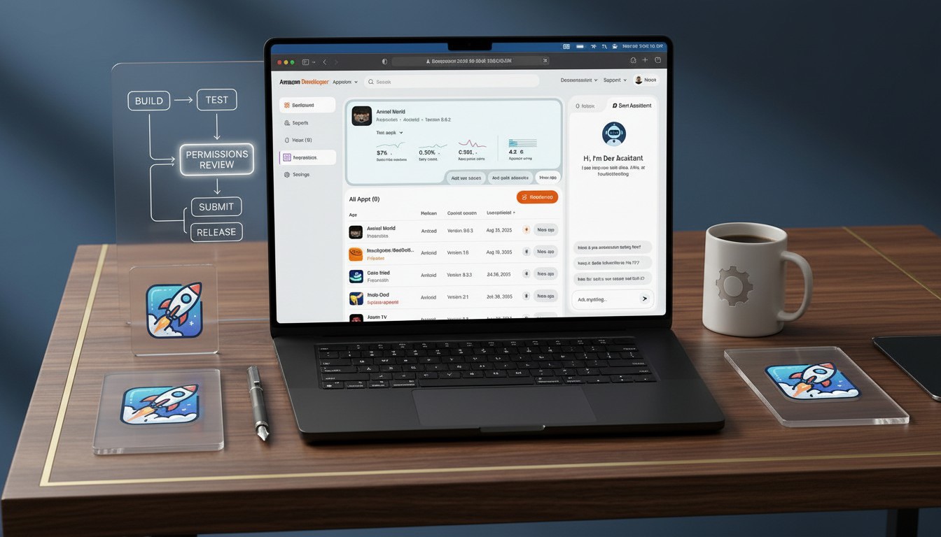
Amazon Developer
The developer platform rebuild — where the proposed rebrand continues the playbook.