

Case Study 01 · Amazon Appstore
Designing the Amazon Appstore
As a design leader on the Amazon Appstore, I led the consumer experience across every screen — directing the team, the research, and the strategy behind the work that follows.
An introduction to my Amazon Appstore work
Browse, discover, subscribe, and buy
The consumer Appstore — where customers shop games, apps, and subscriptions. Designed for the living room first, then adapted across Tablet, Mobile, and the web.
- Fire TV · Tablet · Mobile · Web
- Discovery → purchase
Outcome
The redesigned detail page — the store's most-visited page across every device — grew downloads 33%, and shared tablet/mobile components cut development effort in half; on-device subscription management was a first for the store.
Click any image to enlarge.
At a glance
Role
Head of UX, Amazon Appstore — strategic design leader and people manager who led UX for the consumer Amazon Appstore on Alexa devices, leading the design org — design leads and UX designers across the space — for over three years
Scope
The consumer Appstore — the storefront (output) side, including its brand & marketing; across Fire TV, Fire Tablet, Mobile, Web & Automobile
Also leading
Concurrently led the Amazon Developer platform (the developer/input side), plus the systems and tooling behind it — Fire TV & Fire Tablet design systems, internal enterprise tools for Fire TV (1P enablement), AI tooling for design-system automation, and 3P manufacturer HIG & support
Skills
Design strategy · Design systems · Information architecture · Cross-platform UX · Research-driven case-making · Stakeholder prioritization · People management
Images here are of publicly-shipped product. The deeper work behind the password was done under NDA and is shown abstracted or recreated; figures are directional. Full detail available on request.
How I worked
I led the strategy, the process, and the teams
Every initiative below could be its own case study. Together they show the breadth of the space I led — and the many leadership decisions it demanded, each owned end to end with a consistent approach.
The more unknown or complex the initiative, the more rigor — early market research up front, and usability testing after the concepts. What follows is the range of that work across the ecosystem, and the many leadership calls behind it — what to build, what to unify, what was worth the resources, and what to push back on.
Design leader and program manager in one. As Head of UX here — with no PM support — I ran the intake, scoping, and project plans for how we’d ideate and deliver each ask; even the centralized enablement team leaned on me as that rare design-plus-program-manager hybrid. It traces back through scrum-mastering and running delivery for a 40-person small-business team at Chase, to my development days, where I learned to scope resources and complexity accurately. Design ops isn’t instinct for me so much as institutional knowledge — earned from wearing every one of those hats — and my managers have repeatedly named it a core strength: not just the leader who gives reviews, critiques, and coaching, but equally strong at driving deliverables to the finish.
For how I run design ops & systems, see the deep dive →Cross-Device · Ecosystem
One store, every surface
The same store, working across very different devices — each one designed for how people actually use it, without fragmenting the whole.
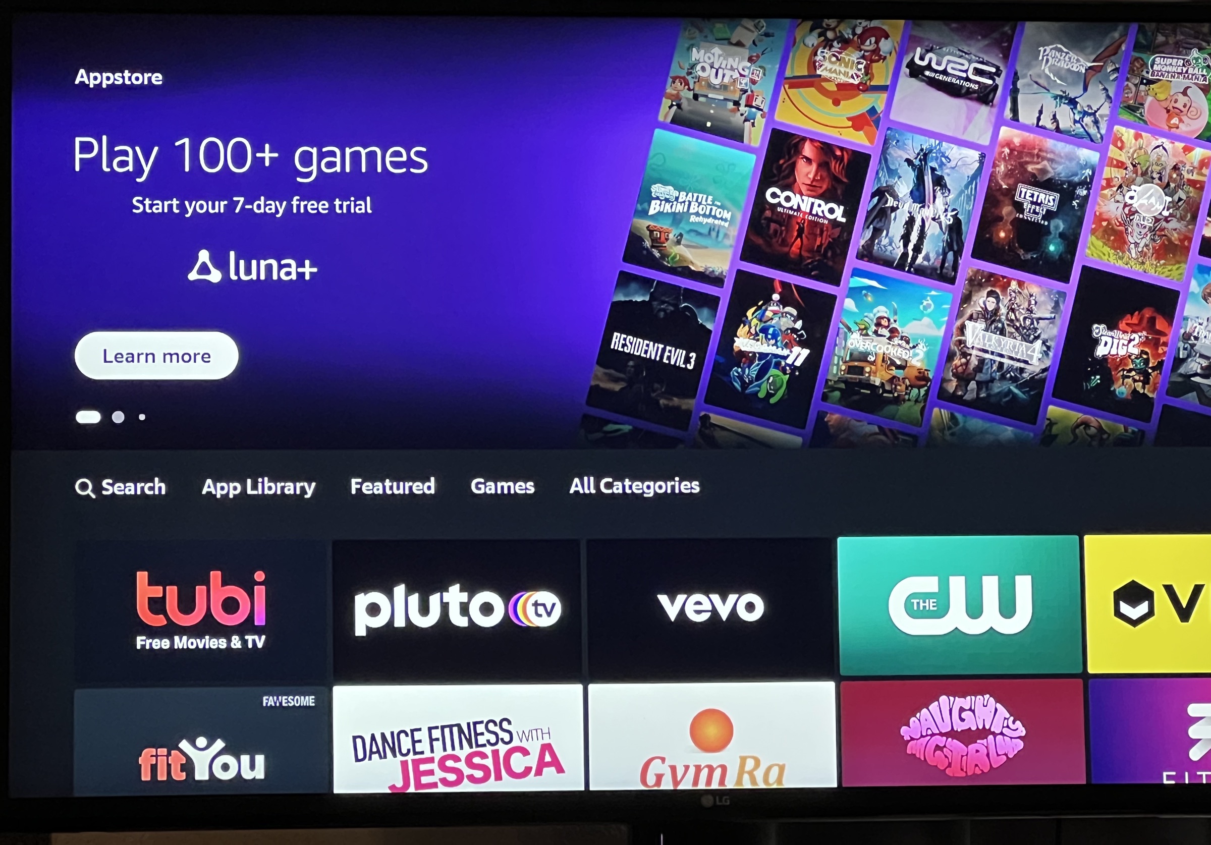
Fire TV
10-foot, remote
Big, browsable rows you can read from across the room.
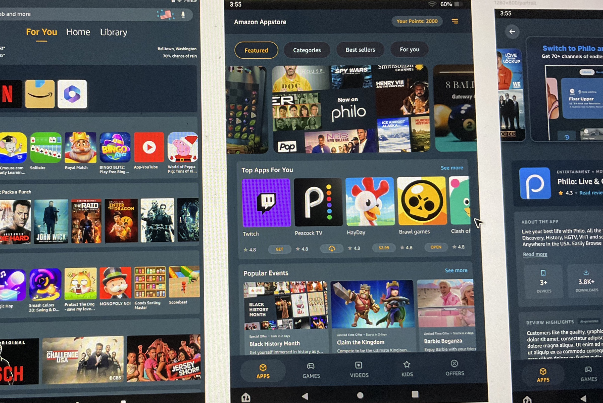
Fire Tablet
Touch
More apps and content on screen at once.
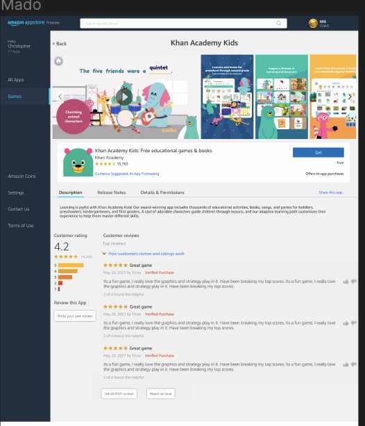
Mado · Windows
PC game play
Buying and playing PC games is why we came to Windows — and an Amazon sign-in makes the buying easy.
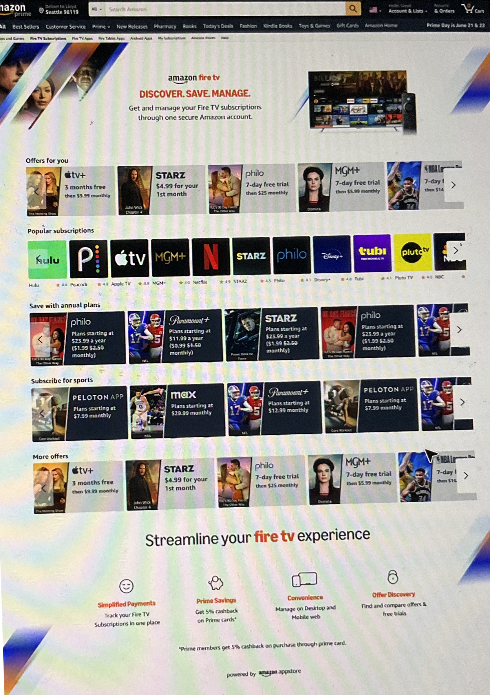
Web · Amazon.com
Retail channel
Sell subscriptions where customers already shop, then send them to the device.
Amazon Mobile
One-handed
Designed for one hand, with fast touch payment.
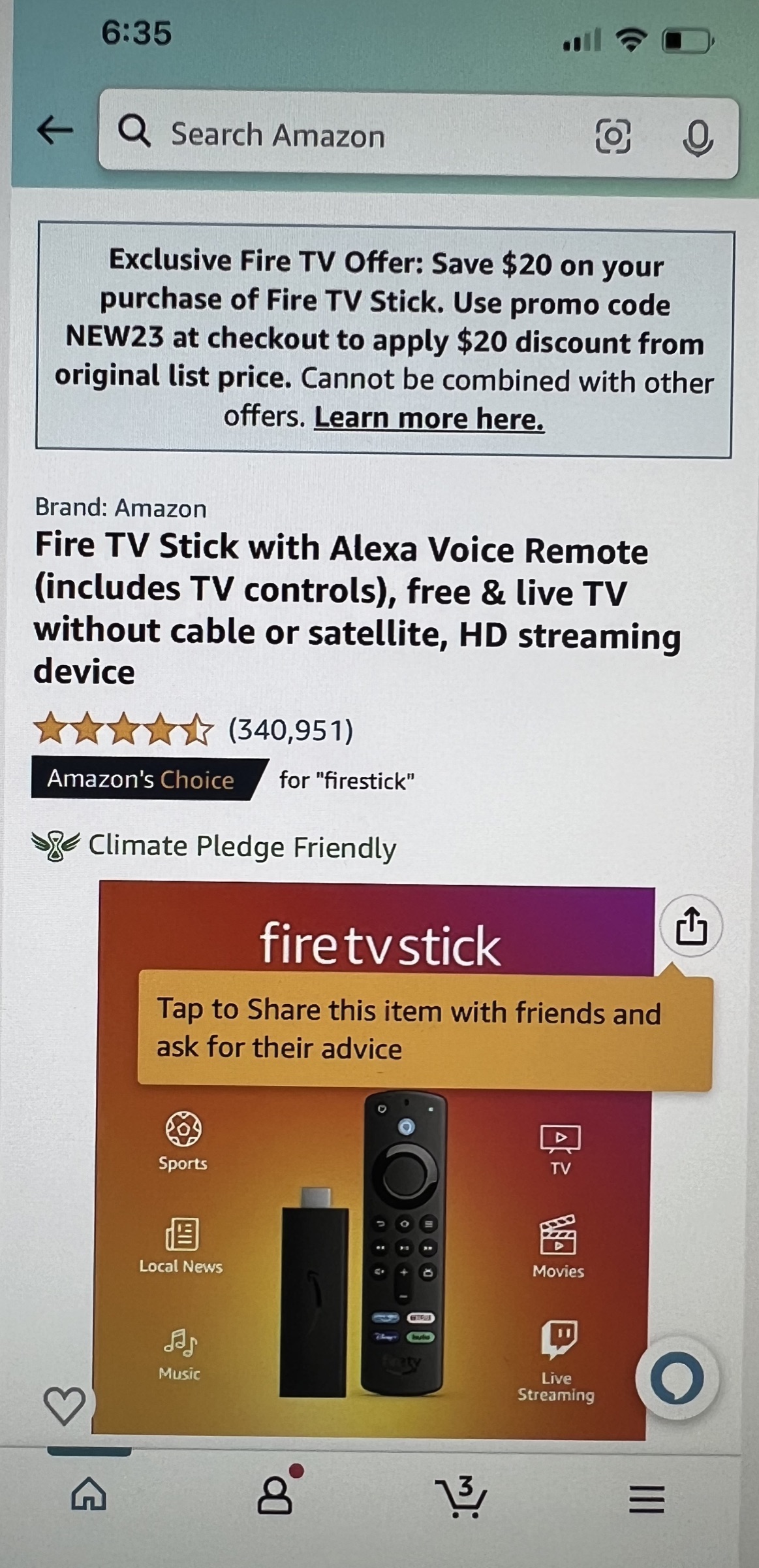
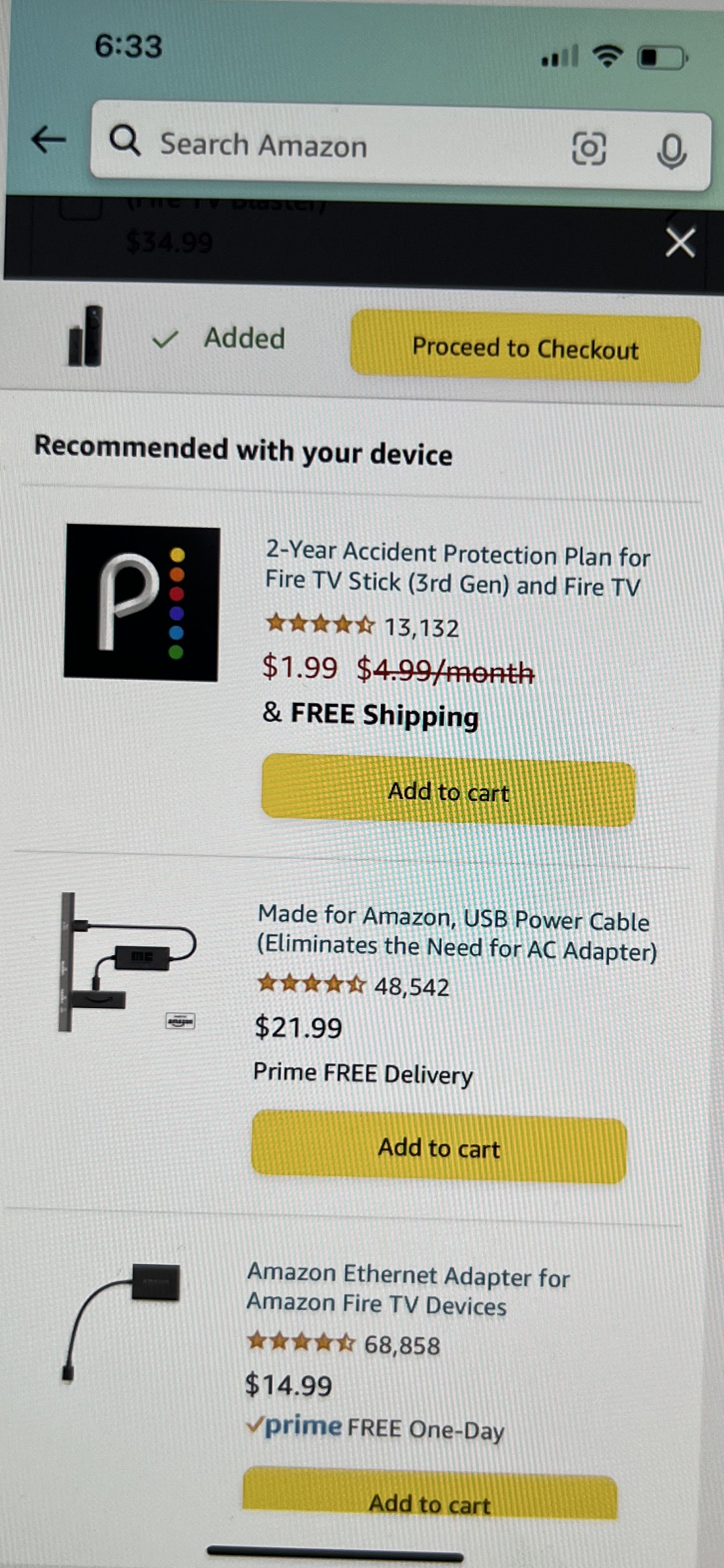
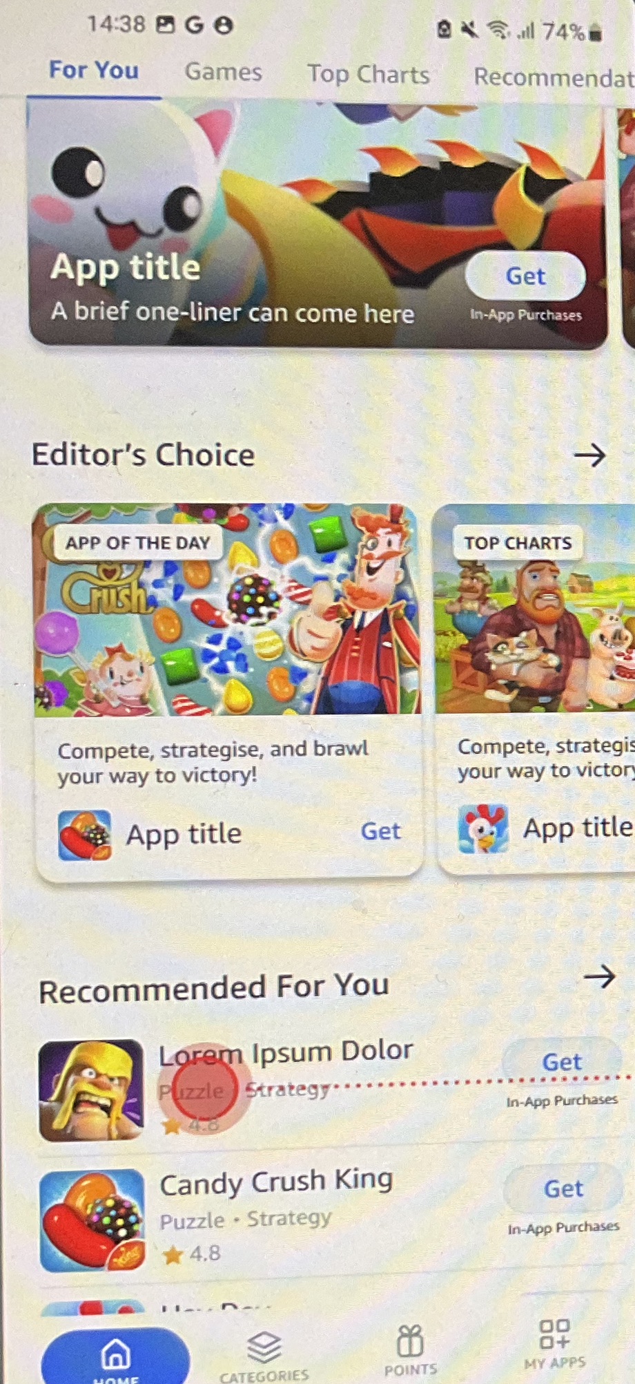
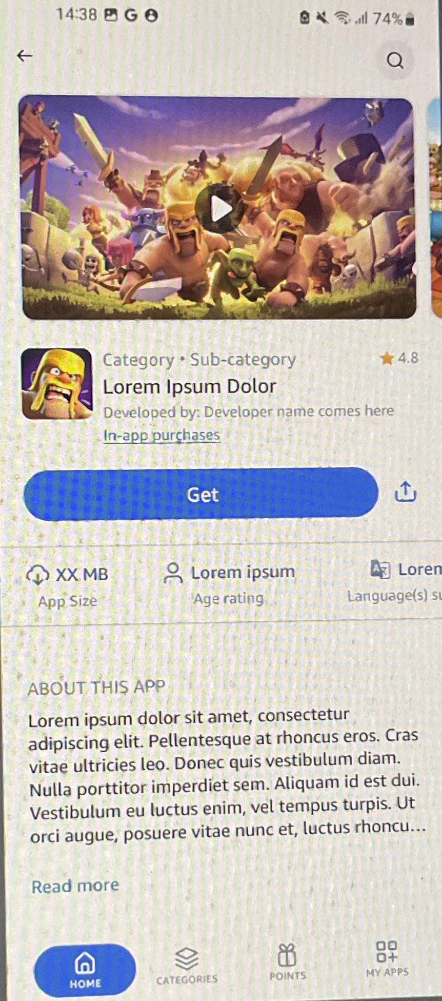
“Hollywood” Mobile
Standalone app
Downloadable on Android.
Automobile
In-car
The store built into the car’s dashboard — simple and glanceable, designed to be safe to use while driving.
My full scope
The consumer store was one of three pillars I led — paired with the developer platform that feeds it, and the marketing that takes it to market.
Also led
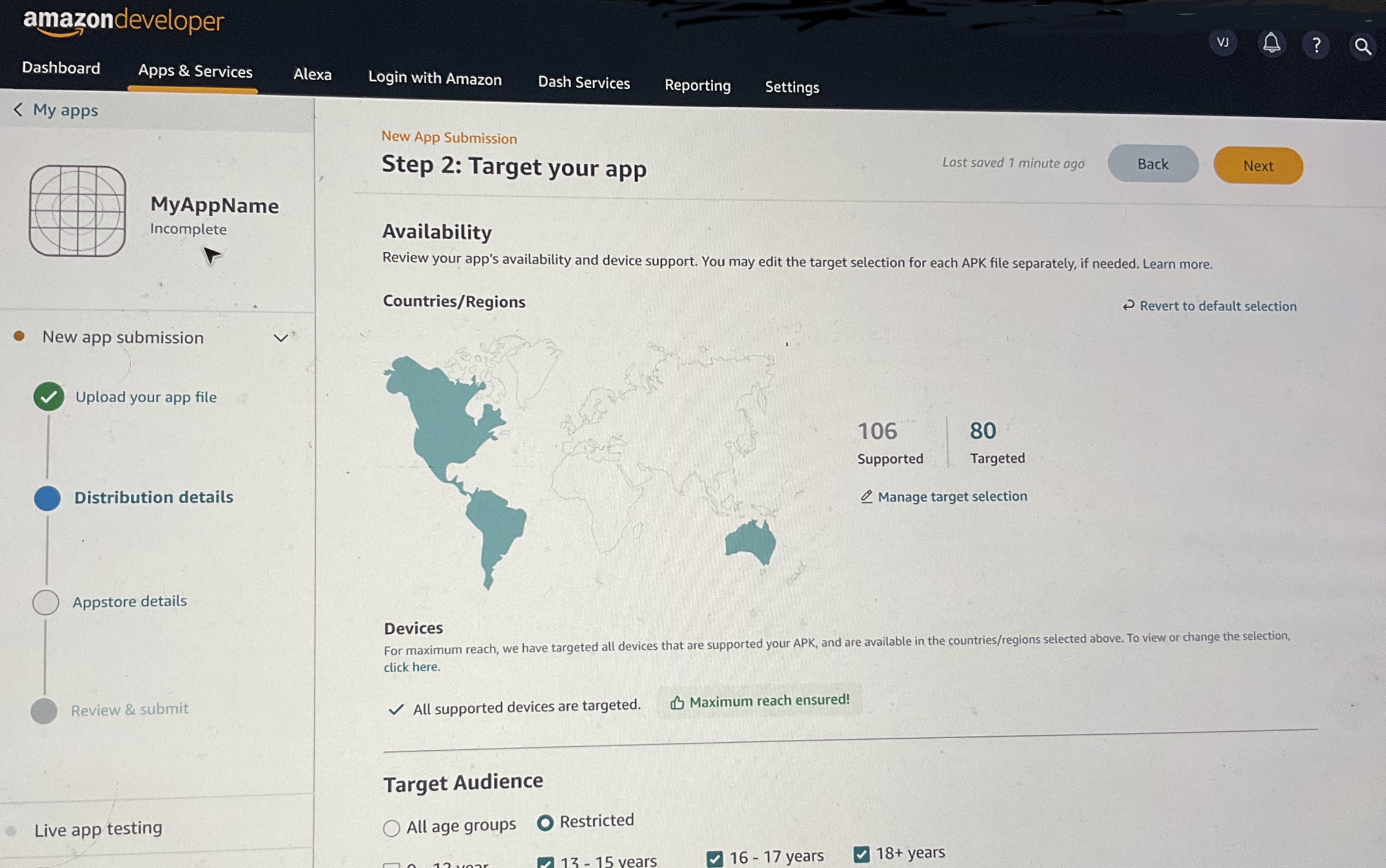
Amazon Developer portal
The input side — where developers submit, monetize, and analyze. I led enablement across first-, second-, and third-party developer teams, and “Redex” — a major brand and workflow rebuild.
Also led
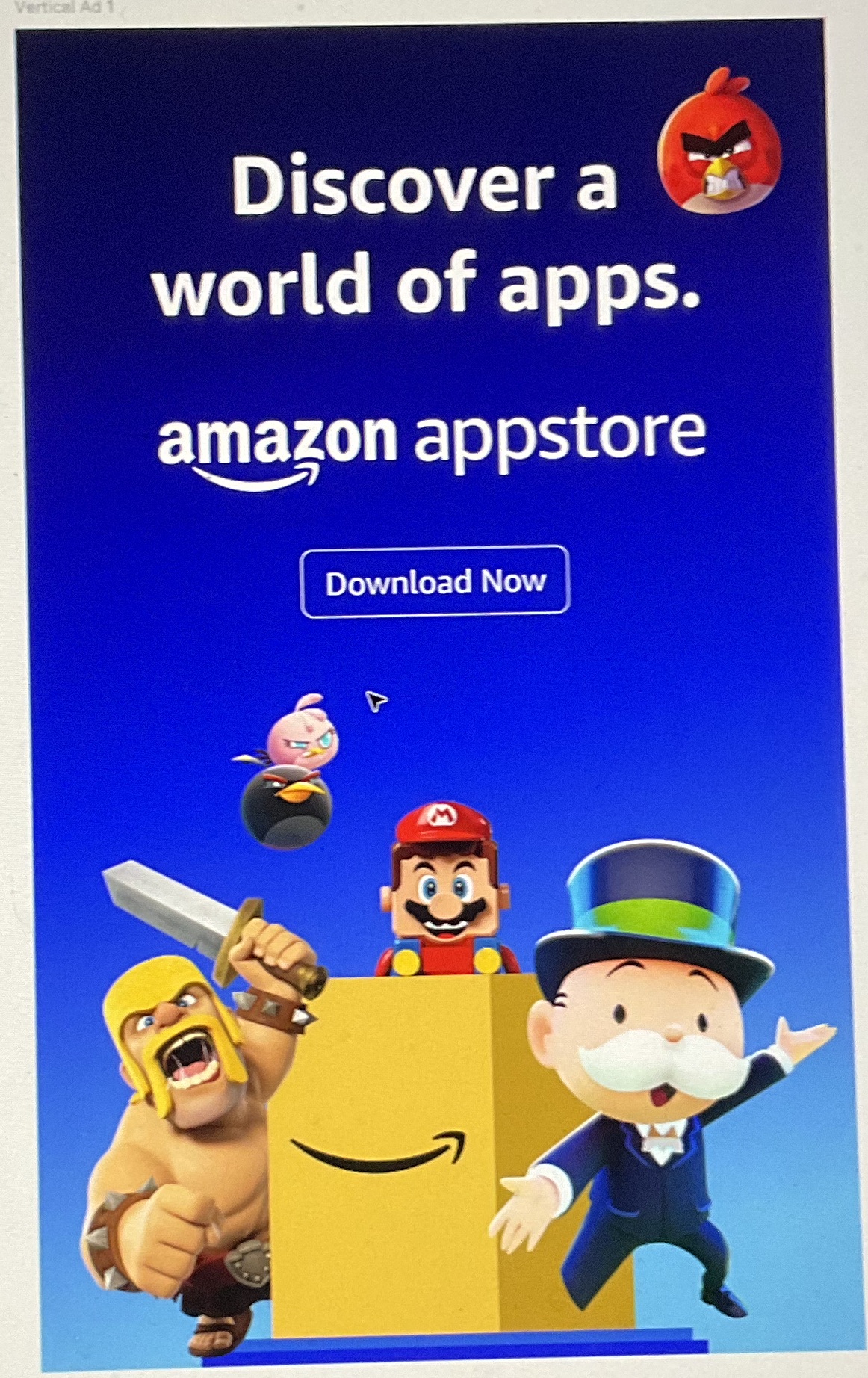
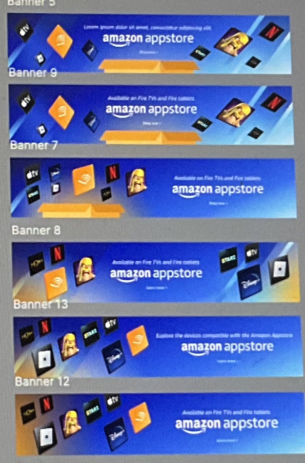
Brand & Marketing
Built the Appstore’s first brand and led marketing across surfaces and global markets.
Acquisition · Amazon.com — Where It Started
Web discovery
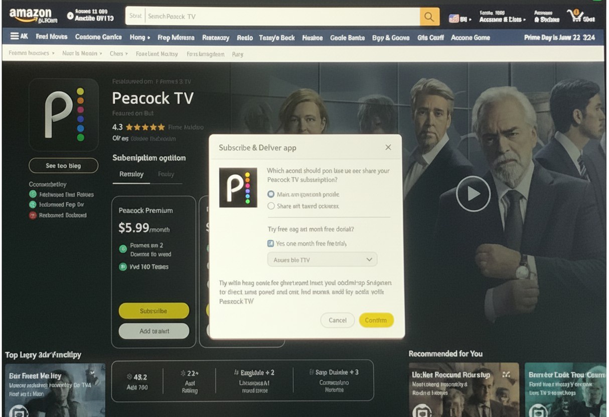
We partnered with the London marketing team, who believed email campaigns directing customers to Amazon.com could sell more subscriptions. The first project was a premium page businesses could buy into, rethinking the content and persuasion customers needed; the second was a device + subscription upsell — sign into Fire TV and the app is already downloaded through your Amazon ID. The premium page earned +33% higher conversion in 2023. My hands-on work, taken on while building up my team.
Origin · Proof
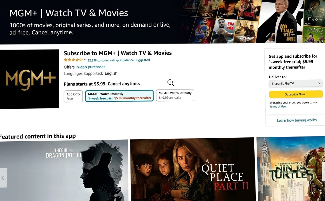
Web proved it — devices followed
A premium page that sold the content — visual and content-forward, leading with the shows and games themselves instead of Amazon.com’s text-heavy product listing. It proved subscriptions could sell on the web, and set the content-forward direction we took across every store and device.
Apps sold like boxed products
The Appstore’s presence on Amazon.com and mobile just reused the commerce detail-page template to list apps to download. But people don’t come to Amazon.com to download apps — and these aren’t ordinary products; they’re shows and games worth getting excited about.
Make it a marketing moment, not a listing
I argued that Amazon loyalists, emailed and marketed to, would subscribe or buy from a one-stop shop — if the page sold the content, showing the actual shows and gameplay instead of just an app logo on a shelf. We elevated the UI, drove customers in through email, and when conversion proved it, invested further: content-forward imagery, sharper persuasion on every detail page, device-plus-subscription bundling, and dedicated Fire TV content and subscription discovery on the web.
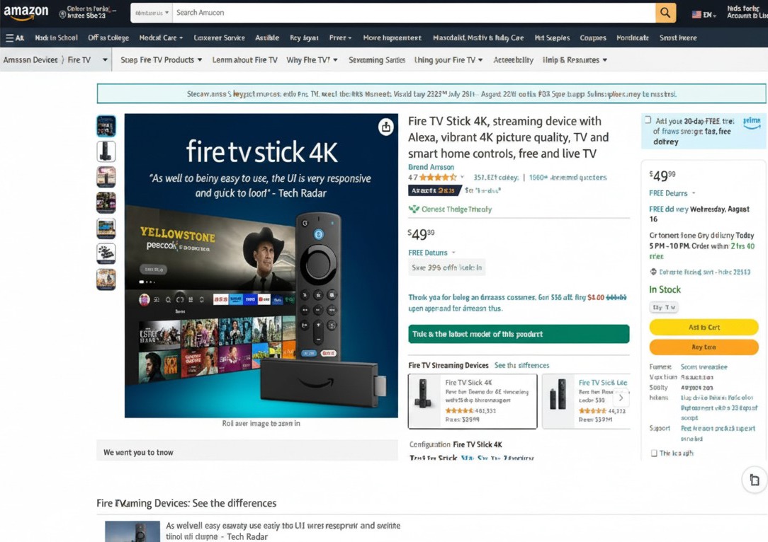
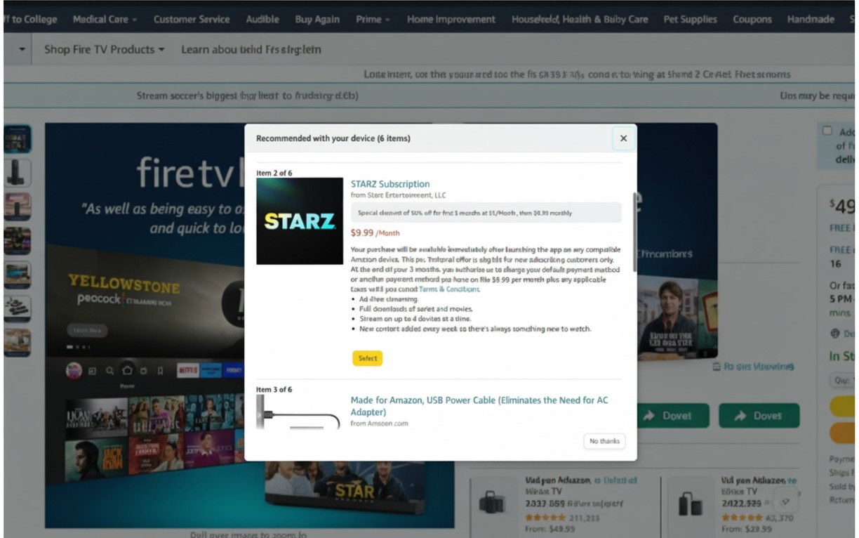
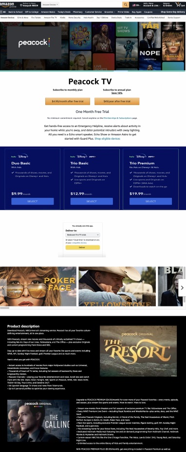
Before
The original premium purchase
Text-heavy, with terms and legalese pushed high into the fold — the decision buried under fine print.
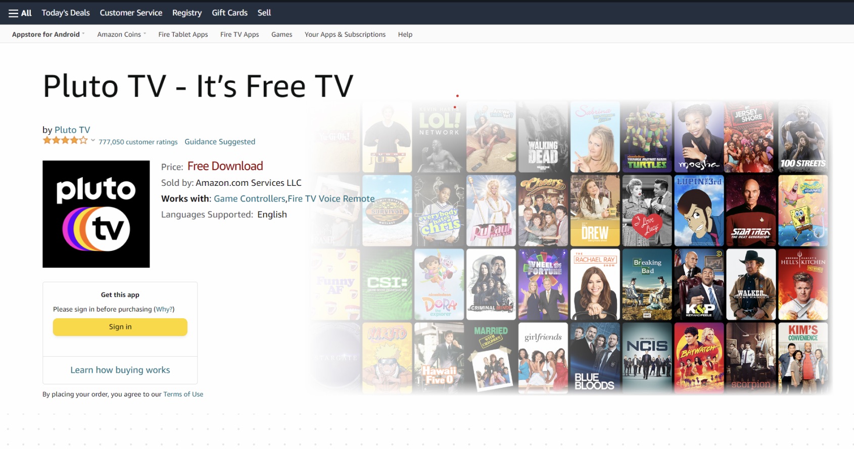
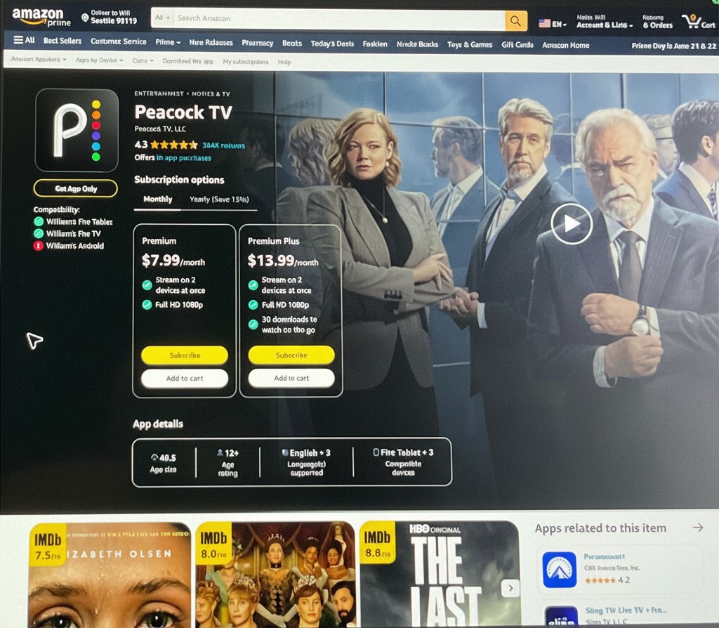
After
The redesigned premium page
A richer, visual treatment that leads with the shows customers can actually watch.
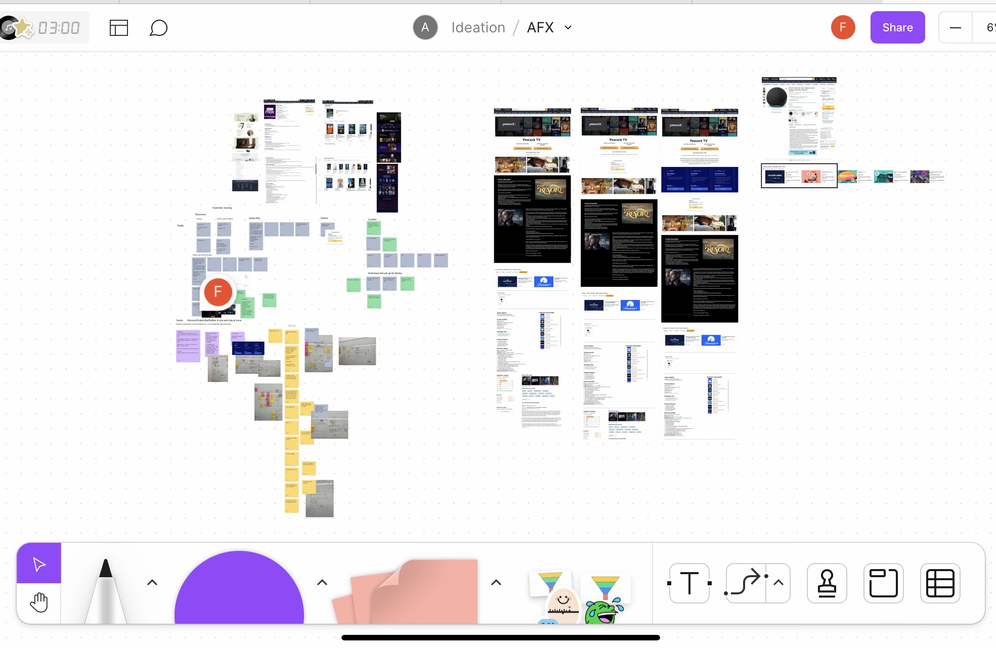
Method
Content strategy & hierarchy workshop
We mapped every content section and its intent — and pinned down where legalese had to stay prominent versus where we could negotiate with the legal team to move it lower down the page.
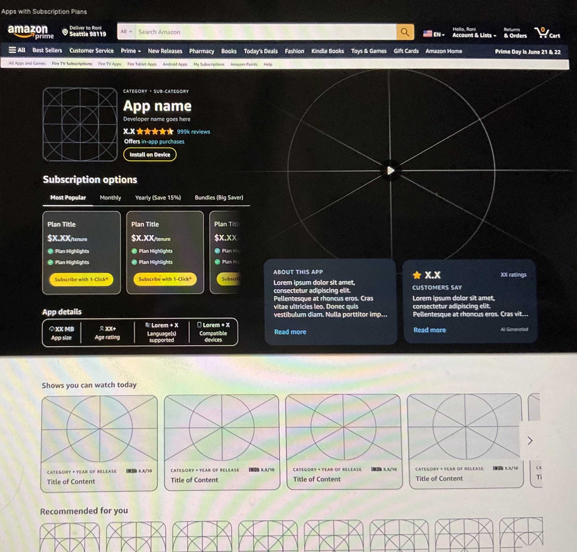
Vision
Adding Quick Subscribe
Layering Quick Subscribe in to shorten the path to purchase — and, since not every 3P developer had integrated it, designing the page to scale gracefully whether Quick Subscribe was present or not.
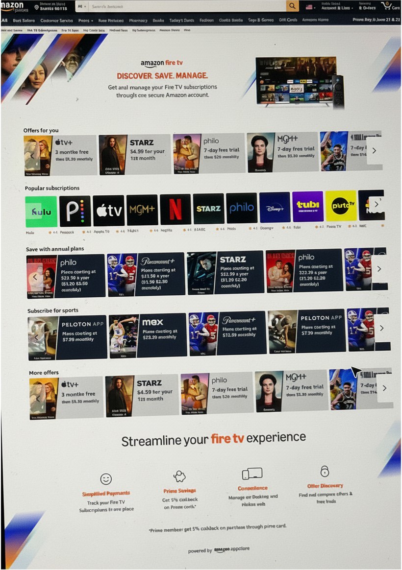
Landing pages
MVP → vision on Amazon.com
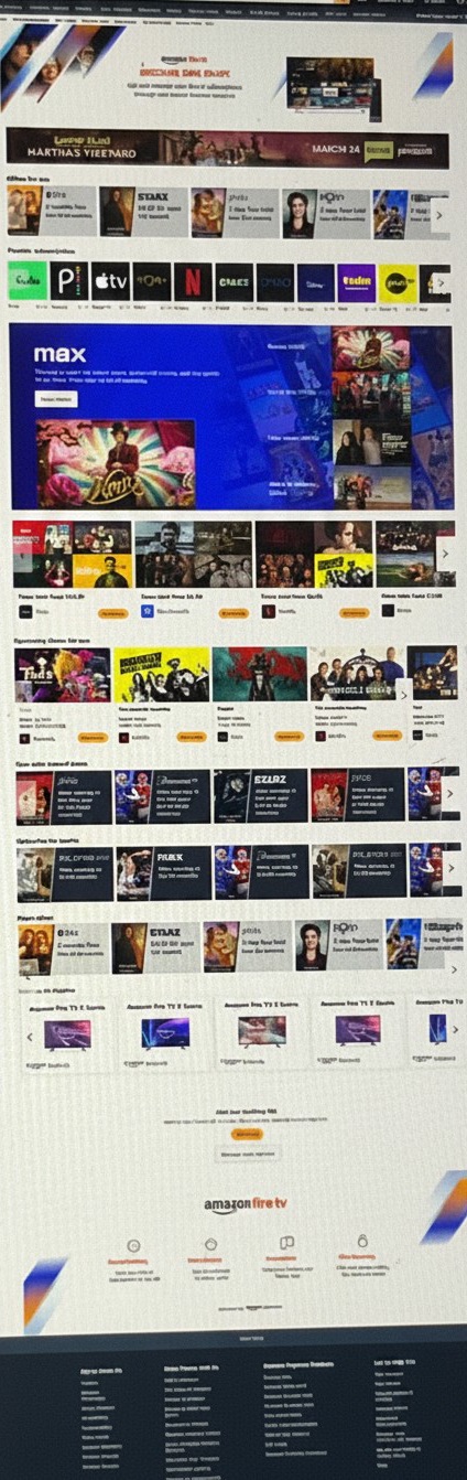
Building on the premium page’s success — proof that email campaigns could lift sales — we added more pages like these Appstore and Fire TV store pages, surfacing shows and apps relevant to each customer to subscribe to.
Vision · Roadmap
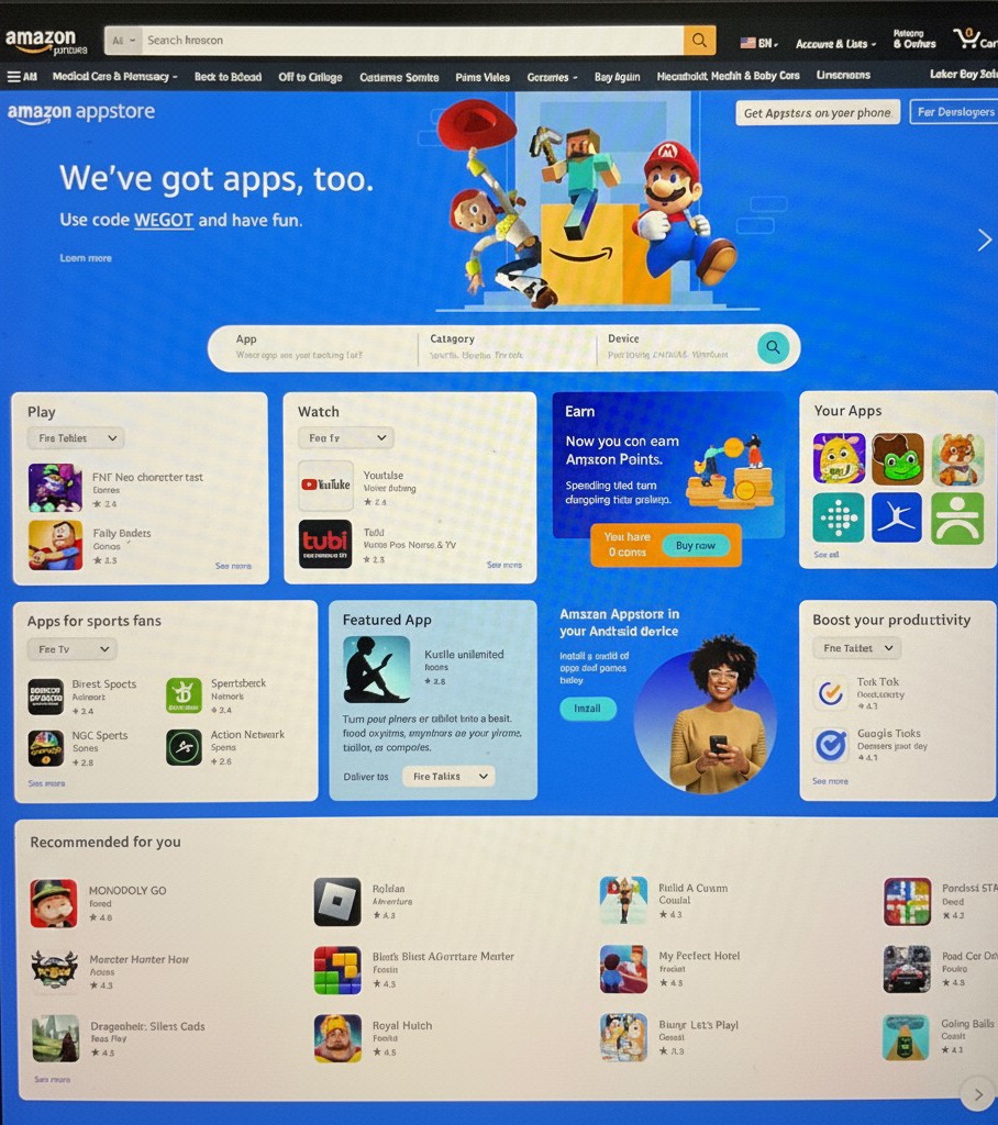
Appstore landing redesign
A content-forward vision for the Appstore landing page — on the roadmap, not yet implemented.
Bundling
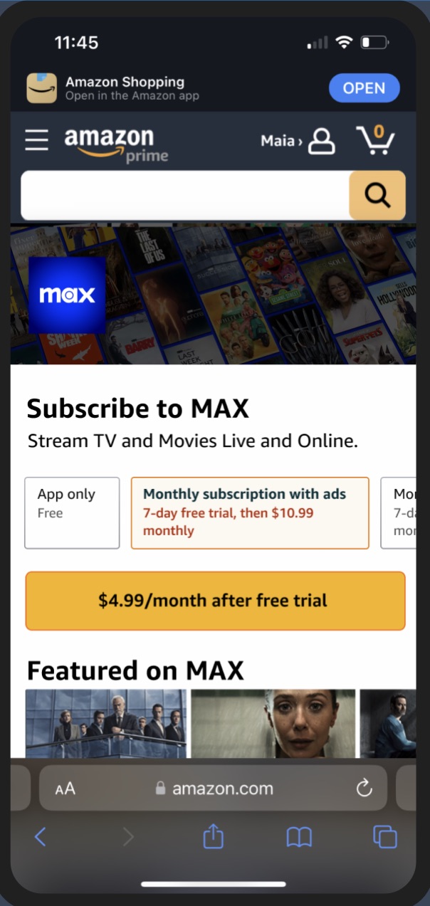
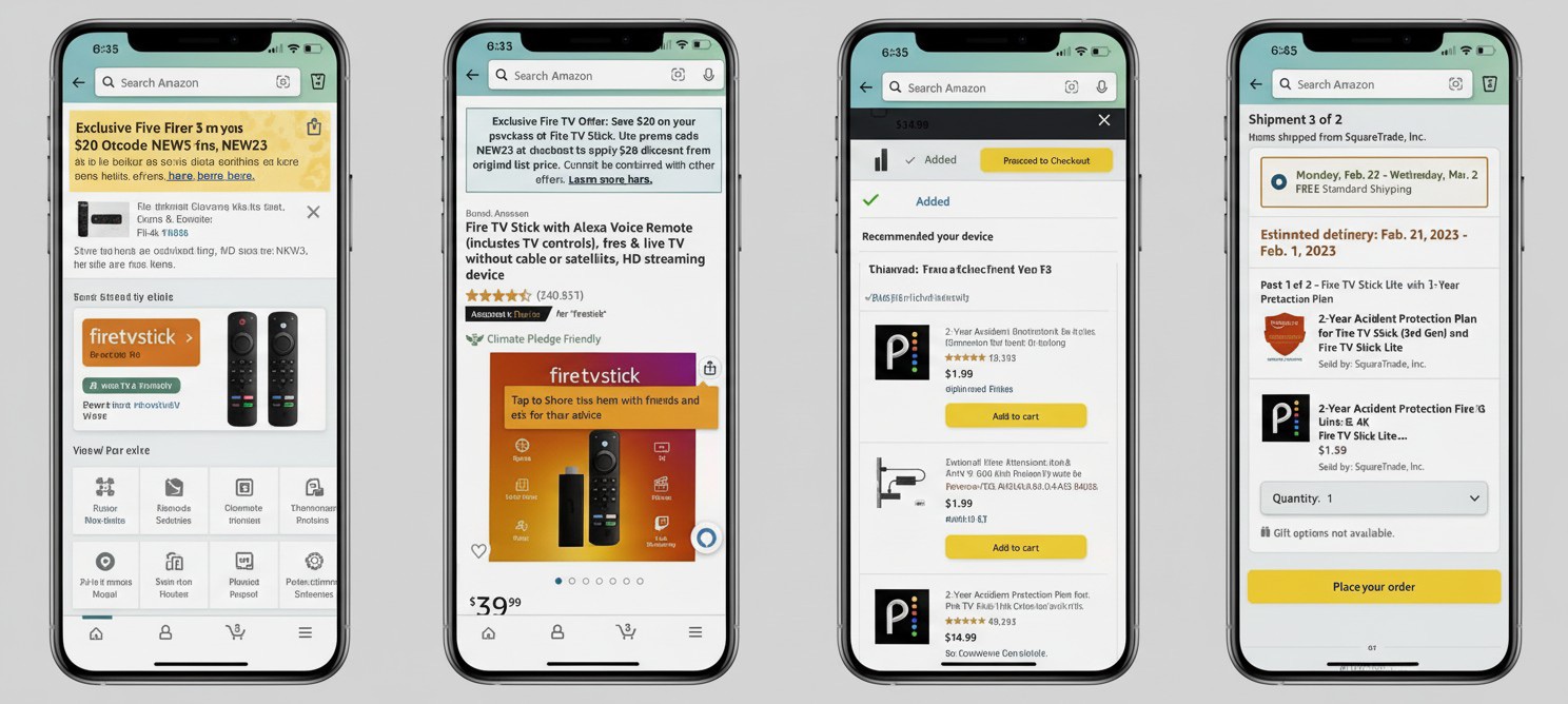
Amazon Mobile — devices & subscription bundles
A successful upsell — buy a device and get a discounted subscription bundled right in, on mobile.
Bundling
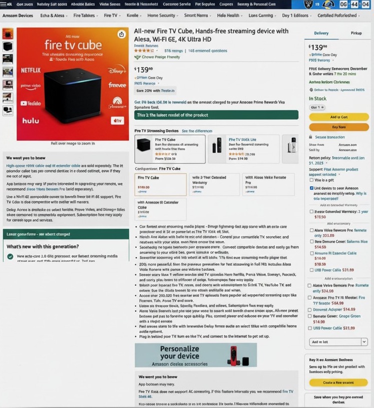
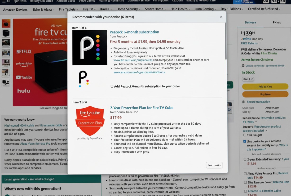
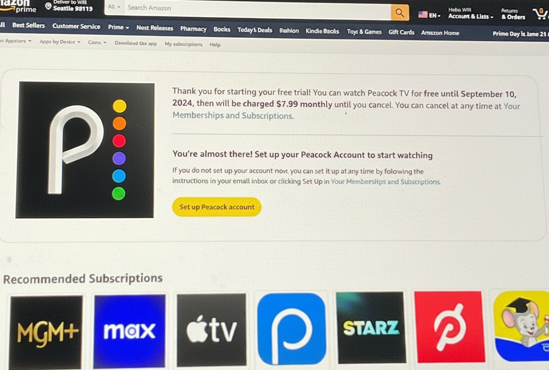
Amazon.com web — devices & subscription bundles
The same device-plus-subscription upsell on Amazon.com — where we had to work within their systems and established shopping and selling patterns.
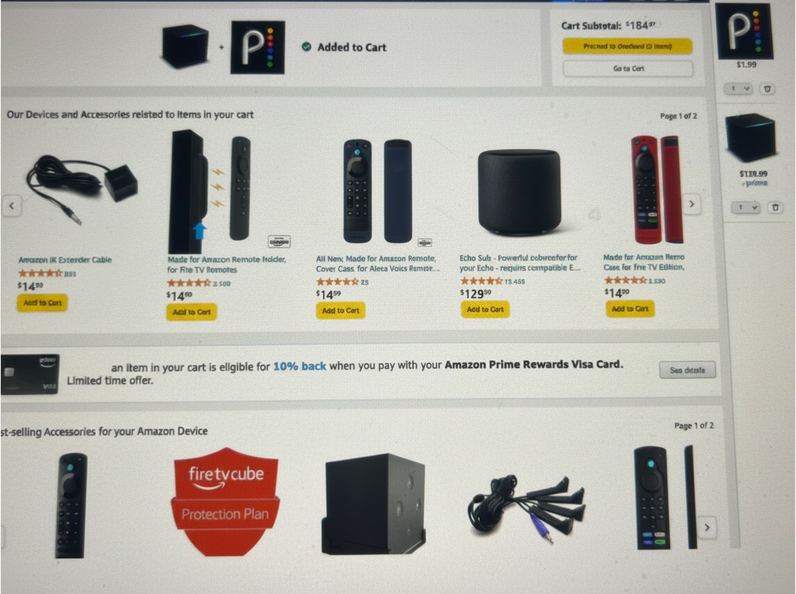
The premium page lifted conversion 33%
Selling the content on the premium page — paired with the email campaign directing customers to Amazon.com — drove a 33% increase in conversion in 2023, and unlocked the investment in content-forward detail pages across devices.
Acquisition & Discovery
Finding different opportunities for discovery
Through both browse and the persuasive detail page, we tested continuous improvements — turning every surface into a path to acquire.
Continuous improvement
Every entry point, a path to subscribe
Whether from the home page, the Appstore home, detail pages, or special campaigns — discounted offers, in-app purchases, gaming events — we designed discovery to lead to acquisition, and tested it before and after.
- Before / After
- Fire TV + Tablet
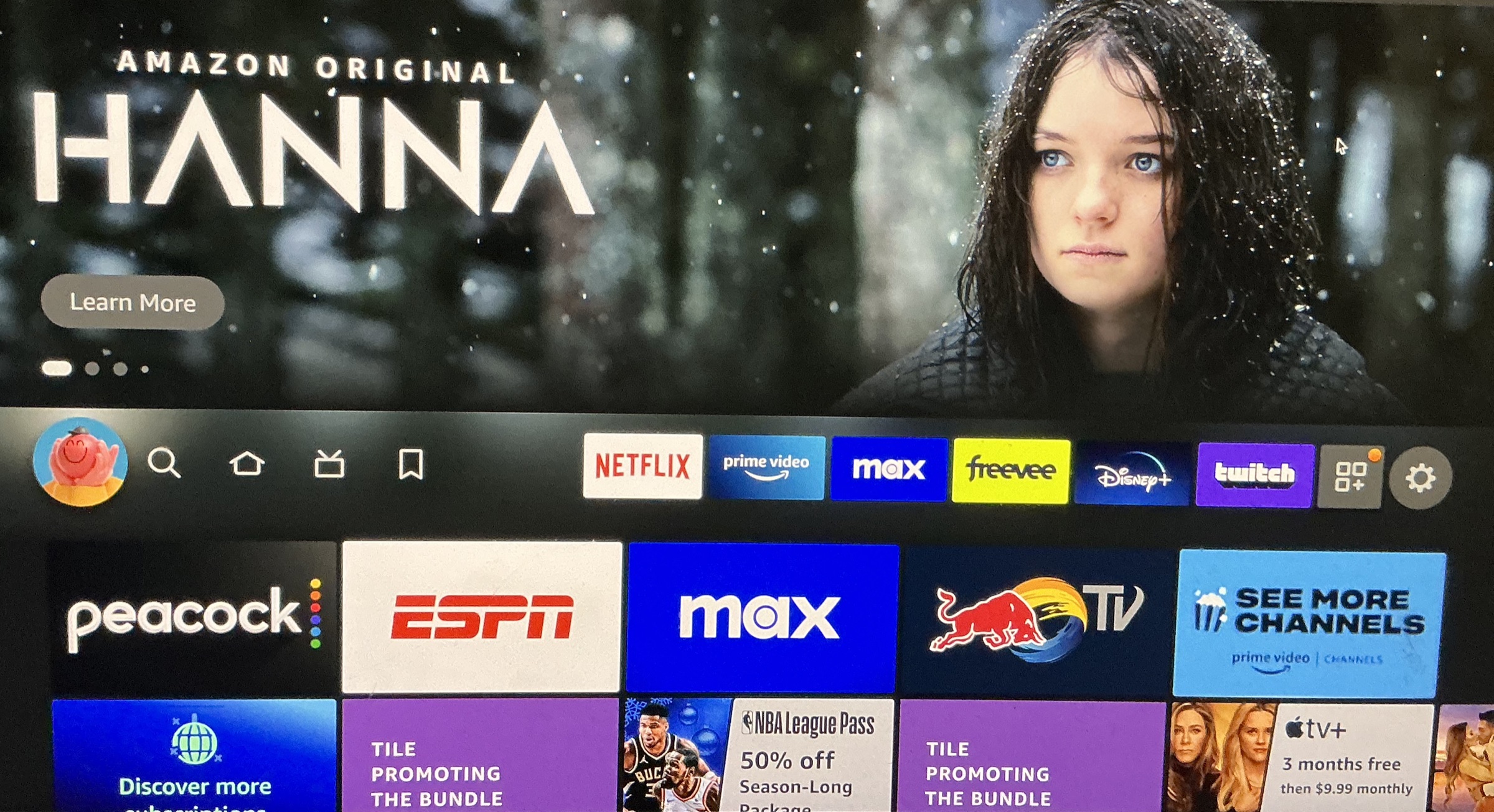
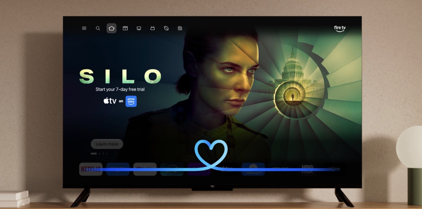
Every browse surface is a test of what lifts click-through — an offer like our “Eket” with its distinct visual, swapping app tiles for content and show titles, a free trial, or an in-app event row. We’re constantly trying variations to increase sales, and read the analytics weekly to see what’s working.
When this work came back under the Fire TV partner teams, they wanted to minimize pushing app sales in favor of Prime Video, which is slightly more profitable for them. Their nav redesign — project “Burton”, a node-and-hub model for more features and richer landing experiences — is partly why our “Yac” app nav row was removed. The redesign was otherwise well received — its one criticism was exactly this: removing the Yac row took away users’ ability to customize their own apps. They leaned on app performance (slow loads, apps getting stuck) as reason to sour on the apps business — even imagining an app-less future — which is part of why a later Amazon Developer project nudges 3P developers to test and optimize loading. But app subscriptions are a big part of streaming today, with real user benefit: subscribe once and watch your shows almost anywhere. That’s the tension — business incentives versus user preference — and the strange reality of a large company competing with its own products for the sale.
Fire TV
From home, Appstore home, detail pages, and special campaigns.
Home
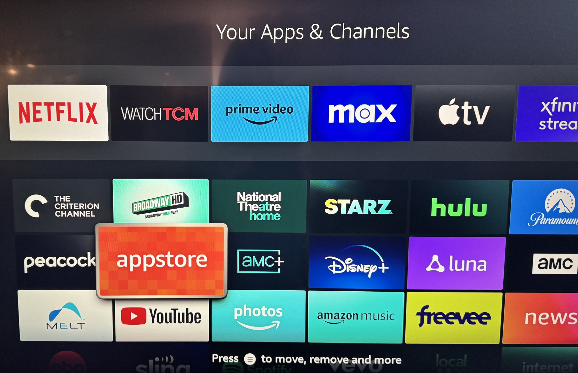
Favorite home, your app nav
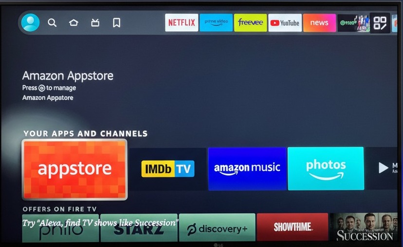
The “Yac” app nav row — your favorite apps up front, an ingress to get more, and the control to customize which appear here.
Control
Your apps & channels
Customize your nav and the order of your apps — another way into the store.
Store
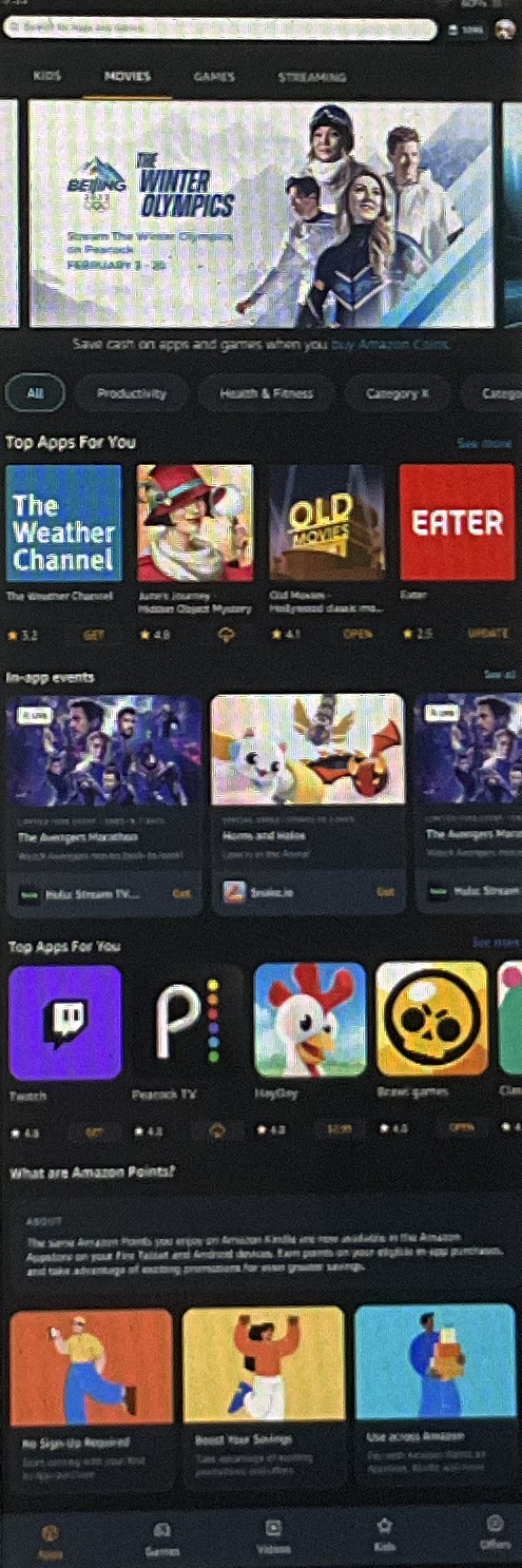
Appstore home
Debates, user testing, and analytics probe the same question: do users prefer the simplicity of symmetric, consistent rows, or variation to break up the endless “scroll-hole”? I argued to drop the generic category titles too — but real relevancy needs AI to improve the content we surface, which became our focus in late 2025.
Offers
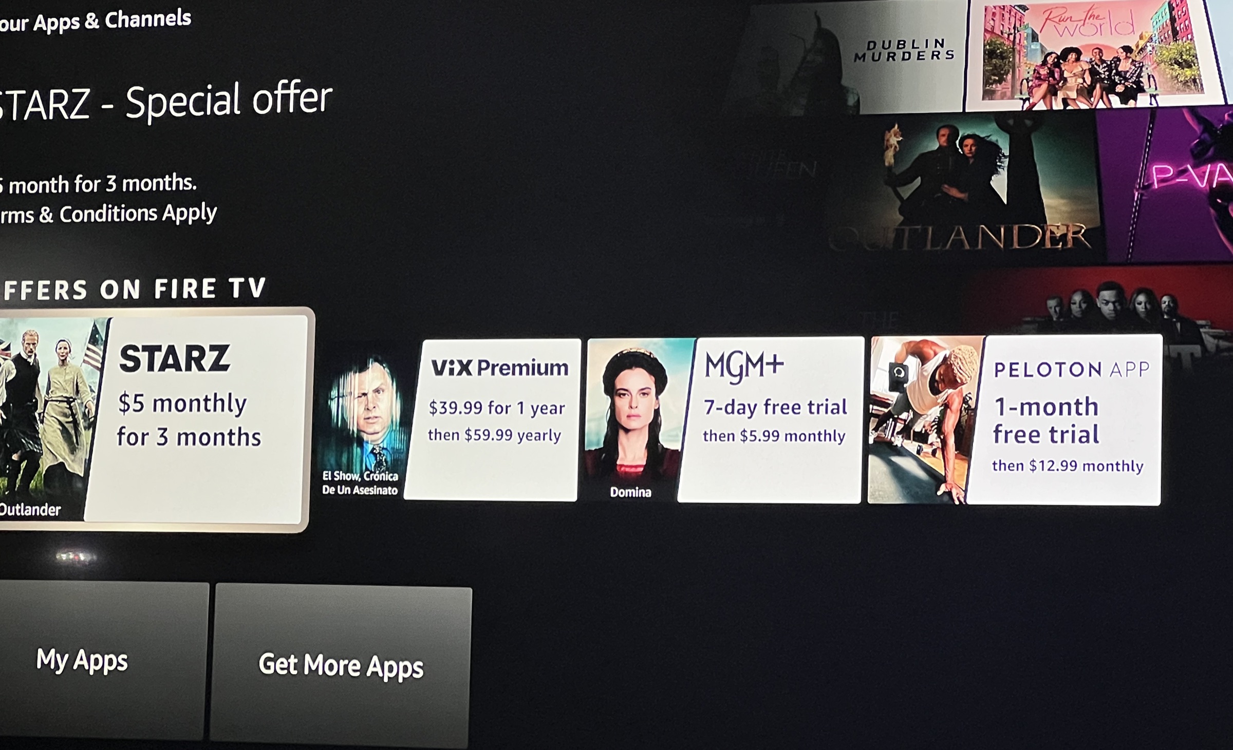
“Eket” offer templates & rows
A uniform template approach was how we scaled — a 3P or marketer supplies the show, and the rest is built programmatically, cutting the resourcing these assets used to demand. I often had to push back on our team becoming an asset producer: the more we automate solutions like this, the faster these products scale.
Tablet
A major redesign — as Quick Subscribe and the web campaigns lifted conversion.
Events
In-app events & ingress
Games bring their own variety of in-app upsells to surface — consumables (currency, boosts, extra lives), one-time unlocks (remove ads, level or character unlocks), season passes and subscriptions, and cosmetic packs. Automating that mix is something even the dev portal had to support — and templates became key to scaling these products.
Offers
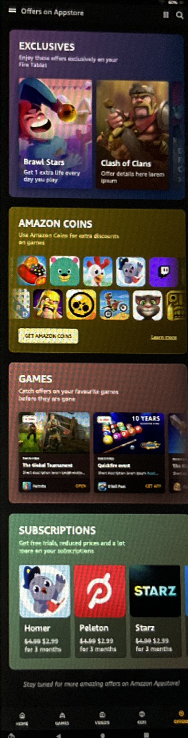
Offers page
Our push to make deals a differentiator — the kind of sales customers expect from Amazon. It tested well with users, but analytics showed weak click-through when the page lived mainly in the nav. The fix: introductory “view more” rows across the Tablet and Appstore landing pages leading into it — which lifted sales.
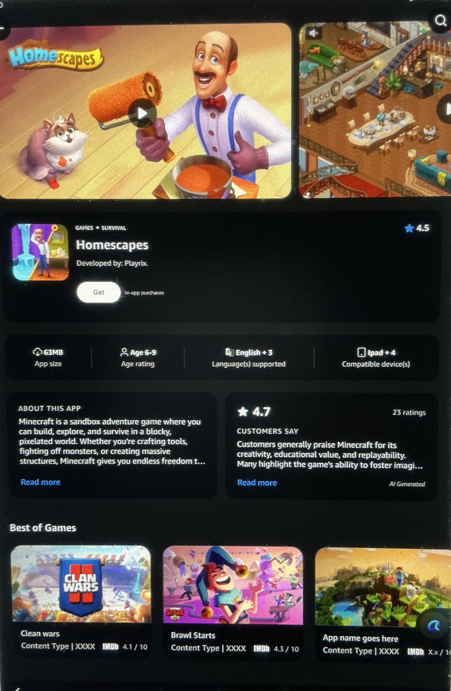
Category
Games page
Across the game and movie category pages you can see subtle UI variation by content — the same detail page, with extra elements tuned to sell that specific product.
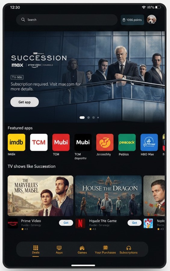
Category
TV & Movie page
The same foundation, its sell tailored to shows and movies rather than games.
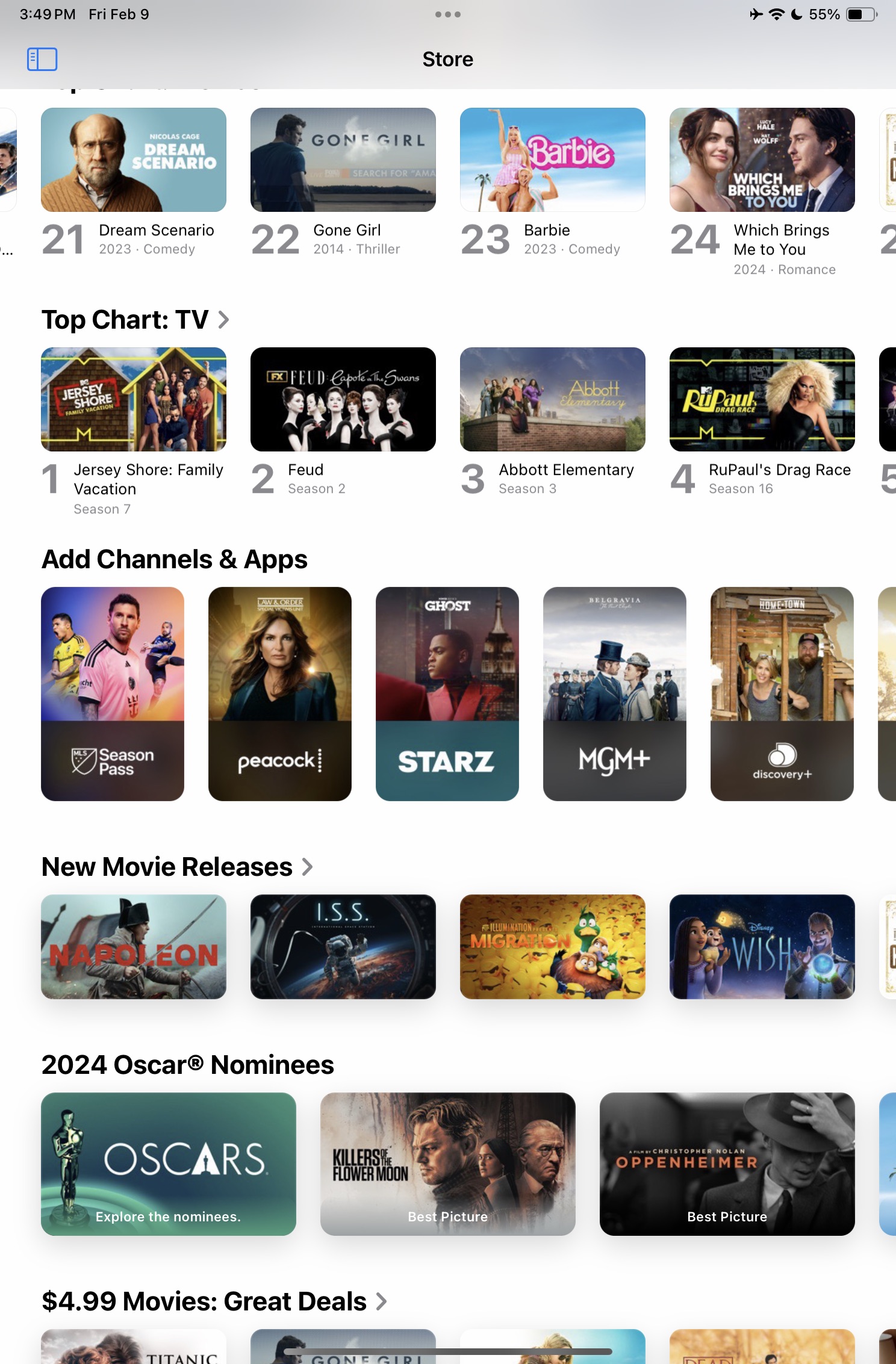
Redesign
Home — before & after
The old home was repetitive rows under meaningless category titles. We pushed for more hierarchy and variation while keeping it symmetric and simple — which tested positive with users.
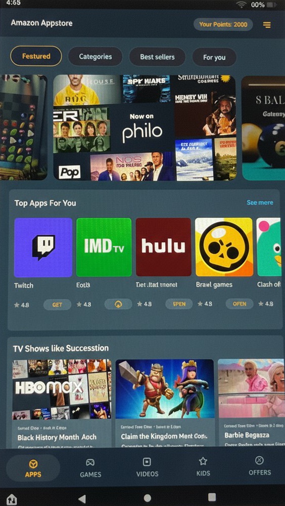
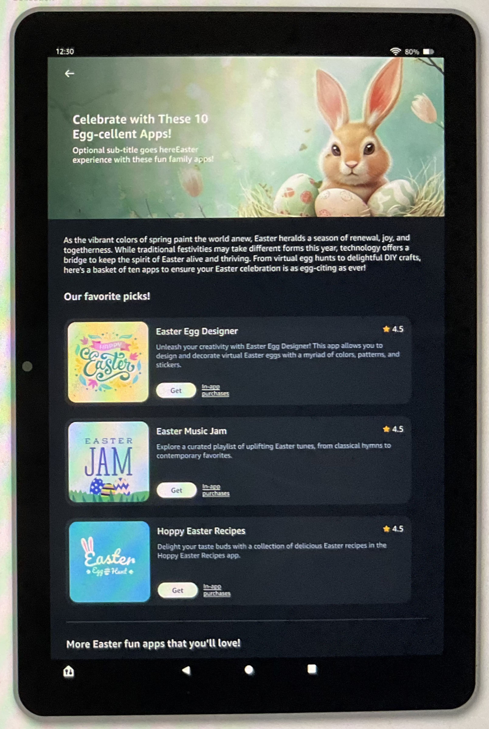
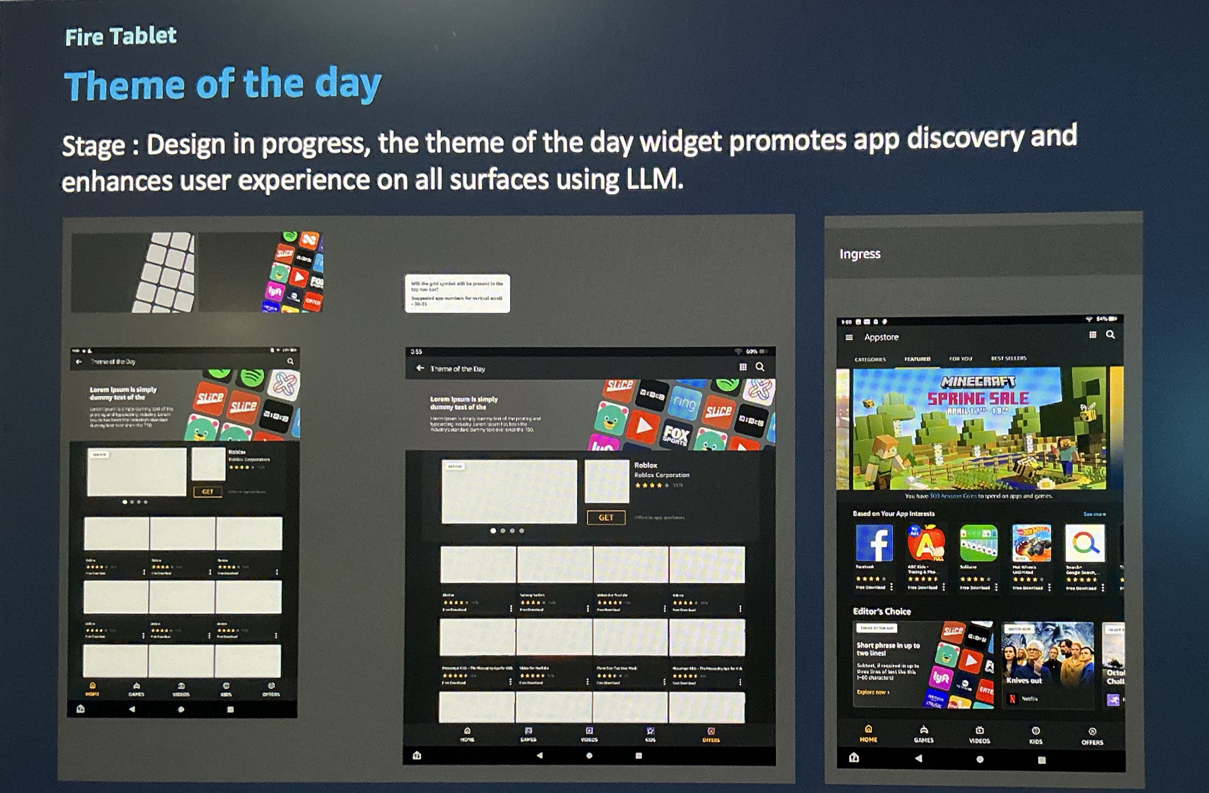
Marketing
Marketing themes & sponsored
Highly templated and building-block based — letting teams assemble sponsored marketing pages without design or development resource. A model I pushed for heavily, and one you’ll see again in my Chase and Amazon Developer work.
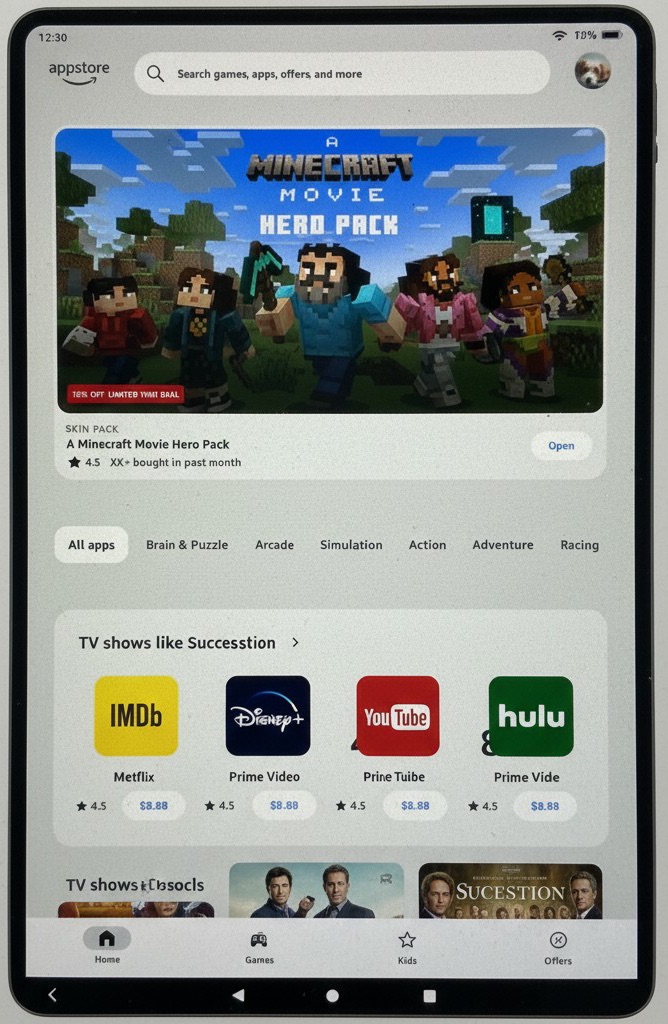
Vision
Dark & light mode
Forward-looking theming explorations — vision work for what’s next.
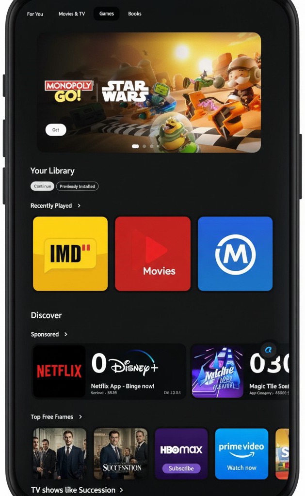
Unifying the surfaces cut development in half
I ended siloed, per-surface builds and moved 3P, Tablet, and Mobile onto shared, reusable UI — especially across discovery and acquisition. Building once instead of rebuilding per surface cut development roughly in half, and gave customers one consistent experience with a lower learning curve.
The engine underneath
It all ran on systems I introduced
None of this reuse or unification happened by accident — it ran on design systems, some we contributed to and some we owned outright. We built our Web and Amazon-mobile store on Amazon.com’s Rio system and contributed back to it, and contributed to the enterprise Lola system behind the developer portal. Everything else we built from the ground up and owned — the 3P, Tablet, and Mobile systems, and eventually the developer portal, rebuilt custom on Cloudscape. Fire TV is mine across roles, too — I led the original as Design Systems lead and rebuilt it ground-up on returning to systems. Bringing systems to teams that had never worked with them cut both development and design lifecycles — the dramatic shift behind every result on this page. I’ve kept the systems themselves out of this story; they’re their own case study.
The deep dive — password protected
More from Appstore — additional deliverables
Conversion, the detail page, cross-device mobile, localization, monetization, retention, and the brand build — under NDA, shown abstracted or recreated. Reach out for access to open the full case.
Acquisition
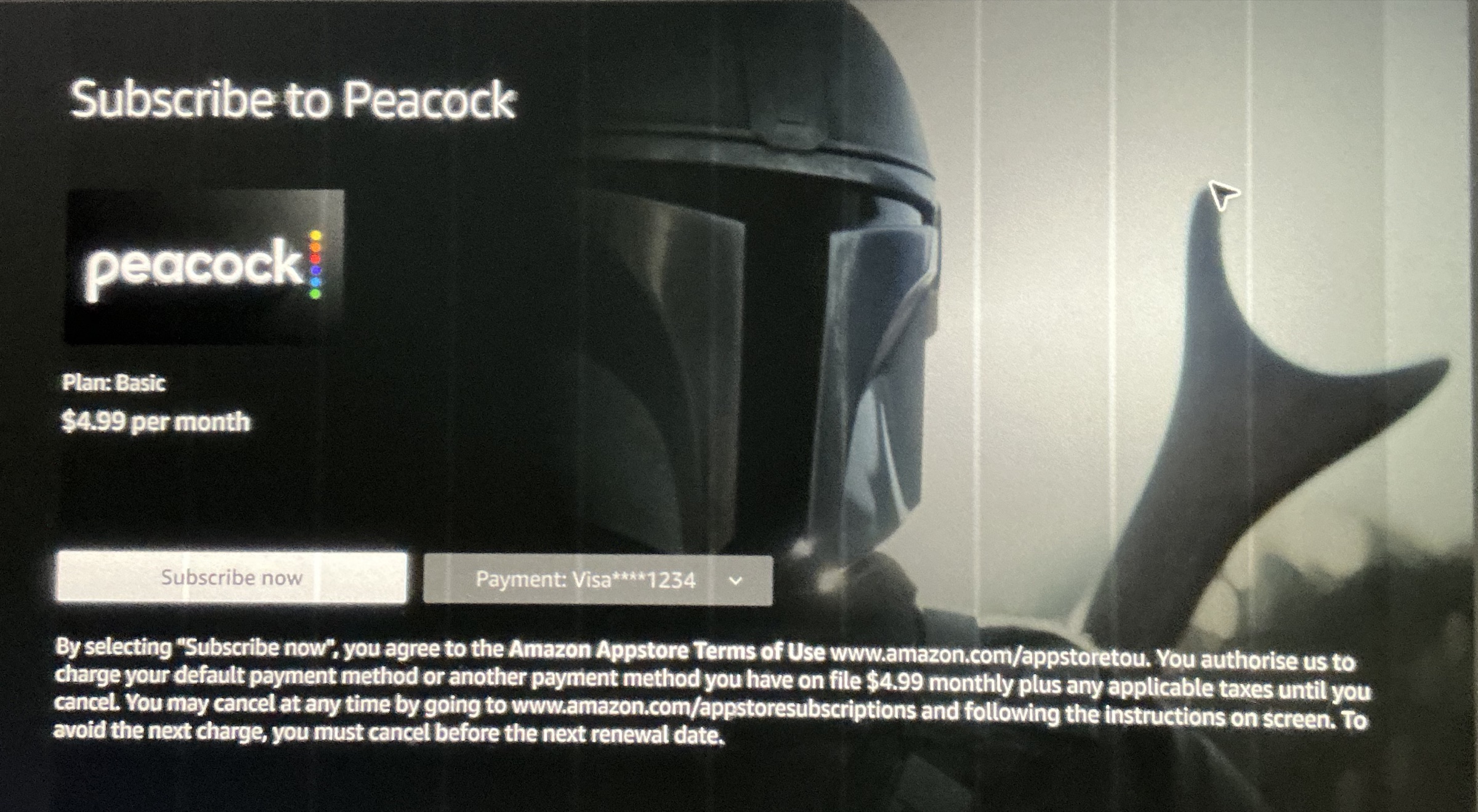
Frictionless Conversion
Ecosystem
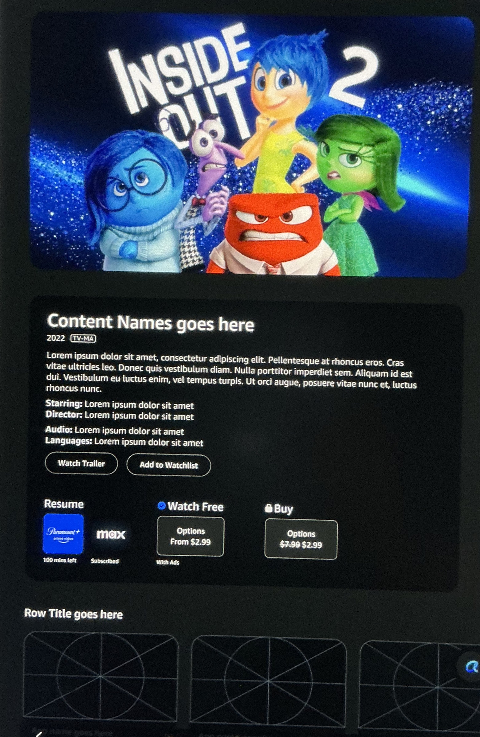
The App Detail Page
Cross-Device
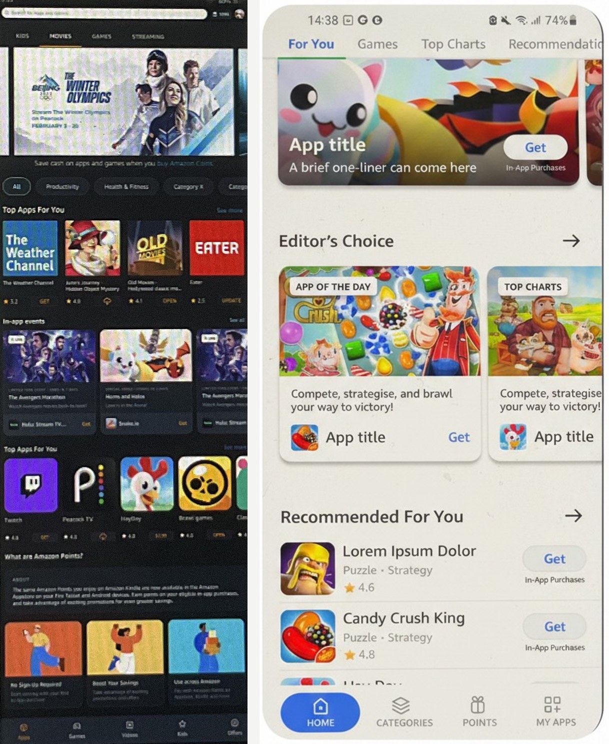
Mobile & Tablet
Global
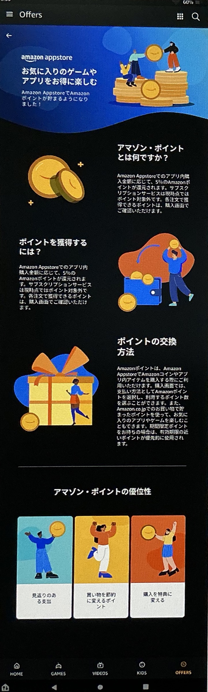
Localization & Points
Monetization
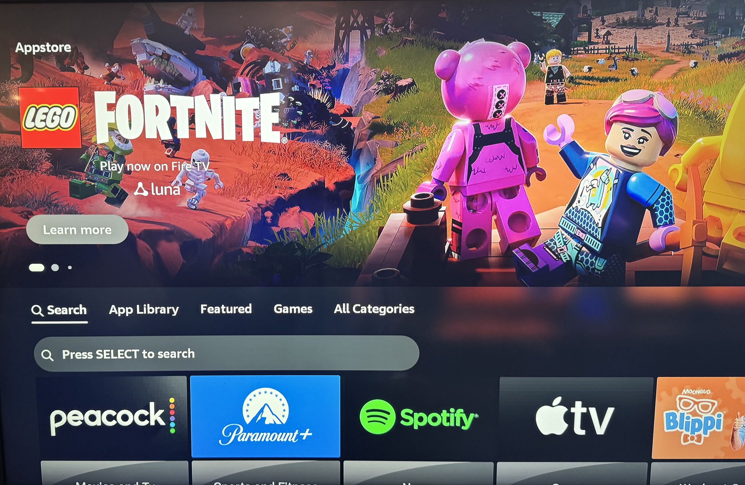
Monetize
Monetization
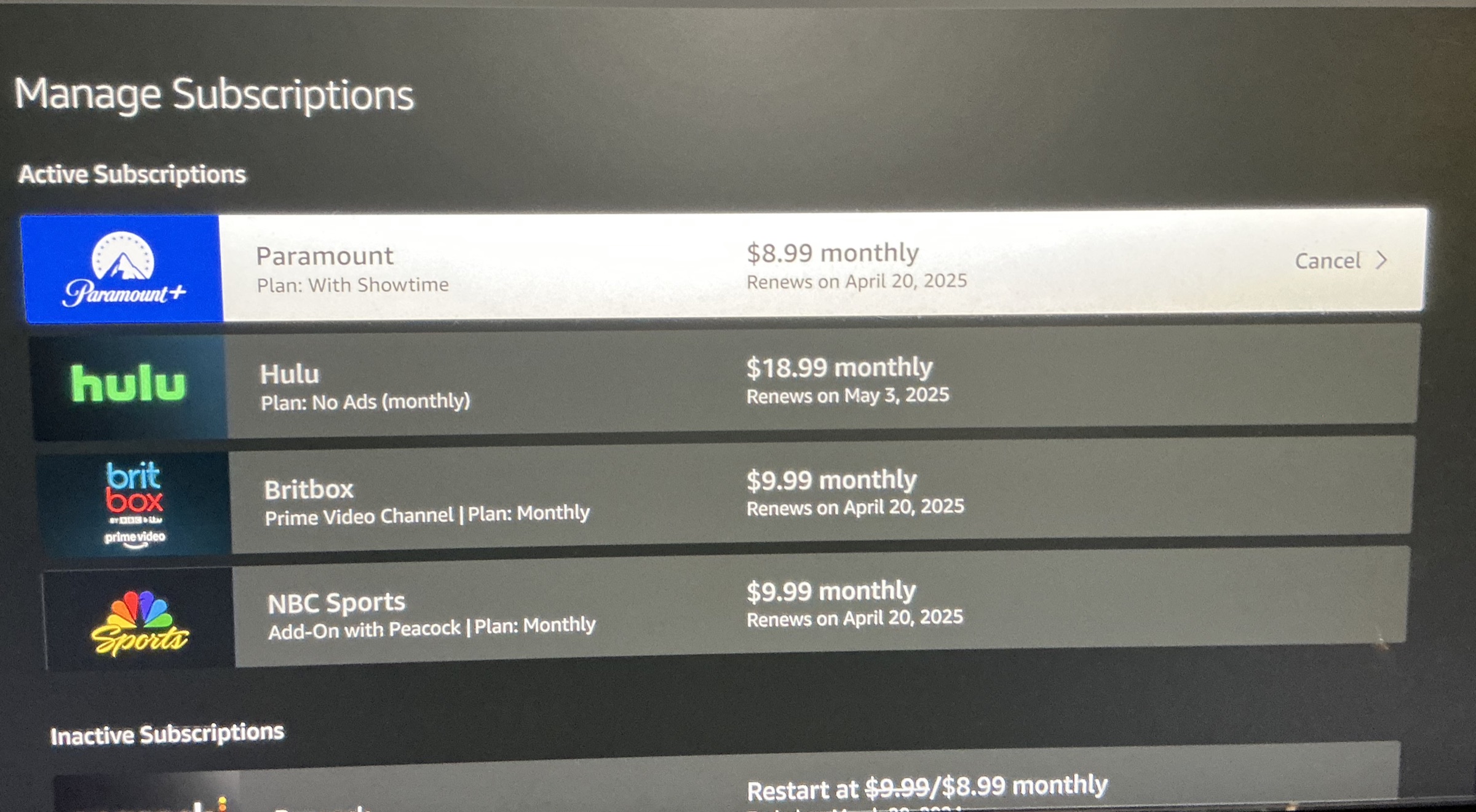
Retention & Management
Brand & Marketing
Stakeholder Leadership
Brand & Marketing
Taking it to Market
In closing
One store, many businesses — led end to end
This is the most diverse work of my career — consumer-facing commerce across multimodal devices, spanning marketing and the third-party developers who build on the store, all while leading the org toward stronger design operations and a research-first, data-driven practice. Product, enterprise, and systems design; a design-and-program hybrid with real technical depth — whatever a role calls the work, the proof is here, not in a title. Across acquisition, conversion, the detail page, discovery, mobile unification, loyalty, monetization, retention, and brand, it was one store serving many businesses — and I led it end to end. What ties it together isn’t one standout project — it’s the judgment I brought to all of them: what to build, what to unify, what was worth the resources, and what to push back on. And I carried each one from project plan through design ideation to research-first, data-driven decisions — with the frameworks to prioritize, break work into agile, incremental delivery when needed, and still land elegant solutions to complex problems. I turned compliance deadlines into customer-first wins, unified siloed teams and partners behind shared systems, and made the hard calls between business incentives and user needs — often when the company was competing with itself.
The outcomes followed: a hundred clicks down to three, conversion up 33% and sales up as much as 24%, development halved by unifying surfaces, and a brand delivered 100% on time and on budget — adopted as far as Amazon Japan. And increasingly I delivered it by building the systems and AI tooling that let teams move faster: templates, an IMDb-fed API, and my own code rules — the through-line that continues in my design-systems and AI work.
Amazon Developer
The engine behind the storefront — rebuilding the application where third-party developers submit and manage their apps and services.
Design Systems & AI
The evolution of scaling across devices and organizations — systems, automation, and AI-assisted tooling that speeds delivery and productivity.