

Case Study 02 · Amazon Developer — the input side
The engine behind the storefront
The B2B/SaaS platform where developers build, submit, test, publish, monetize, and analyze their apps for our app stores — across our 1P Alexa and 3P partner devices, plus Amazon.com and the Amazon Mobile native apps — and the multi-year effort to rebuild it into a self-service, developer-facing product held to a consumer-grade standard.
The consumer-facing app store is the output; the Amazon Developer portal is the input that powers it — a complex application used by everyone from small-business developers to Sparq VIP partners like Disney and Netflix. I led the design strategy, the research that made the case for a full rebuild, and the design direction — spotting the pain points and opportunities from years in developer portals — while a senior designer drove much of the hands-on execution under my direction and critique.
Outcome
Baseline-to-redesign usability testing showed high satisfaction with the monetization and submission workflows, and the long-requested analytics shipped as part of the redesign.
Amazon Developer
As Head of UX for the Appstore, I owned the consumer and developer experiences — and, for the first three years, marketing too. Requirements came from every direction: product, the Tablet and Fire TV device teams, compliance, our “Cape” business-development partners, and the app developers themselves — who also build for Google and Apple, and could walk if we couldn’t automate what they needed. The constant challenge was how to prioritize initiatives across all these competing requests — from so many different partners and stakeholders.
Click any image to enlarge.
At a glance
Role
Head of UX, Amazon Appstore — strategic design leader and people manager who led UX for Amazon Developer and the Amazon Appstore on Alexa devices (including Appstore commerce), leading the design org for over three years; and, with AI, building production code myself
Scope
The Amazon Developer platform — the developer-facing (input) side; B2B/SaaS across 1P Alexa and 3P partner devices, Amazon.com and Amazon Mobile
Also leading
Concurrently led the consumer Appstore across devices (including its brand & marketing), plus the systems and tooling behind it — Fire TV & Fire Tablet design systems, internal enterprise tools for Fire TV (1P enablement), AI tooling for design-system automation, and 3P manufacturer HIG & support
Skills
Design strategy · Design systems · Platform HIG · AI design tooling · Information architecture · Stakeholder prioritization · People management
A note on my background: I’ve been lucky to have a genuinely wide-ranging career and portfolio — consumer-facing, award-winning products in banking; Chase’s more innovative work building data-aggregation and API developer portals; intranets; and enterprise work for a global law firm. At the Appstore I ran both sides: the consumer commerce store across many devices and applications, with its complex information architecture, and — what you’ll see here — the Amazon Developer application, where third-party developers come to build and submit their apps. Throughout, I’ve been as comfortable on the technical and program-management side — scoping and building the project plans that break huge initiatives into deliverables — as I am with ideation and design critique. Add a front-end background with real design-systems expertise — and a growing comfort with vibe coding and the automation tools that speed up workflows and delivery — and the Appstore was a rare fit: it used almost every hat I’ve worn, from strategy to leading a team across multiple orgs to maturing our design-ops practice. Consumer-facing or developer-facing; product, enterprise, and systems design; a design-and-program hybrid with real technical depth — whichever label a role leads with, the range is the point, and the proof is in these case studies rather than any single title.
The Two-Sided Marketplace
One submission becomes the storefront
Every listing and subscription a customer sees begins as a form a developer fills here. I led the strategy and teams on the designs across the whole chain — the developer’s input, the automation that processes it, and the output: how it appears on the store and on the device.
This is a different kind of design than consumer UI. It sits closer to enterprise and service design — complex, systems-level thinking and digital transformation, where much of the job is defining how a submission gets automated from the backend out to the store. Service blueprints and journey maps did a lot of the heavy lifting, mapping what each form actually has to do, and the monetization side drew on service design for payment flows.
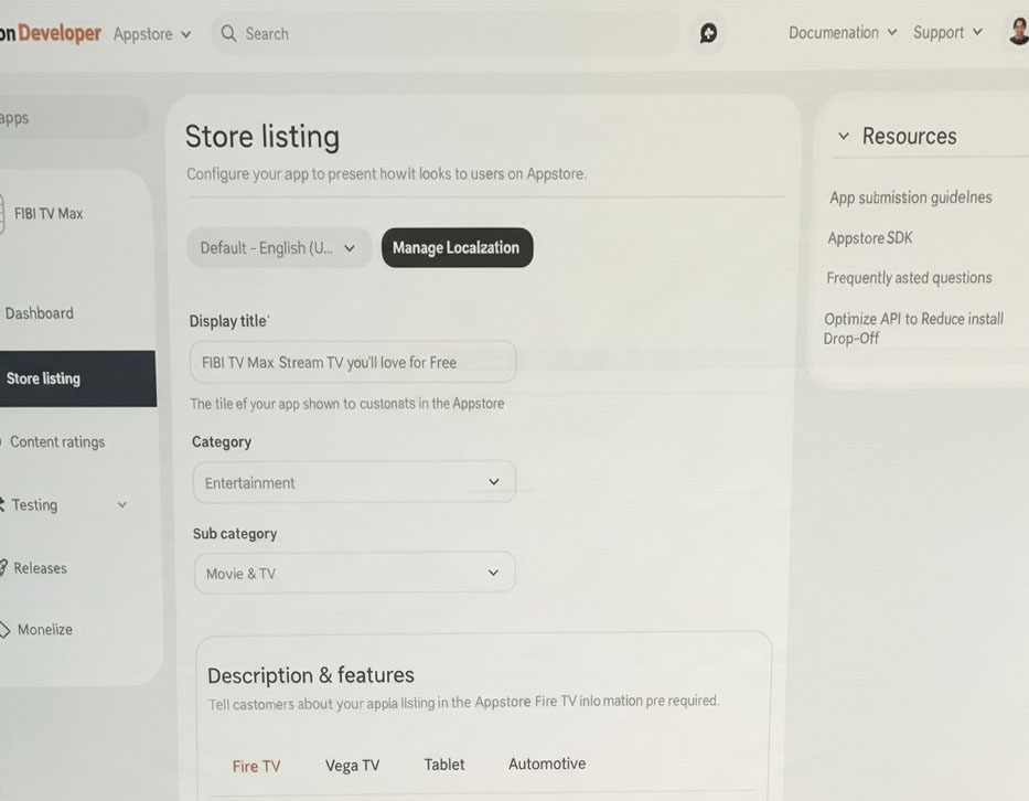
Store Listing
The form where an app developer or marketer fills in the metadata and target markets and uploads the imagery.
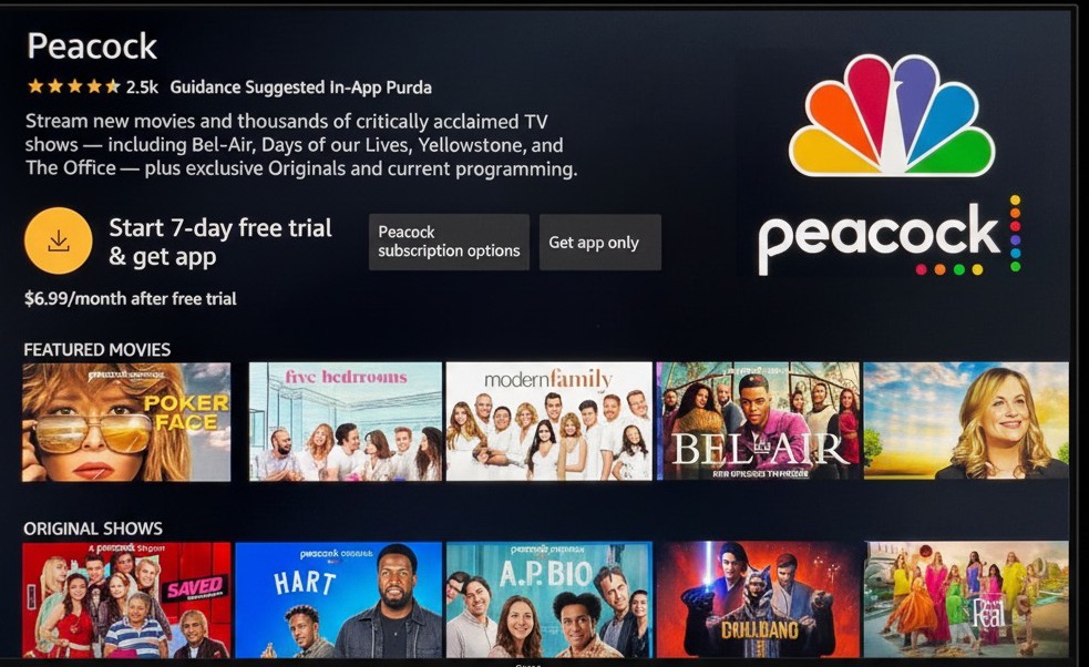
Subscription detail page · Fire TV
It renders as the customer-facing detail page — its job is to persuade, then let the customer buy or subscribe and finish in the payment flow.
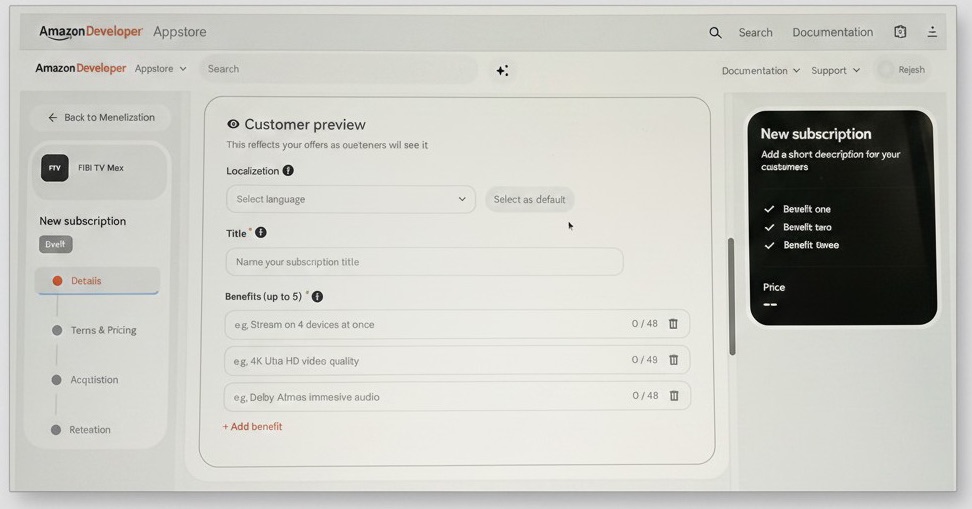
Customer Preview form
Part of the new subscription form — where the app developer chooses the tiers (basic, premium, with or without ads) and the terms (monthly or yearly).
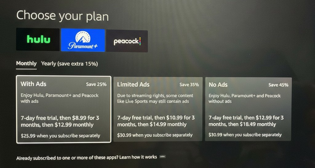
FTV subscription option selection
Those tiers and terms become the subscription options a customer selects on Fire TV before they subscribe.
A decade of dev-led, feature-parity work
The portal had been built the way dev portals usually are: feature by feature, with siloed teams bolting each new request onto a form and no one holding the whole. We made incremental improvements, but the pattern had a cost — and it was time to name it.
Feature parity, no self-service, no single owner
Chasing competitor parity, with no self-service and no one accountable for the experience end to end, left the app with a tangled information architecture, poor discoverability, and long, difficult workflows that badly needed simplifying.
Argue for the overhaul — but earn it through the developers
I began making the case that the entire application needed a major information-architecture overhaul — the initiative we called Redex. That was a multi-year bet, and it had to start by proving why it was needed: research, a workshop, and a business case for stakeholders. Meanwhile, we kept prioritizing and delivering what developers actually wanted — the friction fixes and features they were asking for.
The current state · Pain points
Years of feature adds — bulky workflows, poor discoverability
Years of chasing competitor parity — one feature bolted on after another — left the app hard to navigate: weak discoverability, and core workflows stretched into long, unintuitive forms that got less efficient with each addition. Three screens made the case on their own.
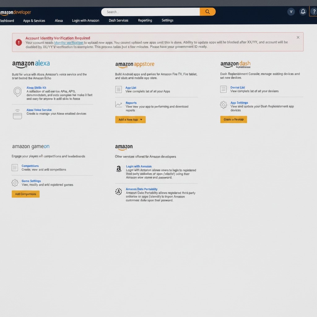
A marketplace, not a home
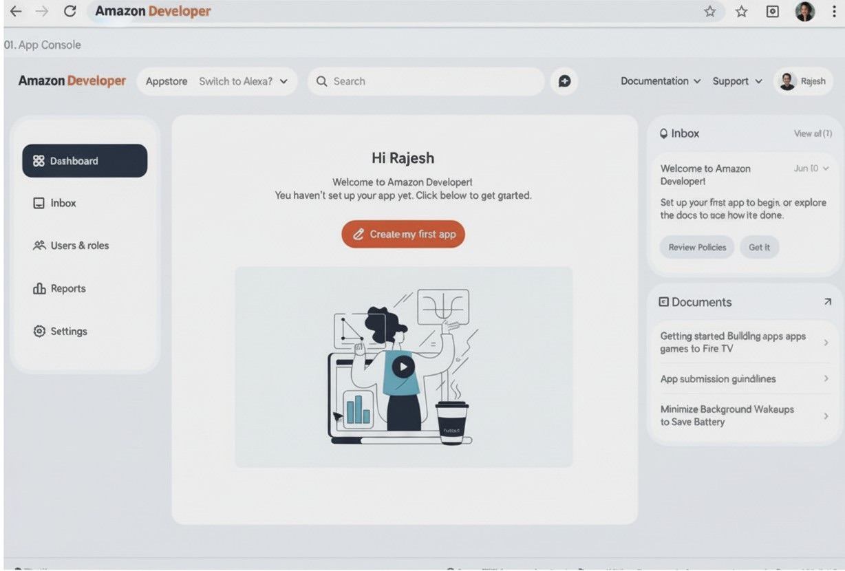
The homepage was a link farm out to different businesses — not the landing dashboard a developer should drop into and get straight to work.
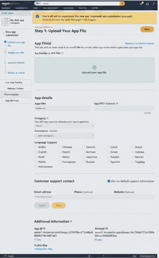
A submission form that never ends
App submission had grown into one long workflow, every team’s feature ask bolted on — exactly the kind of flow we needed to simplify.
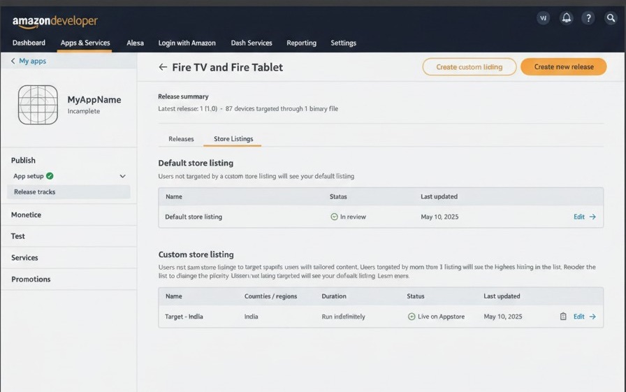
A multi-release flow shipped as an MVP
The new multi-release flow went out as an MVP and it showed — not intuitive; we wanted to rebuild it end to end, folding in testing and sections for the different people who touch a release. This view is the start of the store-listing list: multi-releases often need edits to a listing’s metadata, so we decoupled the store listing from “create a new release” — letting each listing act as a reusable template a developer or marketer can pick from.
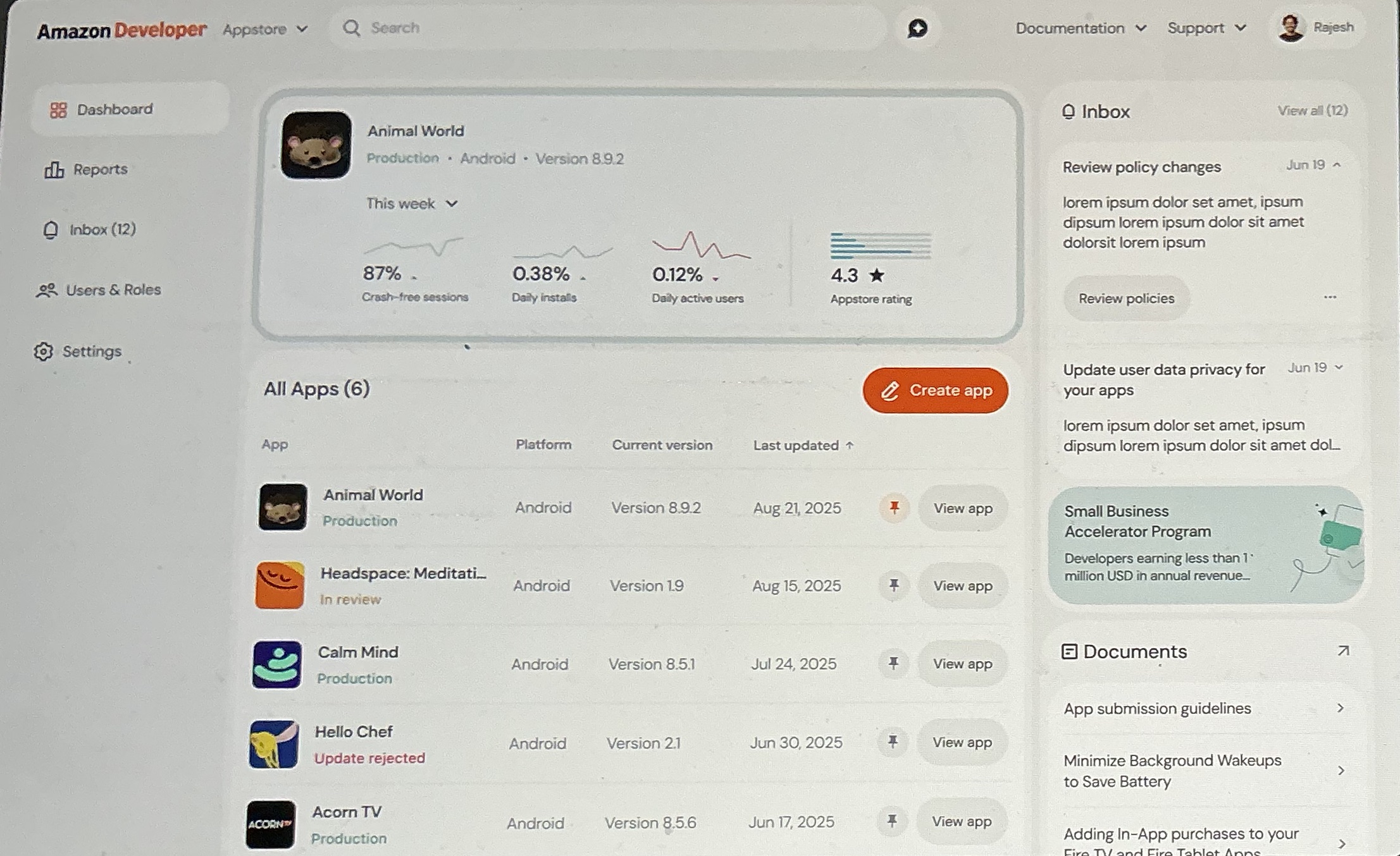
Delivered · Reports (2024)
The analytics developers kept asking for
Amid all that, we still delivered the thing developers asked for most. Until Reports, they had no analytics at all — just PDF downloads of their numbers. Reports (2024) gave them a real analytics UI, to positive reviews: it pulled developers back into the app — where we could surface features they were missing and unblock friction — and it earned the credibility to argue for the full rebuild that came next.
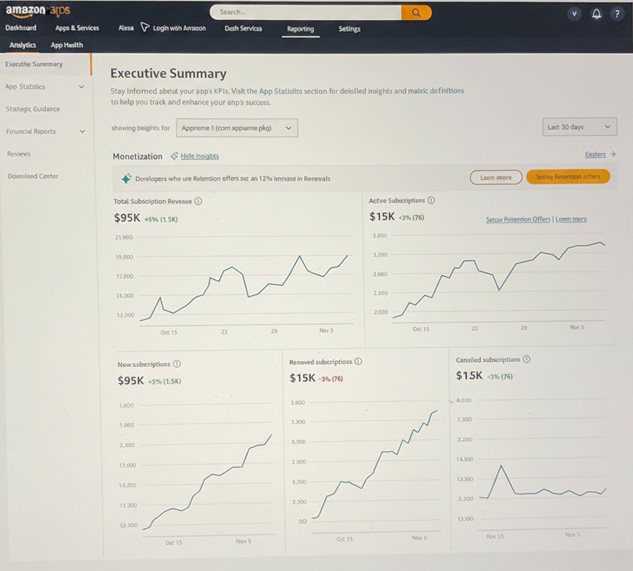
Executive summary
The landing view of Reports — an at-a-glance overview of the KPIs our research showed developers most wanted first: installs, revenue, active devices, and rating.
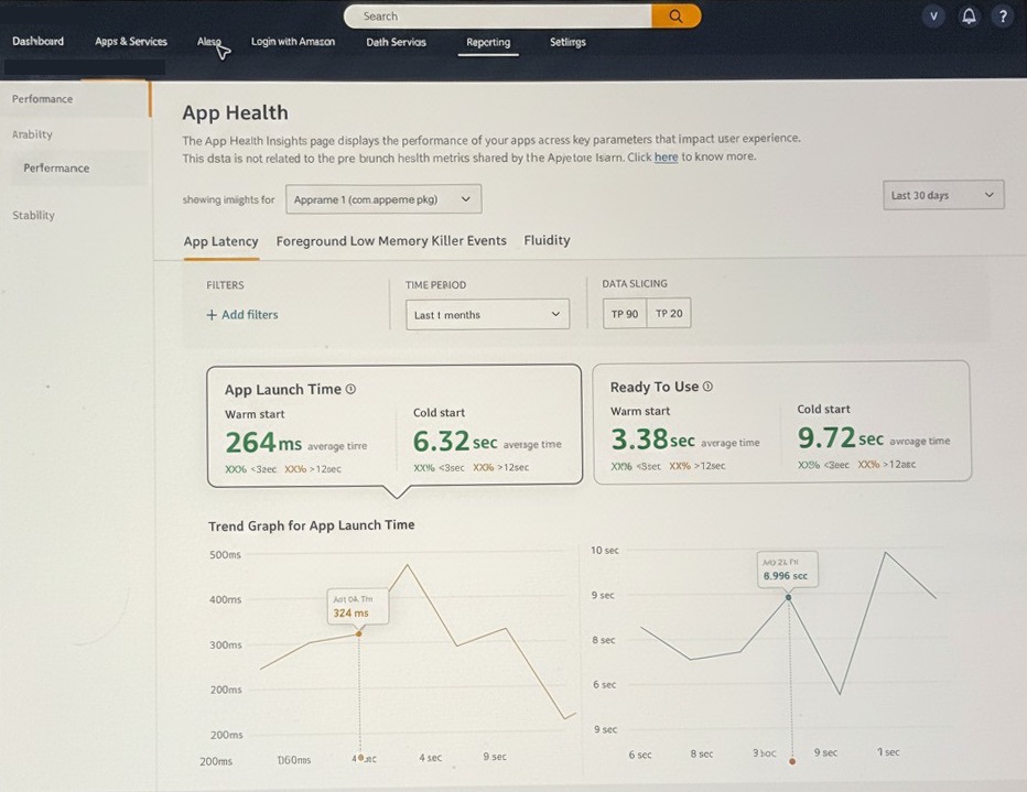
App health
The quality of an app on the store — so a developer can act before a rating slips.
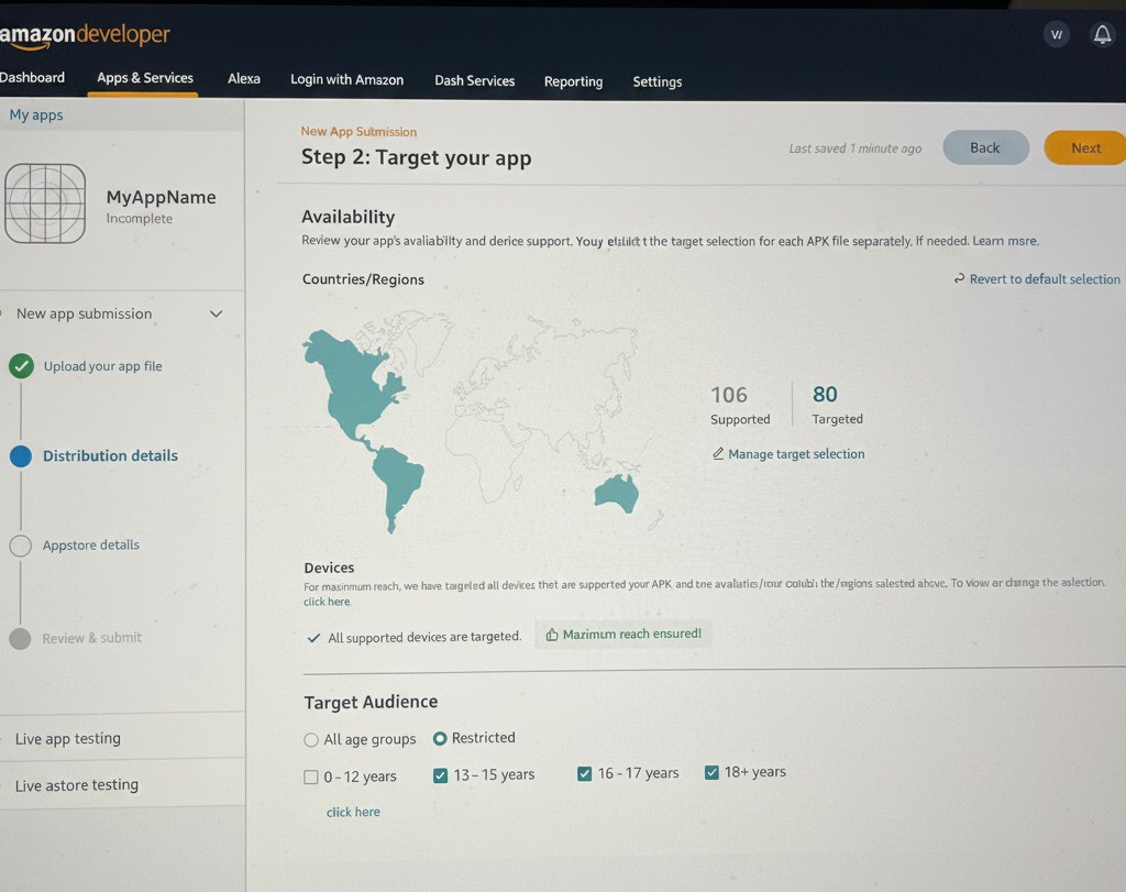
Targeting & devices
Where installs land across the device family — so a developer can target the surfaces that matter most for their app and reach larger audiences.
The Redex deep dive — password protected
One initiative, start to finish
Amazon Developer is really one story: Redex, the multi-year initiative to win and design a full rebuild of the developer portal. The case for it is above. The design process that made that case — and the redesigns it’s producing — is available on request. There’s no results section here on purpose: winning the rebuild was the result, and the finished screens aren’t public yet, so the deep dive shows the thinking, not the shipped UI.
Research & discovery
Usability testing, competitor analysis, DSAT scores.
“Walk the store” workshop
Mapping pain and opportunity with product & research.
Personas & voice of customer
Two developers; the on-video, unfiltered truth.
The IA problem
Nav exercise, synthesis, the brand split exposed.
Concepts & AI prototyping
The Monitor UI, prototyped with AI.
The Figma proposal
Hi-fi mocks that won our scope.
Brand, systems & the call
Unifying the portal; I pitched the third path.
The full design-thinking process → proposal
Research, the “walk the store” workshop, the two personas and the on-video voice of the customer, the information-architecture fix, and the Figma strategy proposal that won our scope — the complete case for the rebuild, step by step.
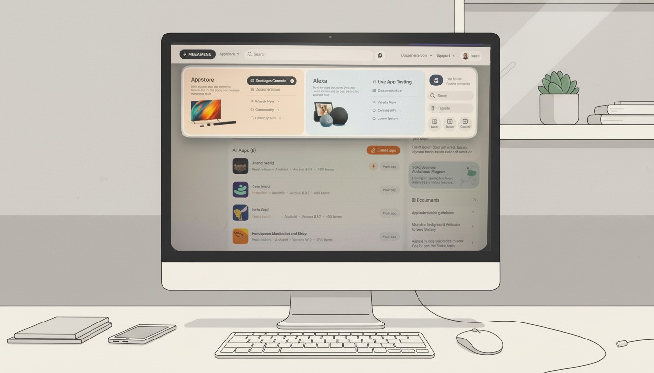
AI in the work
Where AI entered the practice — the Monitor UI we prototyped with AI, and how I’m bringing AI into delivery through prototypes and concepts. Shown abstracted; one or two pieces are active rebuilds.
API Portals
One application, two brands — a shared developer & API platform that unified the portal experience across Chase and JP Morgan.
Branding Developer Experiences
Insisting on a great developer experience — a branded, cohesive Chase developer portal and payment APIs, held to a consumer-grade bar.