A design-leadership case study
Chase Security Center
How I led the strategy and a cross-functional team to deliver a banking security experience that earned JPMorganChase the #1 spot in J.D. Power customer satisfaction.
The result
One place for everything that protects your account.
A security experience for Chase that brings every safeguard together — easy to find, clear to understand, and built to trust.
What it delivered
At a glance
Role
Hands-on strategic design lead and people manager — directing the work and leading the cross-functional team that delivered it
Scope
Consumer digital channels — Chase.com (Web) and Chase Mobile; the Security Center hub across lines of business
Also leading
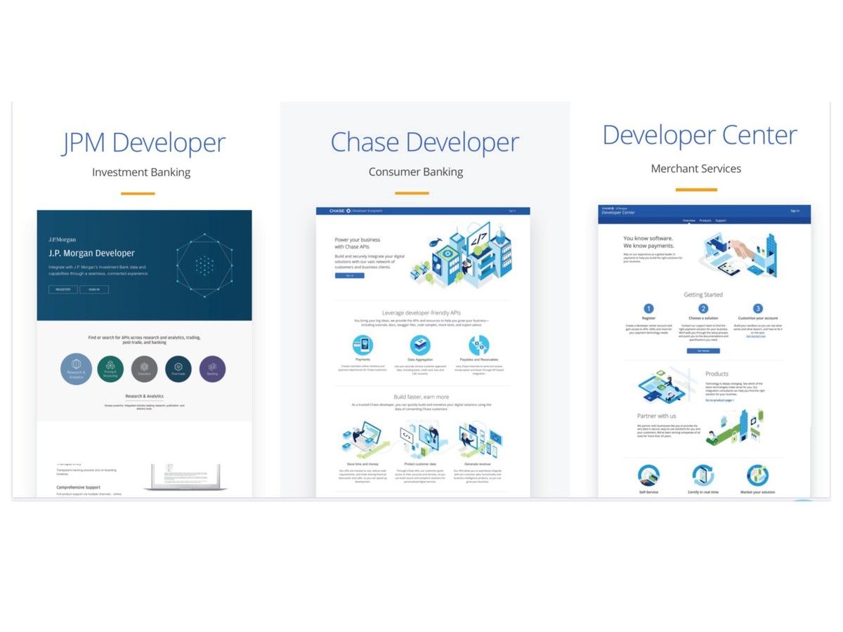
Concurrently led Merchant Services, the API Portals program (a multi-brand developer platform — Chase and J.P. Morgan — plus the payments Dev Center), and the horizontal, cross-LOB Digital Channels org (IA, navigation & systems) — the org this work sat under
Skills
Systems thinking · Information architecture · Design-thinking facilitation · Stakeholder alignment · Agile delivery · Visual craft · People management
The problem
Chase had powerful security tools. No one could find them.
Chase had built genuinely strong safeguards — control your data sharing, lock a card, see the devices connected to your accounts, monitor your identity. But they were buried, unbranded, and scattered across several Lines of Business, each built its own way — so customers couldn't find them, didn't understand them, or didn't expect them at all, most just assuming the bank had it handled, even as scams and identity theft climb.
Three attempts — three failures
Three earlier tries — by other teams, before me — each failed the same way: they only pointed at the features.
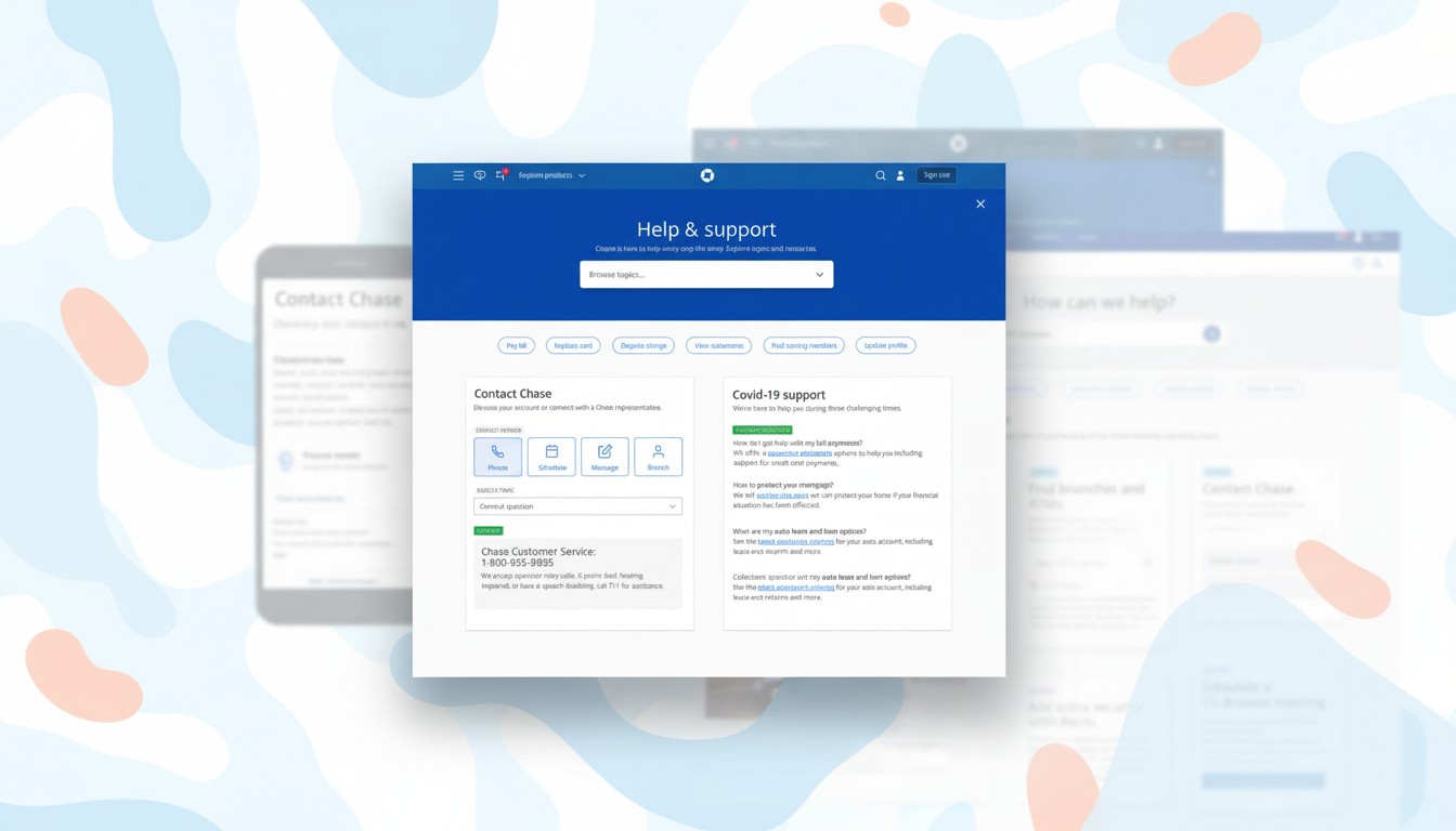
A catalog buried in Settings
A category list tucked inside Settings — customers didn't know these features existed, so they never went looking, and "AccountSafe" meant nothing to them.
Settings · AccountSafe categoryA single landing — still a link farm
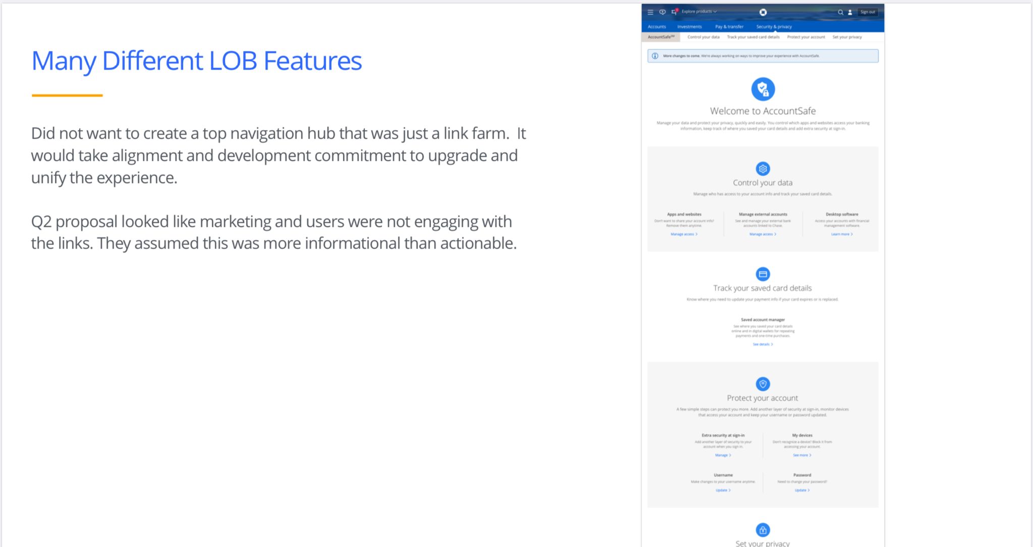
The tools were pulled onto one AccountSafe landing page, but it still read as a farm of links. The analytics were clear: almost no one clicked through.
AccountSafe landing pageThen it looked like marketing
The content team iterated a more descriptive page — but the Head of Consumer flat-out rejected what "looked like a marketing page." That's when I was brought on.
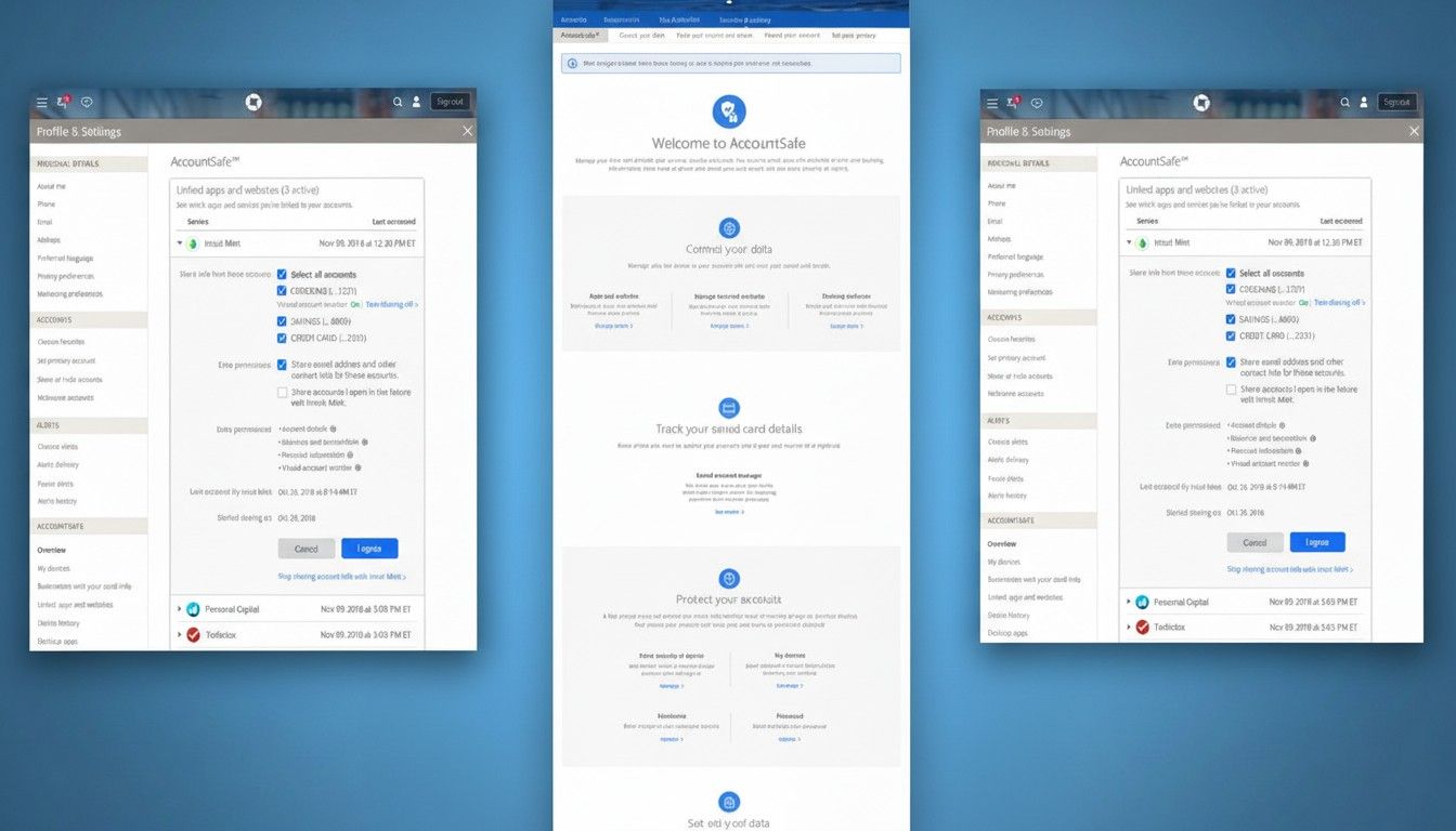 Content team · education page
Why they brought me in
This took more than design — that's the point.
Across multiple orgs, I'd built a reputation for one thing — aligning many leaders behind a single strategy and vision, with a proven framework for delivering large, 0-to-scale initiatives.
So they expanded my portfolio into Digital Channels, Consumer — a new space, security in banking, and a plan to wrangle every partner and feature into one experience.
The path that led here
Five years, five roles — across the bank's biggest platforms.
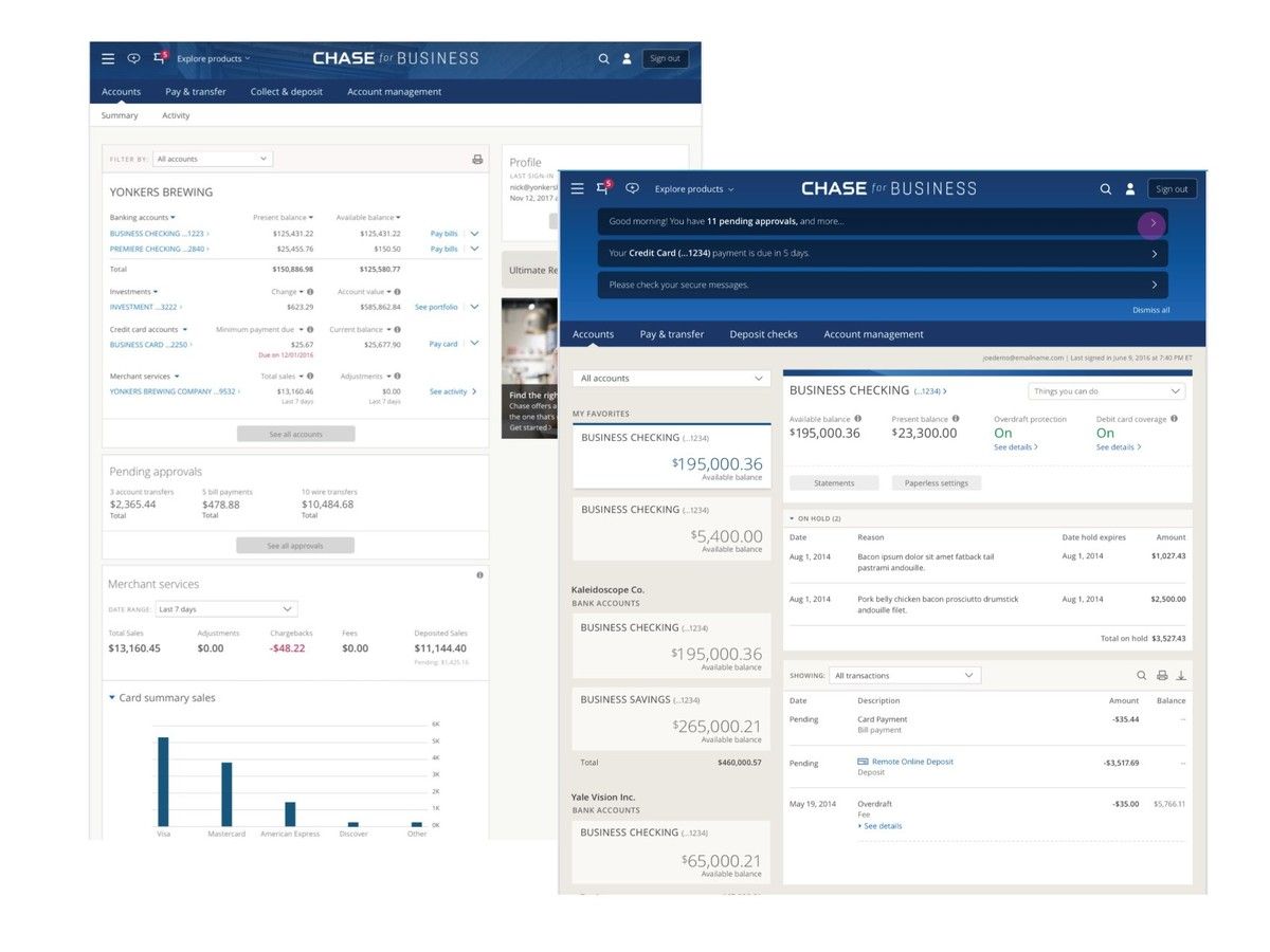
A fraction of the work
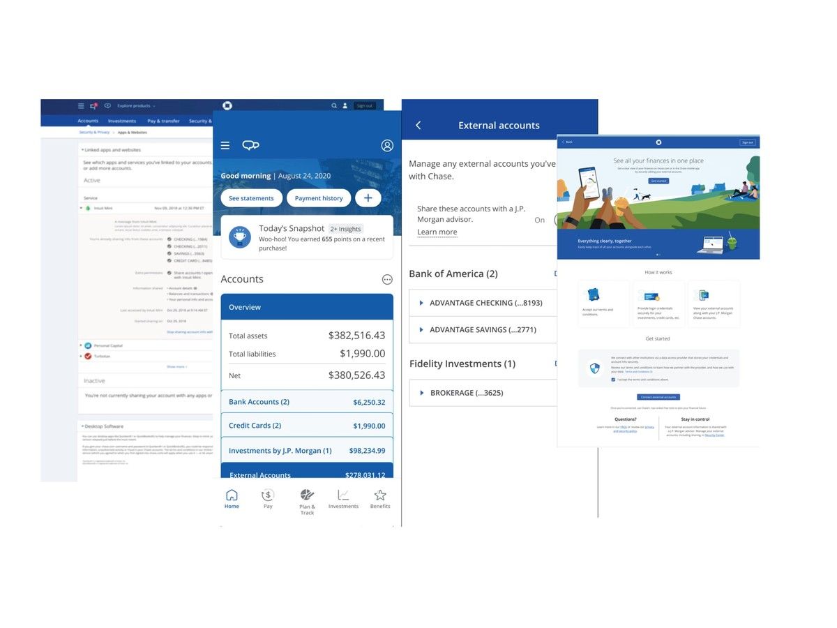
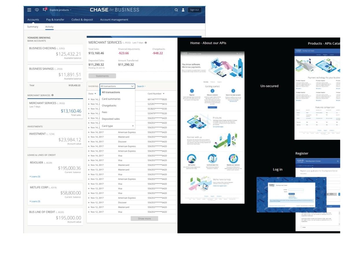
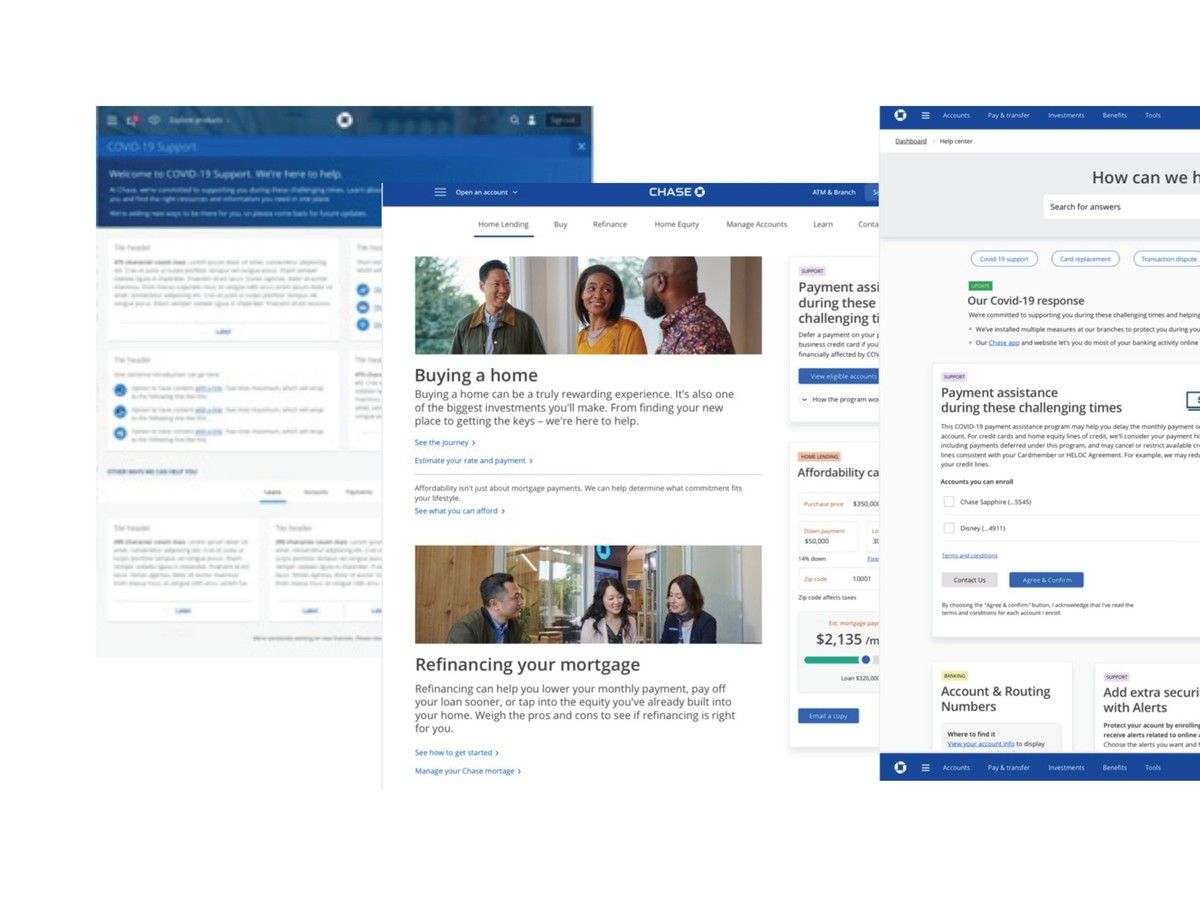
Five roles delivered far more than one case study can hold — the Security Center is one initiative among many. A few others I can walk through in depth:
Discover
Before a plan, I scoped the work.
To propose a plan leaders would fund, I first had to scope the work — size the real complexity, map the partners who owned each piece, and shape an approach worth the team, timeline, and budget it would take.
My Vision-to-Scale Playbook · 0 → 1 → Scale
Think big, ship small.
The methodology I bring to every large initiative — scope it honestly, prove the shape, phase the build, and keep it visible the whole way.
Define the North Star, then scale to it from an MVP that ships — a vision worth aligning behind, delivered in stages each team can commit to.
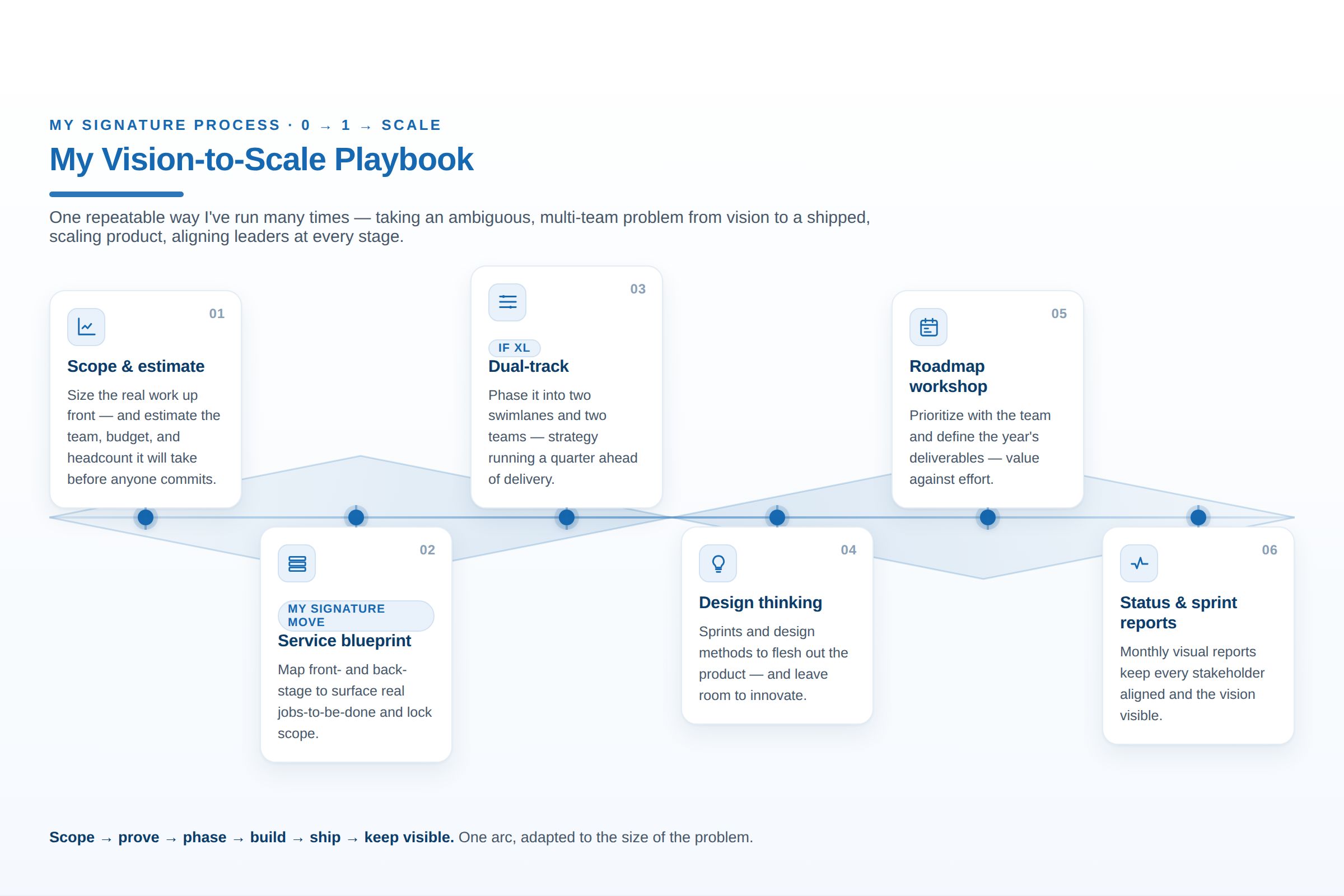 Vision-to-Scale Playbook
The framework — think big, ship small
In this chapter
What scoping demanded
Interview every partner, learn what customers understood, and size it into a plan — before assuming any solution.
Interview every stakeholder
I met one-on-one with every partner — and the design team before me — to learn each product, its owner, users, goals, and roadmap, so I knew whose buy-in a single, shared experience would depend on.
What I learned meeting every partner
Framing the challenge — a system, not a screen.
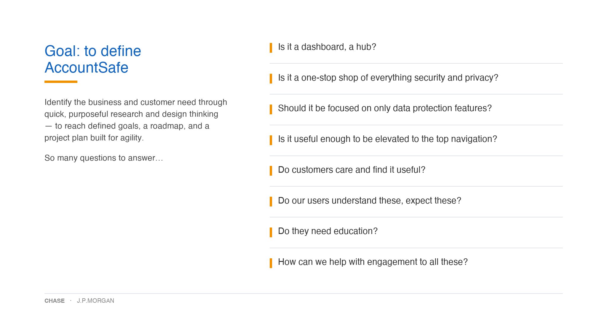
Straight from the deck I built to define AccountSafe — the questions the listening tour raised, and the case for one connected experience.
Define
So many questions to answer
What AccountSafe even is — a dashboard or a hub, which features belong, and whether it earns a place in the top navigation.
Socialize
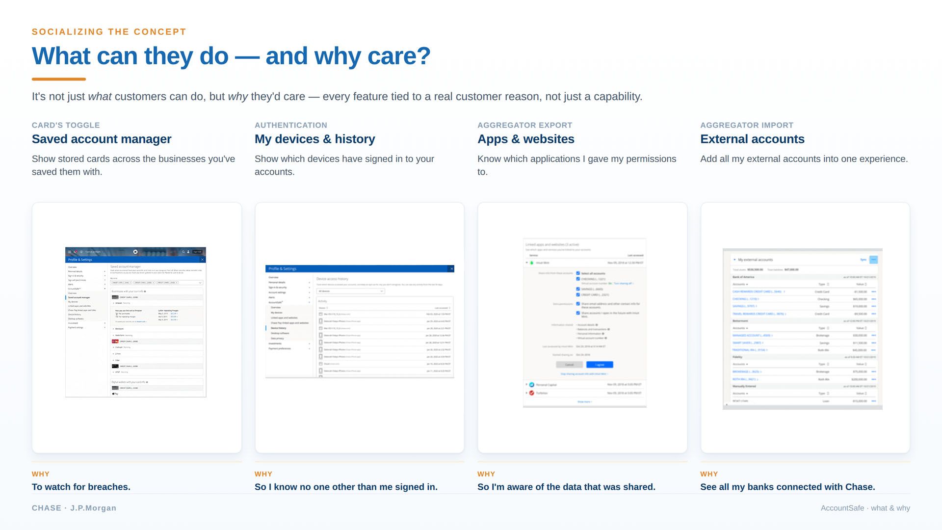
What can they do — and why care
Every feature tied to a real customer reason, not just a capability — the artifacts shown in full.
The PR/FAQ move · concerns head-on
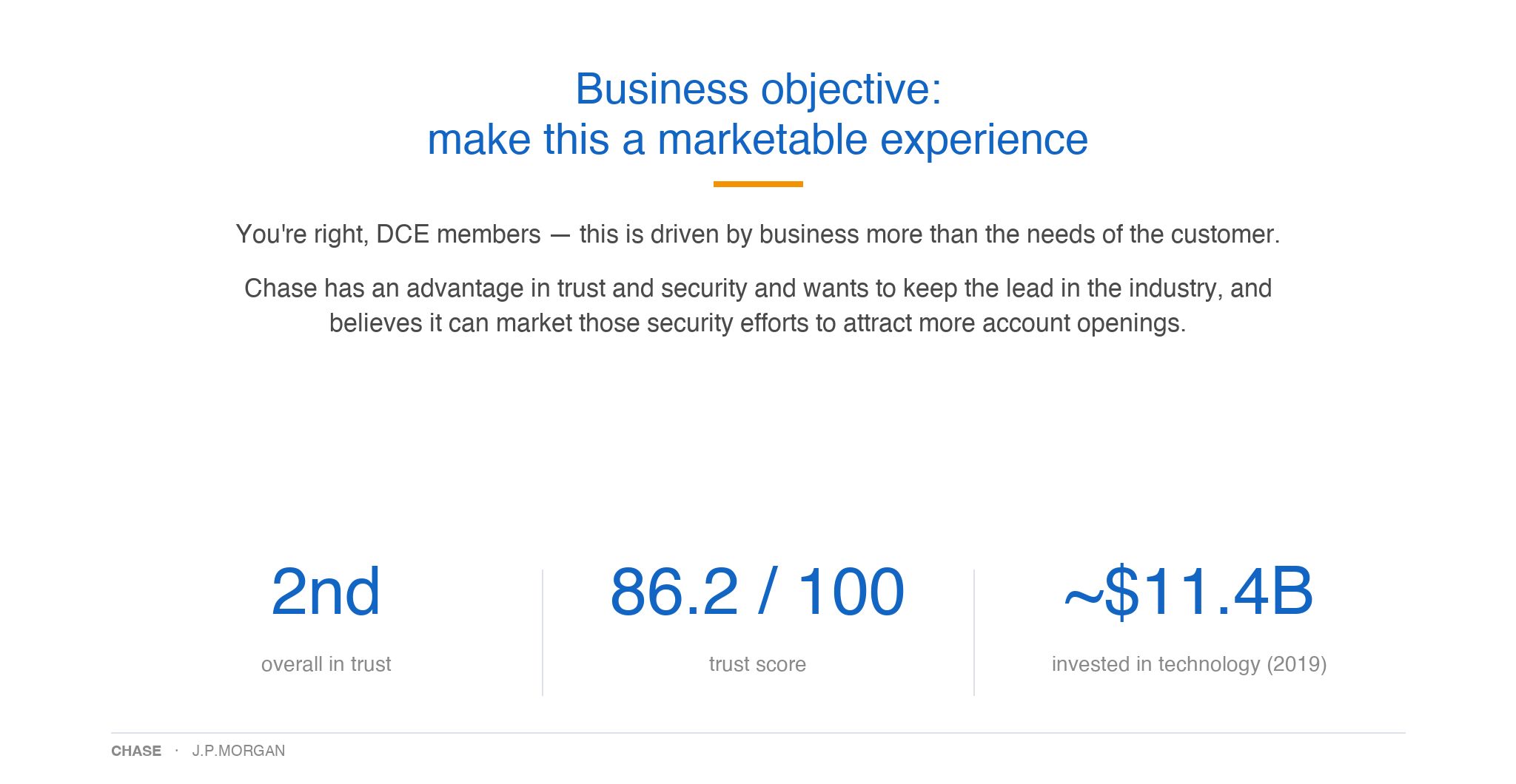
Business objective — the pushback, answered
DCE — my own design org — argued this was a business goal, not a customer need, and shouldn't take prime real estate. PR/FAQ style, I named the objection out loud, granted what was true, then gave the rationale: customers can't ask for protections they don't know they have — and Chase's trust advantage made security worth marketing (2nd in digital trust, 86.2/100).
The bar
Not another link farm
One connected, actionable system — not a page of links that read as marketing, the way the earlier Q2 proposal did.
The through-line: every partner owned their own product feature — no one owned the whole experience. That gap is exactly what the plan had to close.
Everyone I interviewed & aligned
Know the customer
Early conversations and the mental-model read pointed to the real gap — and it wasn't the tools.
Who we're designing for — and how they read security
The real gap wasn't capability — it was comprehension. People read security through cues, not data: a shield icon, a plain "your data is secure," a familiar pattern — and they need help interpreting what they see before they act. That pointed the design at two things I latched onto early — education and visual cues — which later drew real pushback I had to defend.
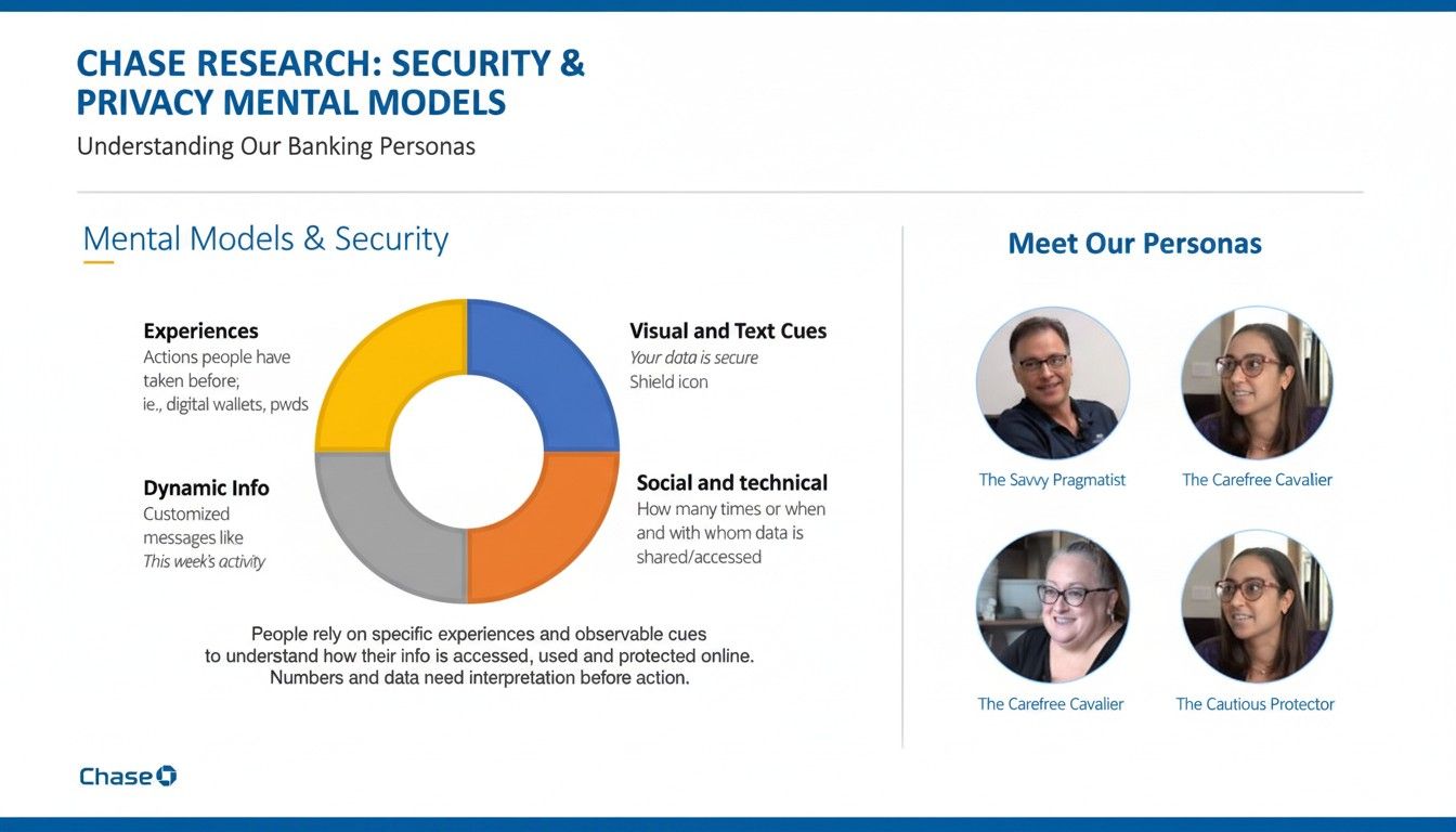 Mental-model study
The approach — a vision-to-scale playbook
From a scoped problem to a shipped platform: discovery to know the customer, a one-week design sprint to find the direction, then a war-room ritual that delivered it over a year. The full process — and the artifacts — are in the deep dive.
In the deep dive (password)
- Due diligence & scoping — how I framed the problem before a plan
- Know-the-customer research — the full discovery
- One-week Google Design Sprint — Ask the Experts, Co-creation, a Design Studio of ~20 concepts, the hub-vs-cards directions, and final A/B concepts
- The war-room ritual — propose, validate, iterate
- User testing & validation — concept-test results
- Content strategy — the “what and the why,” the hard part
- The final proposal to the head of CCB Product — Trust · Navigation · Scale
The system, tested by a crisis
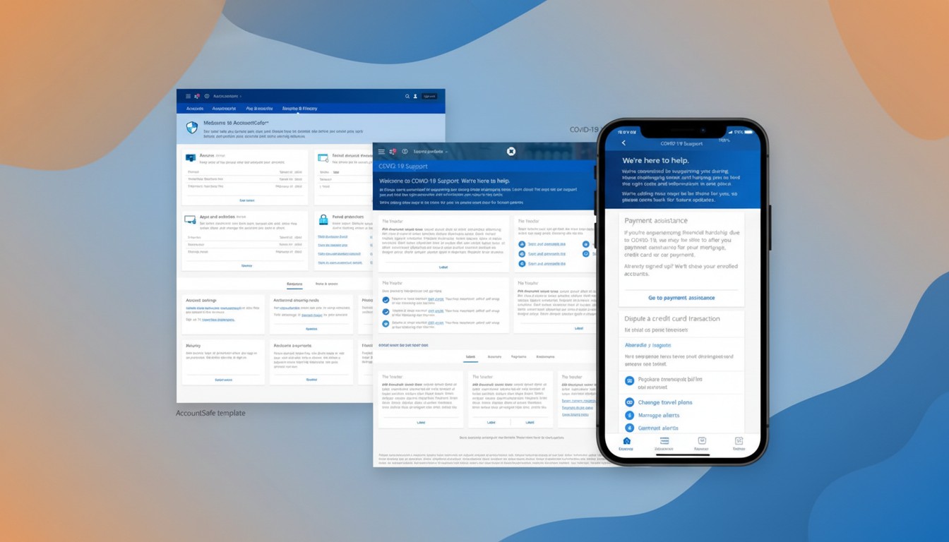
When COVID hit, the hub-and-spoke proved itself in weeks
Mid-build, the pandemic changed everything. Branches across New York were closing, call centers were overwhelmed, and Chase had committed to a government program to get small-business relief loans out fast. We paused the roadmap for two weeks and stood up a COVID-19 Support hub — and the fact that we could, in days rather than months, was the proof that we'd built a system, not a page.
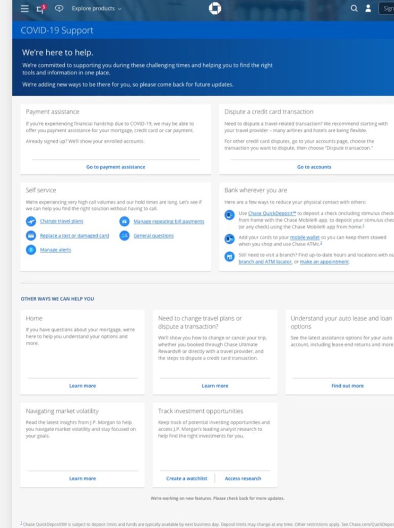
- Same pattern, new purpose. We repurposed the AccountSafe hub-and-spoke into a COVID-19 Support hub in a fraction of the usual time.
- A platform, templated and CMS-supported. The pitch I'd been making — reusable templates with managed content — is exactly what let us move this fast, and it's what CCB called out after the strategic success of these pitches.
- Agile, across audiences. Consumer, business, and more, delivered on a tight cadence because the system flexed to each.
The payoff of systems thinking: a crisis response that would normally take months took weeks.
The finals · what shipped
The Security Center, live.
One place, a uniform card per safeguard, each with a summary and a way to go deeper. This is where it all landed — web and mobile.
What shipped — web & mobile

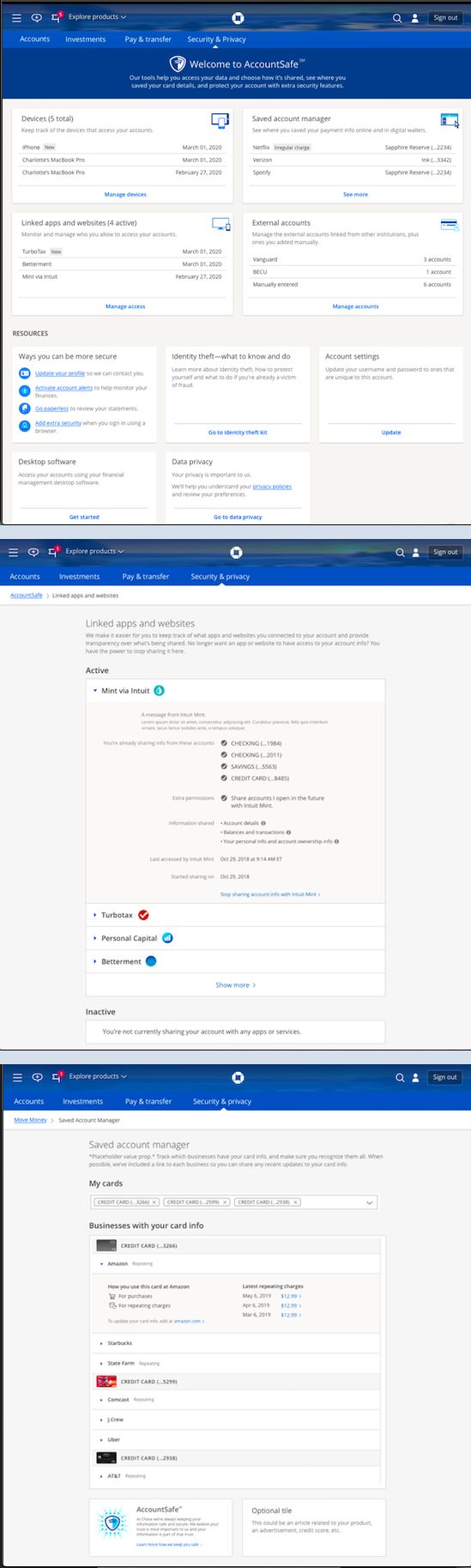
each device auto-scrolls once when it enters view — then scrub by hand
Impact
The destination customers returned to
The Security Center shipped on web and mobile, earned its place in the top navigation once the results were in, and became a destination people came back to — the outcome the whole strategy was built for.
Recognition · the digital channels this shipped into
Across my years leading Help & Security design — work that spanned web and mobile and several Lines of Business — Chase earned top industry marks in the channels this work shipped into:
- J.D. Power — #1 in security — Chase ranked highest for account security and protection, the very factor this work was built to move.
- J.D. Power 2020 — Chase ranked #1, U.S. Online Banking Satisfaction.
Influence
The reusable card-and-hub model became a pattern other teams adopted — the platform thinking outlasted the project.
Objectives we set
Feature migration to a standalone template, aggregator secure-API adoption, and reduced account takeover — the outcomes the roadmap drove toward.
Figures from the AccountSafe program; J.D. Power ranking independently verified (2020).
The legacy · the no that became the direction
The things I was told no on became the company's direction.
Two of the biggest calls I lost at launch came back as wins on their own — about a year later.
Illustration over stockA new visual language — adopted company-wide
I pushed for an illustrative, humanized feel over stock photography to cut cognitive load; the MVP was held to colored icons. A year later the design leader I'd hired for the API portals was promoted to Head of Brand — and that more modern, illustrative language began rolling out across all the apps.
Security out of SettingsElevated — and announced by the CEO
Mobile kept Security buried in Settings at launch. A year later Mobile elevated the Security Center out of Settings, and Jamie Dimon announced it in a video — it became not just a value for customers, but a marketing experience for the business.
And the model itself shipped forward
The Linked Apps and data-sharing experience I designed became the backbone of Chase's Data Security Center, launched in 2026 — one place for 87M+ customers to see, audit, and revoke third-party access to their accounts. The hub-and-spoke bet, now the default.
An uphill challenge — but the hard work of gathering the evidence ultimately proved the value of this work for customers.
Why it was a design-leadership dream: a rare chance to run the complete practice — strategy, research, content, and design — in-house and at scale, and build the team and systems that made it repeatable.
Related case studies
Where this led next.
The Security Center work led to my promotion to Head of Connected Banking — partnered with the Managing Director — the role where this platform thinking scaled across the business. More of the story: