

Case Study · Chase Help & Support
From link-farm to platform
A ten-year-old Help & Support page — a static wall of FAQ links and a call-center number — buckled when COVID closed branches and pushed first-time customers online. I led the reinvention: not another page, but a reusable content platform. The pitch became organizational direction.
The result
A search-driven help hub — built as a platform, not a page
An MVP that reused the COVID-19 dashboard pattern — a hub of modular widgets and quick actions instead of a link farm — with a vision to grow into search-driven, in-context help. In testing it scored 4–5 on a Likert scale against the old baseline.
North Star vision of Help & Support — animated walkthrough
At a glance
Role
Hands-on strategic design lead and people manager — directing the work and leading the team behind Chase’s Help & Support hub
Scope
Consumer digital channels — Chase.com (Web) and Chase Mobile; consolidating Help & Support across lines of business
Also leading
Concurrently led Merchant Services, the API Portals program (a multi-brand developer platform — Chase and J.P. Morgan — plus the payments Dev Center), and the horizontal, cross-LOB Digital Channels org (IA, navigation & systems) — the org this work sat under
Skills
Information architecture · Content strategy · Systems thinking · Service design · Natural-language search · Agile delivery · People management
Why this one matters — the pitch outgrew the project
Platforms, not pages. I was credited for naming the problem in our application — and the lean way to decouple content from development. The Head of CCB set it as org-wide direction: build “more a platform than a page-by-page build.”
Adopted cross-org. Two further initiatives were greenlit to build on the same system.
Validated. The MVP + Vision concepts scored 4–5 on a Likert scale against the old link-farm baseline.
The ask
Reinvent a page that broke under COVID
The Head of Consumer Product — who I’d already partnered with on Security Center and COVID-19 Support — asked me to take on a new initiative: redesign Help & Support, with some early thinking about whether COVID-19 Support could evolve into it. The existing Help & Support page was a static link-farm of FAQ and help-doc links plus a call-center number.
The break & the overlap
A page under pressure — and a second hub already in play
When COVID shut branches — hitting New York especially hard — and pushed first-time customers online, the ten-year-old page couldn’t help people find what they needed. A static link farm is a wall of links, not a way to find answers — so users fell back on the call center, which was quickly overwhelmed.
Meanwhile COVID-19 Support — the hub I designed across Consumer, Business & Commercial — was carrying urgent tasks like government-backed small-business loans. As COVID’s urgency subsided, could that hub scale into a permanent Help experience?
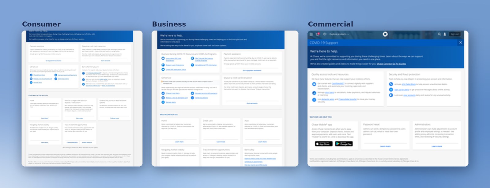
My read: both could be true — build both, and combine over time. COVID keeps its own link now, and eventually becomes a deep link inside the help system.
My approach
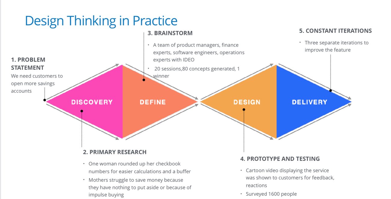
Design thinking in practice — research first
How I ran it
What I walked the new product owner through
I took the new product owner through my design process and pushed hard for research up front — competitor analysis, time with the call-center team, and their data on what customers actually call and search for.
I ran it as an MVP + Vision dual track (the model from Security Center): ideate the vision, ship a focused MVP, and split the team to scale the vision incrementally.
And I staffed for it — insisting on a content strategist alongside a design lead, because the system depends on structured content (you’ll see why at the content system).
By this point I’d already owned the API-portal work across Chase, JP Morgan and Merchant Services, and was expanding into Consumer and Foundation / IA work — leading roughly four teams across several orgs at once. My operating model was consistent: for each initiative I scoped the team I’d need, made the case for it, and was given the resources to build it.
The strategy & process · password-protected
How we got to the shipped hub
Between the framing and what shipped: discovery & research, the channel-demand case, the strategy pitch, a feasibility-first system, and the hi-fi MVP we put in front of real users. The detailed process is in the deep dive.
- Research · discovery & synthesis — the discovery behind it
- Channel demand & the call center — the data behind the case
- The strategy pitch — winning the platform over a page
- The system — feasibility first — the CMS/JSON backbone
- The MVP — put in front of real users — tested before scaling
The North Star vision — a customer-journey proposal
Modular, search-driven — and beyond the redirect
The North Star we proposed — built as incremental MVPs: search first, with browse, quick actions, and filters / drop-downs as fallbacks while keyword search matures. Walked as a journey: from where help lives, to one ingress, to a templated answer that brings the task to the user.
Where help lives · the ingress
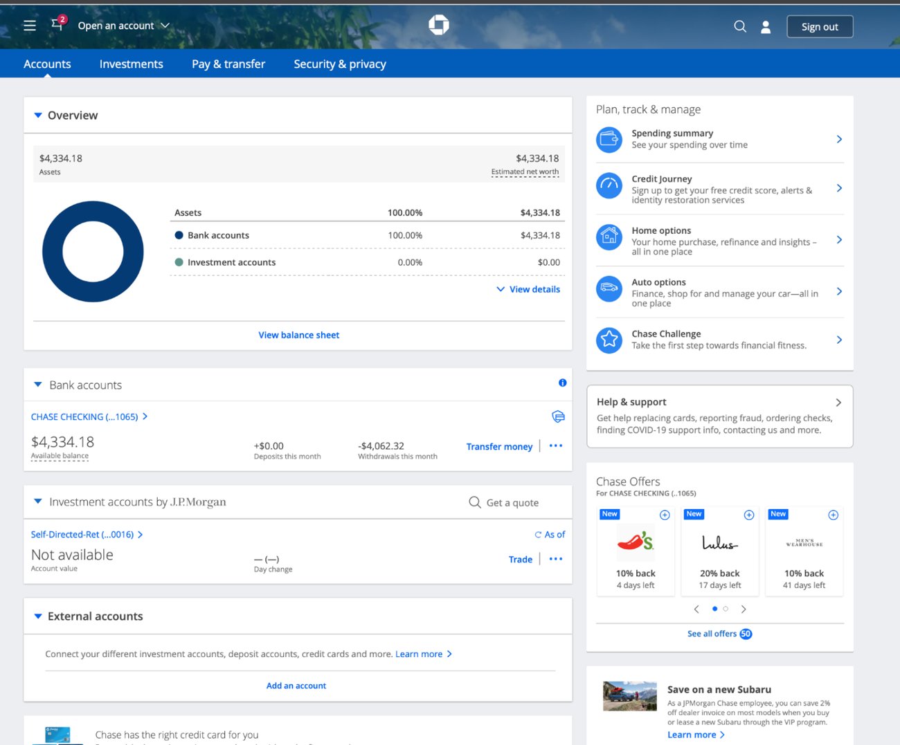
Hamburger menu & right-column widget
Customers ingress from the hamburger menu or the right-column Help & Support widget — the widget I designed into the account dashboard, one of my first Chase initiatives, later adopted across business lines and mobile.
The landing
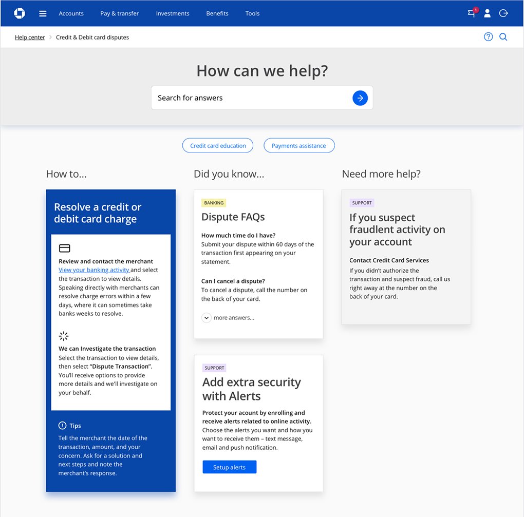
“How can we help?”
What customers land on — the tested help landing. Search here is one level in; a real keyword match then renders the results page.
Browse
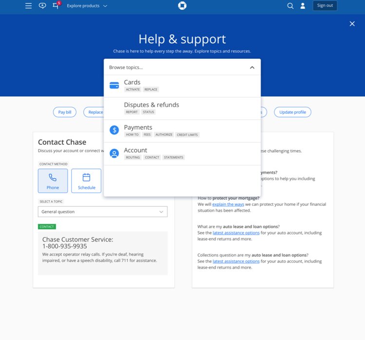
The drop-down
Search comes first; while keyword search matures in the data, a drop-down lets people browse to the right topic.
Browse variation
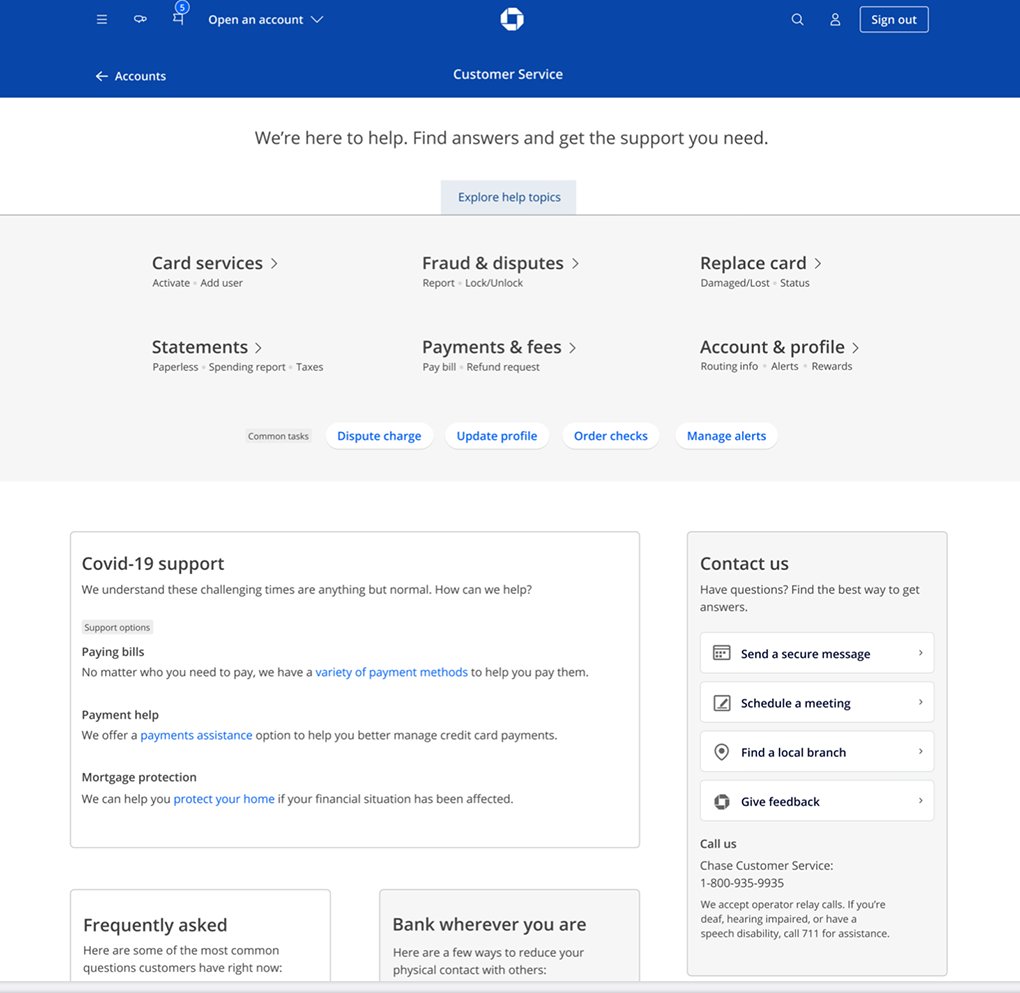
Mega-menu & filters
A richer mega-drop-down and topic hub — browse and filters carrying people to the right place while keyword search matures.
Browse variation
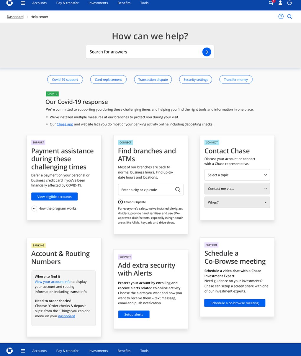
Quick actions
A concept for the top ten help requests, prioritized into one-click buttons — another fast path while keyword search matures in the data.
The results page
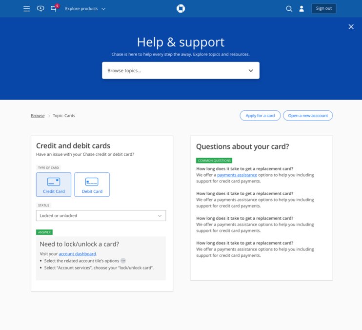
The tested results view
The results page users saw in testing — the templated view that carries the keyword answer, relevant links and actions, and related content, bringing the task to the user rather than redirecting.
Ongoing help
Secure messaging & action widgets
Integration with Secure Messaging — and again the relevant action widget pulls the task onto the page instead of sending the user away.
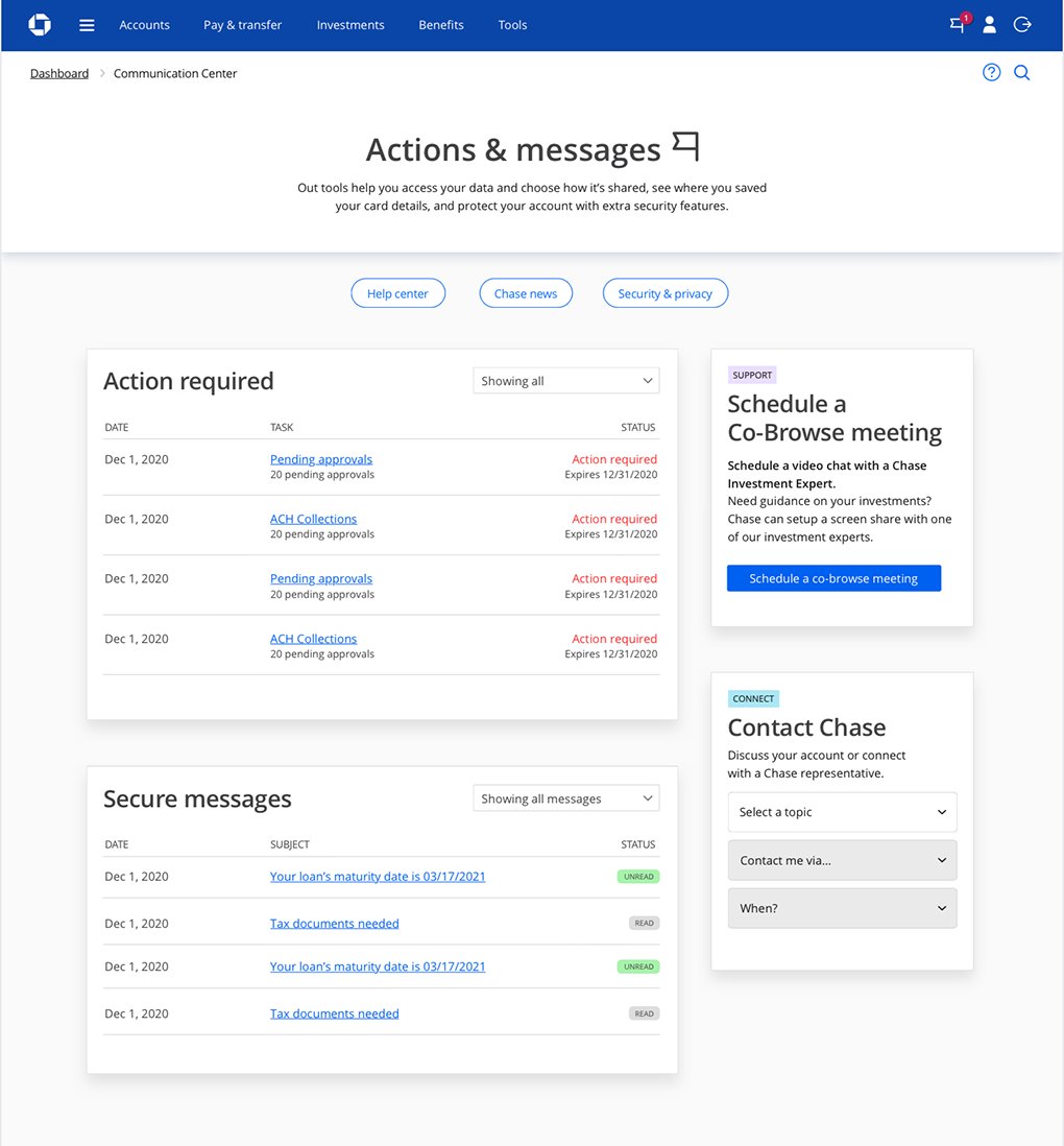
The bigger bet: the more we built these modular widgets, the less we’d need redirects at all — the right help could surface in context and come to the user. A pre-AI take on what’s now becoming common.
What shipped — the MVP
The focused MVP that went live
What went live was the MVP: the COVID-19 hub, reused as a real, organized improvement to Help & Support. It works — but the North Star above goes much further.
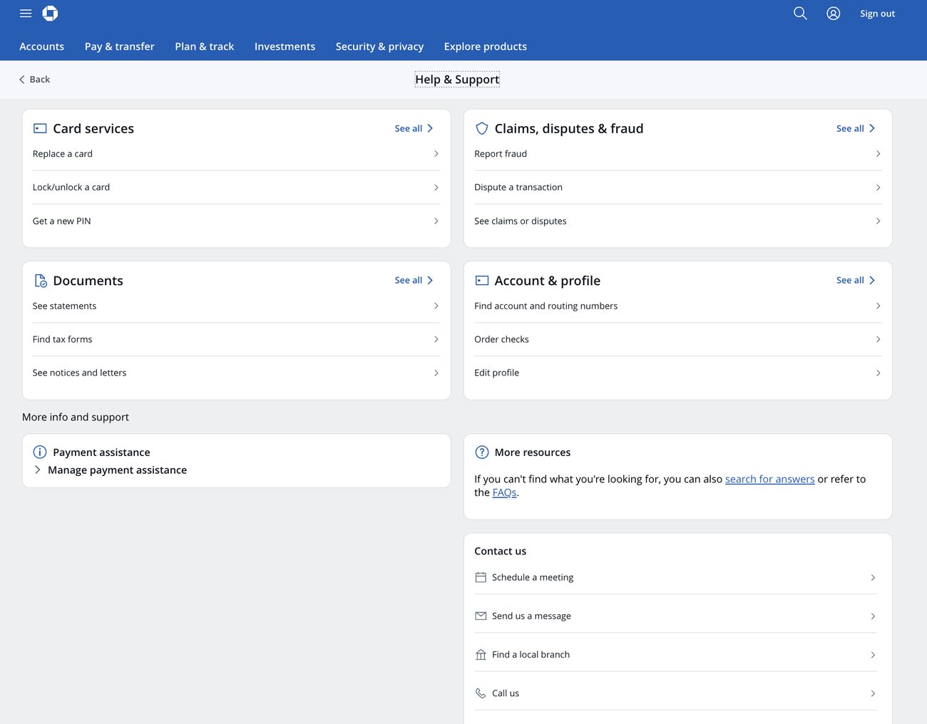
Candid note — what shipped vs. what we proposed
The live hub reuses the COVID-19 Support dashboard — a solution we delivered in about a week under pressure. It works, but it isn’t the fuller experience the design team proposed.
In particular, I pushed for iconography and imagery — visual association that signals what each section is, builds hierarchy, and adds scannability and interest (as in the Security Center vision). The modular, text-forward grouping scans cleanly, but I believe visual association would make it stronger, and I kept advocating for it.
Strategic influence — the part that matters most
The Head of CCB announced it org-wide — and greenlit the budget
After the pitch, the Head of CCB announced the approach to the whole organization: build “more a platform than a page-by-page build,” and wanted more of us moving that way. That announcement greenlit budget for further initiatives built on the same system — two of which I proposed.
Two further initiative requests — greenlit
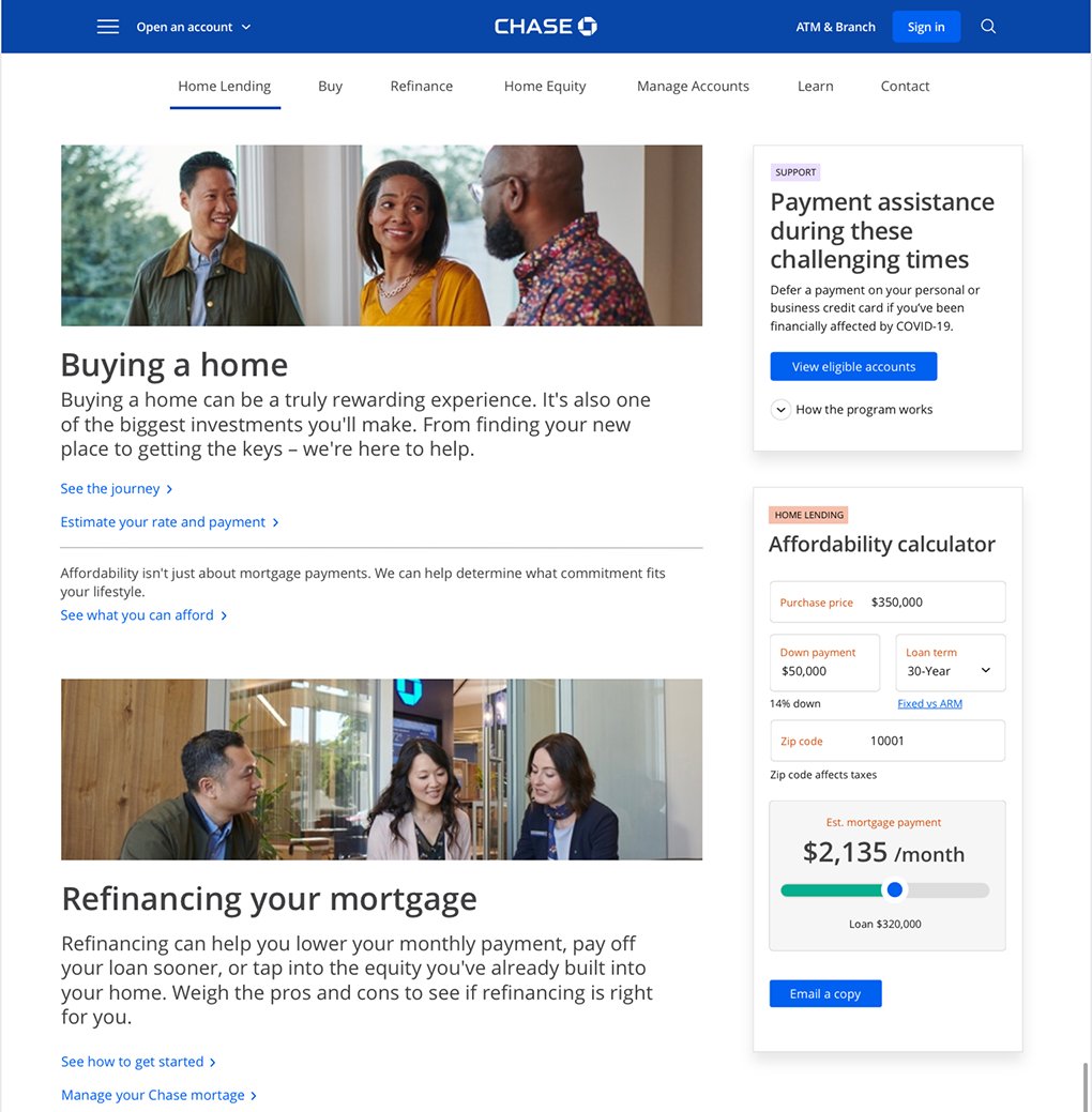
Request 1 · Pre-sign-in marketing
Marketing & how-to pages on the same system
The pre-sign-in marketing team came to me to apply the same template / CMS approach to their pages — selecting section blocks and decoupling content from development.
Request 2 · The modular widget
Help that comes to the user, in place
My proposal’s modular widgets — like the actions & messages and dispute examples — bring the task directly to the user where they are instead of redirecting them. Taken up as an early search / dev-assistant concept, pulled in anywhere, especially through search.
Results
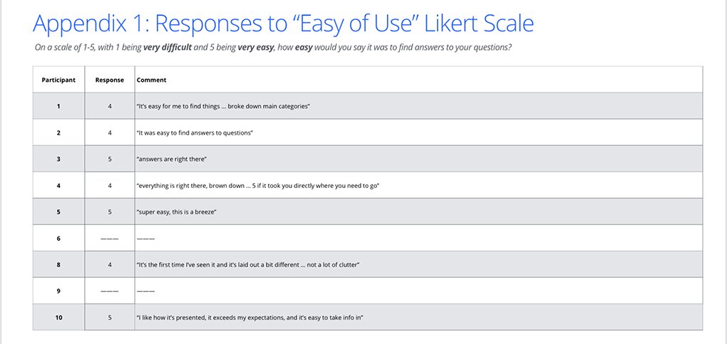
Validated — 4–5 on the ease-of-use scale
On a Likert scale, the MVP and Vision concepts scored 4–5 against the baseline — the old static link-farm of help-doc links. Participants called it easy, clean, and “a breeze” to take in.
In their words
“I like how it’s presented — it exceeds my expectations, and it’s easy to take info in.”Participant · rated 5 / 5
“Super easy — this is a breeze.”Participant · rated 5 / 5
“It’s the first time I’ve seen it and it’s laid out a bit different … not a lot of clutter.”Participant · rated 4 / 5
Beyond the scores, the concept reset direction — it made “platforms, not pages” an organizational goal and greenlit two further initiatives that outlived the project.
Part of one evolving architecture — and a leaner way to build. Help grew from the hub-and-spoke pattern of Security Center and the emergency hub of COVID-19 Support, and the same thinking carried into the marketing and widget initiatives — a repeatable, efficient way to build the application. And bringing content to the user instead of leading them down endless pages was a genuine win-win: a better experience for the customer, and a sharp cut in design and development resources.